UI showdown: EMUI 8.0 vs MIUI 9.5
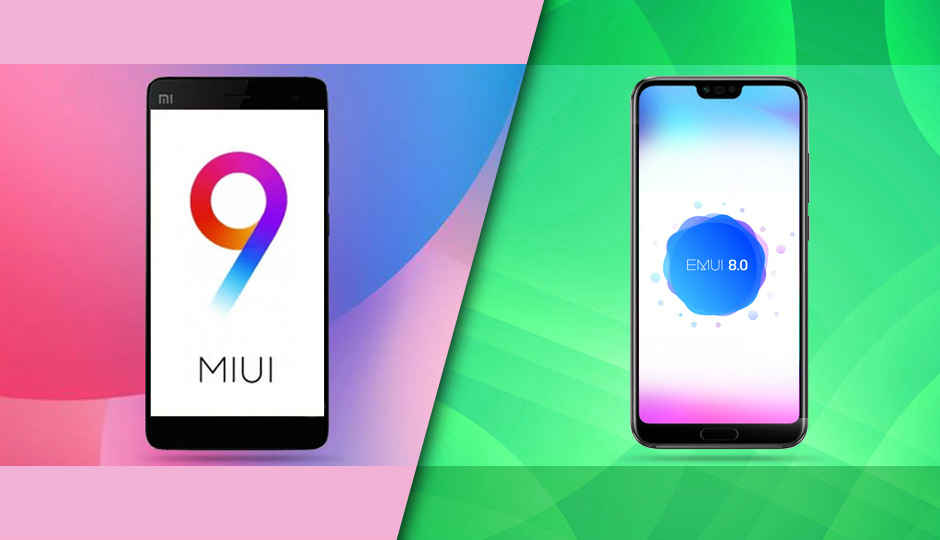
MIUI is the most popular UI in India right now while EMUI is quickly gaining momentum. As interfaces, they are as different from Stock Android as chalk and cheese. So which should you go for? Find out here.
Android is the world’s most widely used mobile operating system. There are over two billion monthly active users of devices powered by the OS developed by Google. But not every Android device is made the same. While the base layer is the same for everyone, the interface of Android devices vary like chalk and cheese. There’s stock Android that is the purest, vanilla form of Android. You see it in devices like the Pixel 2, the Nokia 7 Plus and the likes. But over the years, OEMs have increasingly put efforts to differentiate themselves based on the software experience they offer. Some have ditched the app drawer in the UI, some have their own launcher animations, while some have introduced features that stock Android doesn’t have. As a result, Android is fragmented not just by their versions, but also by the software on top of Android which the users end up loving or hating.
In India, the highest selling smartphone brand is Xiaomi which uses a highly customised version of Android termed MIUI. There’s also Huawei and Honor which again tweaks the structure of Android to offer EMUI. Then there’s Samsung with Samsung Experience, Oppo with ColorOS, Asus with ZenUI and a lot more. With the Mi A2’s launch right around the corner, it’d be interesting to gauge how well a stock Android Xiaomi will be accepted by the public. Interestingly, in a poll conducted by Xiaomi themselves, people increasingly voted in favour of stock Android over MIUI. That poll was quickly taken down, for obvious reasons. But even though a small segment of internet-savvy users voted for stock Android, MIUI-powered devices are the highest-selling. Huawei/Honor’s EMUI is also being largely accepted by the people. The brand entered the top 5 list this year and claims to be the fastest growing among all smartphone brands in India.
With the market flooded by Xiaomi and Honor devices, we decided to take a look at what their respective UIs offer, where they are different and whether there are any glaring flaws. However, the point remains that while hardware can be objectively tested to claim one is better than the other, choosing the best UI is a subjective decision. My opinion in this piece may differ from yours and with that out of the way, let’s begin!
Home screen
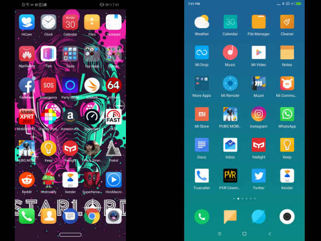
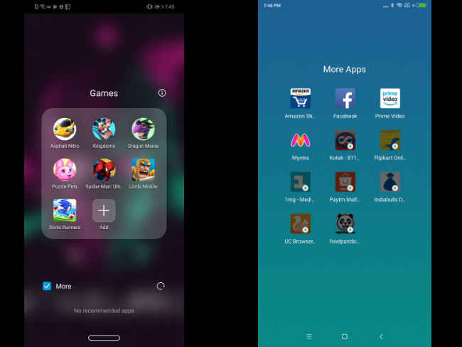
The home screen layout of MIUI and EMUI are both pretty similar. Both take more inspiration from Apple than Google in this case. Both UIs cram the icons in the home screen itself by default, although EMUI does provide the option to turn on a dedicated app drawer where the apps are alphabetically arranged. Normally, all apps and widgets will be present in the home screen itself. You can group the apps into folders and keep only the important ones permanently at the bottom of the screen.
Between the two, MIUI takes inspiration from Google’s Material Design. The icons are flat and menu options show up as cards. EMUI, in that case, is more unique. Icons are asymmetrical and are quite large by default. EMUI feels more crammed for this reason.
You can pinch out to enter the personalisation menu in both the cases, where you can rearrange apps, add widgets, change wallpapers and change the launcher settings.
Then there’s the minus-one screen. When you swipe right from the main home screen on MIUI, you enter what Xiaomi calls the vault. There you get the Google Search bar, shortcuts to the apps you use frequently, widgets, notes and more. EMUI’s minus-one screen houses the Google Search home screen where it displays news articles on topics you like, sports scores, weather and more.
Verdict: As far as home-screen goes, the choice in this case is between functionality and aesthetics. If you’re looking for something that is aesthetically pleasing, MIUI is the one to go for. If you’re looking for more features, EMUI takes the cake here.
Theme engine
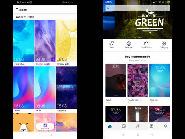
Both user interfaces are heavily customisable. You can make them look like anything. Personalisation has always been a strong point of Android devices and MIUI and EMUI offer some good looking themes and icon packs to work with. The default colour schemes of both the interfaces are different. MIUI has a lot of blue and white, while EMUI is mostly transparent or white. But you can change that.
Mi Theme in MIUI has both paid and free themes to choose from. It’s divided into what’s trending, top charts, and what’s new. You can also choose icon packs, wallpapers, ringtones and fonts individually. You also customise the existing themes to make them your own.
Similarly, the Themes app in EMUI offers a handful of themes to choose from by default. The options are not as many as compared to MIUI but you can create your own theme. However, you are restricted only to selecting a wallpaper for lockscreen and homescreen, icons, and the system font.
Verdict: In this case, Xiaomi offers a wider range of themes to choose from. It’s customisation options are also more than what EMUI provides. The winner is clearly MIUI in this case.
Status Bar/Quick Settings
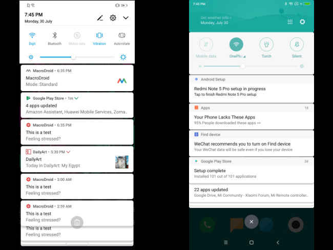
Swipe down from the homescreen and you enter the notifications shade which also houses the Quick Settings tiles. Both MIUI and EMUI have the must-have options right when you swipe down — Wi-Fi, Mobile Data, Sound and the likes. The options are a bit different in MIUI where you can toggle Bluetooth, Torch and sound profile. Expand the Quick Settings tile and you get the rest of the options. MIUI offers 16 toggles in total, while EMUI tops off at 15, but you can always add more. The brightness bar is located at the bottom of the Quick Settings tile and houses the option to toggle automatic brightness on or off.
Both UIs offer stacked notifications. Notifications from the same app is grouped and you can swipe on them to expand. Both UIs offer shortcuts within the notifications itself to take quick actions like replying to messages directly from the status bar itself.
Verdict: Tied
Bloatware
Both EMUI and MIUI come with their fair share of bloatware. The pre-installed apps are a hit or miss, but most of the time (based on observation), they remain unused. Both UIs offer their own versions of a browser, gallery, file manager, note-taker and the likes. EMUI goes beyond that to include a few games as well. All of them take up extra space and depending on the phone you buy, storage can become a constraint easily. Thankfully, most of these pre-loaded apps can be uninstalled.
Verdict: Tied
Security
Security and privacy are two vital things at a time when personal data is considered the oil that drives the digital economy. In that case, both EMUI and MIUI are fairly protected. While it doesn’t go as in-depth as Samsung’s Knox or Blackberry’s DTEK app, it’s adequate for the average joe.
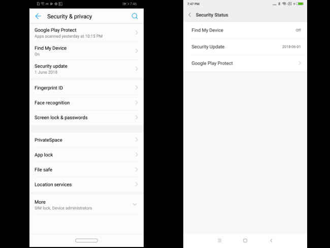
Xiaomi’s security settings are scattered across the Settings app. You can check the Security status which includes Google Play Protect, Find My Phone and security updates. Most Xiaomi phones these days offer face unlock on top of the fingerprint sensor for biometric authentication. You can also encrypt your data at the boot level. If there are more than one user using the phone, Xiaomi offers an option called Second Space that runs a separate profile which can be password protected. You can also run two instances of apps like WhatsApp and Facebook using Dual Apps. Apps can also be individually locked.
In case of EMUI, all the above options are present and housed in a more coherent manner. Furthermore, you can not only lock your apps, but also keep files under password protection. For the uninitiated, it’s easier for users of EMUI to better keep things secure, with all security and privacy features being housed under one section.
Verdict: The winner in this case is EMUI for its coherent organisation of all security features.
Settings app
Over the years, the Android operating system has become more and more complex. Newer features, options and customisations get introduced in every new version, and all that is accommodated in the Settings app. For enthusiasts, that’s a favourite place to explore and tweak. For Xiaomi users, the Settings app looks better, but the options are scattered. But it’s easy to figure what is where. Xiaomi makes it easy by putting the main categories up front. Other more nuanced options are embedded inside. In case of EMUI, it’s also more or less the same. The options are filed under different categories. Wireless & Networks houses the Wi-Fi, Bluetooth, Mobile Data and the likes. EMUI also offers suggested Settings that come up based on your usage. It’s a good way to know your device even when you’re not an enthusiast. I’ve discovered a lot new features simply for the suggestions the app offers.
Verdict: EMUI comes up on top in this case for the clean, categorised and coherent manner everything is presented. MIUI simply looks good but is actually more confusing.
Permissions management
A few years back, Google made app permissions explicit. Apps will have to specifically ask for individual permissions to access key components like phone, camera, contacts and more. The UIs also make it easier to keep a track of the permissions you’ve granted to each app. Both EMUI and MIUI, have provisions to track permissions. The Permissions section is there up front on the Settings app in MIUI and going in will show the key permissions that have been granted to various apps. You can also check what apps have permission to autostart. EMUI has a more basic interface for it. You can only see what permission is being used by which app.
Verdict: MIUI, thus comes up on top in this case.
Cloud backup
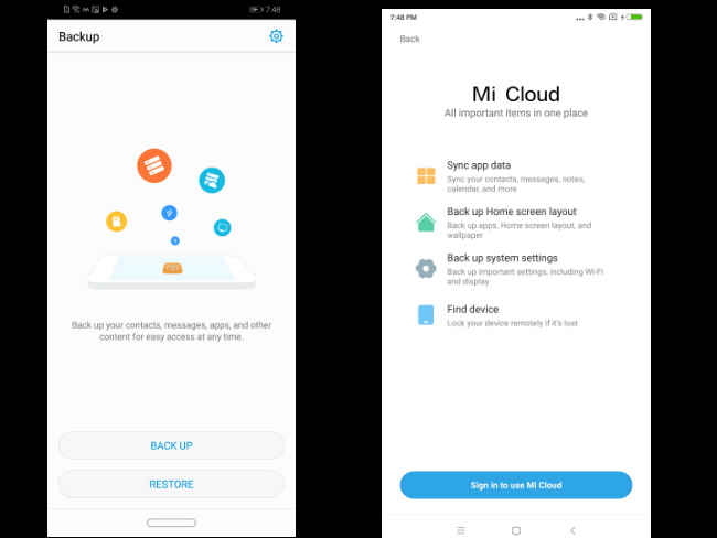
Both EMUI and MIUI have their own cloud services. Mi Cloud backs up and syncs your app data, home screen layout, system settings, text messages and more. You can also store files there. EMUI goes beyond that to allow users to store their photos as well as the current theme, and more. Both are quite capable in doing their job and is useful when you switch devices. However, with Google Drive preinstalled in both MIUI and EMUI, it does come across as a bit redundant as you can do the same using Google Drive as well.
Verdict: Tied
Gesture navigation
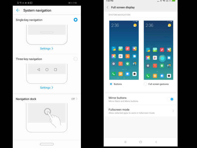
Gestures are the next big thing. The iPhone X has it. Android P will have it, and custom ROMs like MIUI and EMUI has already started to implement it. Starting from MIUI 9.5 and EMUI 8, gestures are offered as a choice. By default, you will have the traditional software navigation keys, but you can turn them on in the Settings menu. MIUI’s gestures follows the iPhone X closely. You swipe up to go back to the homescreen, swipe up and hold to go to the recent page and swipe from left or right to go back. EMUI’s gestures are more unique. You get a single bar for navigation like the iPhone X, and you can pull it left or right to access the home screen, pull up and hold to go back to the home screen, and tap on the bar to go back.
Verdict: Both are quite intuitive and the gestures become muscle memory soon enough. MIUI’s gestures a little more intuitive, for the swipe anywhere to go back option. It’s also closer to what Android P will have. The winner, in this case, is MIUI.
Accessibility
Not every phone is the same, and neither is every phone user. Both EMUI and MIUI takes it into account and offers a plethora of accessibility options. Both ROMs have a separate section for these options, but in both the cases, the option is buried deep inside a larger section. In MIUI, you can turn on one-handed use, a quick ball that houses useful shortcuts, assign shortcuts to hardware buttons, change the notification light, change headphone and sound effects and more. EMUI offers one-handed UI, motion control and voice control.
Verdict: MIUI comes on top in this case for the wide array of options it offers.
AI
Finally, the most controversial feature in ROMs these days — Artificial Intelligence. Both EMUI and MIUI claim they use machine learning to learn for your usage to offer a hassle-free, speedy experience. There’s also AI in allocating resources, pre-loading apps and even in saving battery. However, in our testing we have figured both EMUI and MIUI are quite aggressive in killing background apps to keep the UI running smooth. That results in accidental force closing of apps, delayed notifications and more. Measuring the effectiveness of these AI features is difficult as there is no objective way of determining how well they work. When they work, you won’t realise. It’s only when they don’t and the UI starts to slow down that we begin to complain.
Verdict: Reserved
In conclusion
The decision of which OS is better will come down to a very subjective choice. Sometimes, regardless of which OS offers more (or less) features, we pick a winner based on continued use. If you’re a long time Xiaomi user, chances are, you’d find switching to something else cumbersome. From a usability perspective, both EMUI and MIUI are very well fleshed out as Android ROMs. For power users, EMUI could be a better choice than MIUI, but if you want a completely hassle-free experience with some customisability, maybe MIUI is what you should settle for.


