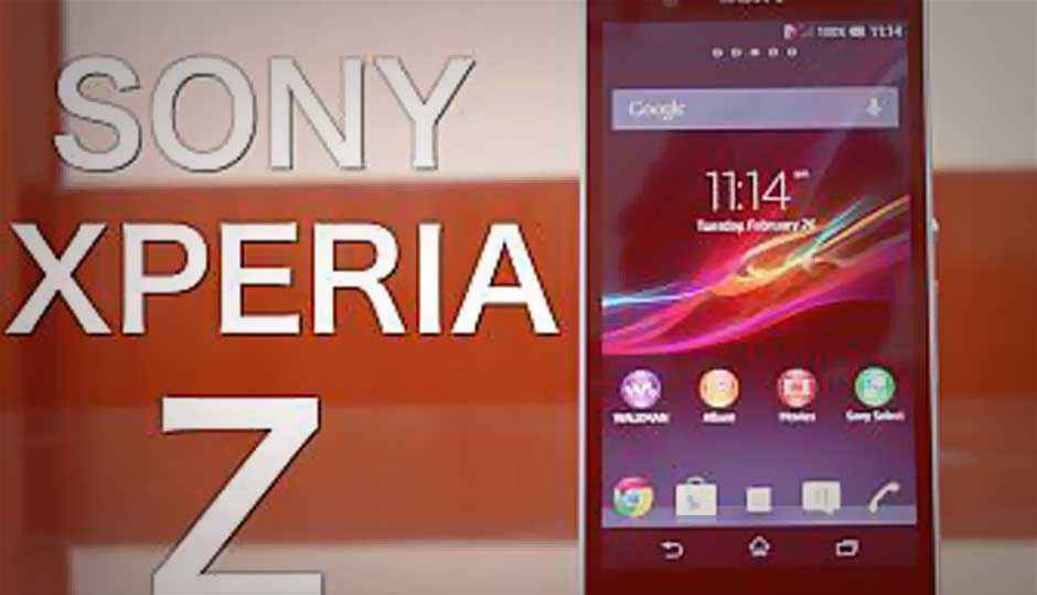
Sony Xperia Z: Video Review

If reading is not your thing, this quick video review of the Sony Xperia Z is quite possibly just what you need!
The Sony Xperia Z is the second Android phone in the Indian market with a 1080p HD resolution 5-inch screen, the first being the HTC Butterfly. We were very impressed by the Butterfly, and the test scores pegged it as the fastest Android phone in the market. So, it would be all but logical to expect the Xperia Z to do pretty much the same logging in the test scores, considering the spec sheet reads almost the same, for the most part.
Sony took time to warm up to the idea of quad-core processor powered smartphones, quoting power efficiency concerns at least for the first generation of devices. The Xperia Z has arrived with a 1.5GHz Qualcomm Snapdragon S4 Pro quad-core processor and 2GB of RAM to help it along. There is the Adreno 320 graphics chip on the chipset as well. Sony has packed in 16GB of internal storage, with a microSD slot for bumping that up by 64GB more. The phone comes with Android 4.1.2 on board, and Sony says that the 4.2 update will roll out soon.
The slab design of the Xperia Z catches the attention almost instantly. Gone are the rounded edges and the slightly curved back cover we had seen on various 2012 Xperia smartphones, in different degrees. This is more like a bar of milk chocolate! For a five inch phone, the edges and the straight lines give it an imposing persona. Having said this, we must warn you that this kind of a footprint may not be to everyone’s comfort of use, and liking. The claimed “shatter and scratch proof” glass on the back seems to be rather prone to scratches.
The 5-inch display on the Xperia Z is what Sony calls the “Reality Display”, and boasts of 443ppi. In comparison, the HTC Butterfly’s SLCD-3 display with the same resolution falls slightly short at 441ppi. Sony has implemented the automatic brightness setting in the Xperia Z, something that was missing in most of the high-end Xperia phones from last year. The Butterfly’s display however possibly still has an advantage is in terms of text crispness, and readability of the written word on the display.
The redesigned Sense UI (version 5) is rather neat though. The boxy design of the previous generation has given way to one that has rounded icons, at least for most of Sony’s own apps. A new range of wallpapers and themes is welcome, but the widget range still is not up to the variety offered by HTC with the Sense UI on the Butterfly. The swipe up to unlock gesture on the lock screen is reminiscent of running your fingers through a window blind! Quick access to the camera is provided from the lock screen, but it is a tad weird that most settings are unavailable in the camera in this mode.
We have heard a lot of hype about the Xperia Z’s 13.1MP camera. What we can say with certainty at the moment is this camera is a huge improvement over the 2012 range of Xperia phones. There is the usual bunch of options are present – image and video stabilization, panorama mode and HDR mode. Sony has added the Superior Auto mode, which is pretty much a slightly simpler version of the standard Auto mode. HDR is also available during video recording and panorama shots, with the results varying from shot to shot – brilliant to a tad unreal, depending on what we were trying to capture via the clicker.
You can see the Xperia Z in action in this quick video review that we have put together for you to check out. You can also check out the detailed text review of the Sony Xperia Z shortly on this website.

