Samsung Galaxy S8+ first impressions: This is the best Android has ever looked
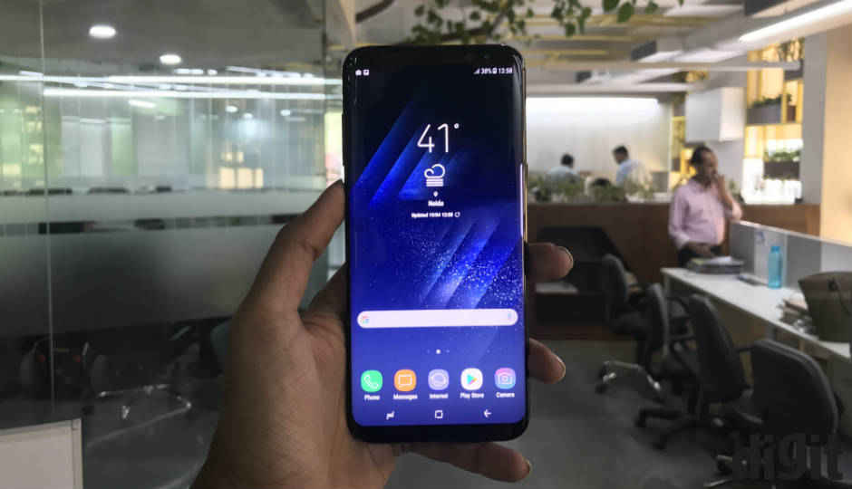
The Samsung Galaxy S8 and S8+ have stunning displays that take up almost the entirety of the real estate, along with presenting a number of well-optimised features.
The Samsung Galaxy S8 and S8+ are finally here, and are priced at Rs. 57,900 and Rs. 64,900. Not only have they been heavily anticipated by worldwide users and critics, even Samsung has a lot relying on the Galaxy S8’s shoulders. And, true to all the previous renders and photographs, Samsung’s new flagship smartphone is stunning to look at.
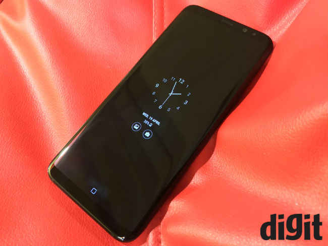
Focusing on the Galaxy S8+ here, the 6.2-inch display is flanked by sleek slices of glass to the top and bottom, set on a metal frame. With the Always On display glowing in darkness, the Galaxy S8+ looks like a vast expanse of glass floating in air. In terms of ergonomics, the Galaxy S8+ fits the large display with dual curved edges into a 5.5-inch smartphone frame. The photograph below will give you a fair idea of its dimensions.
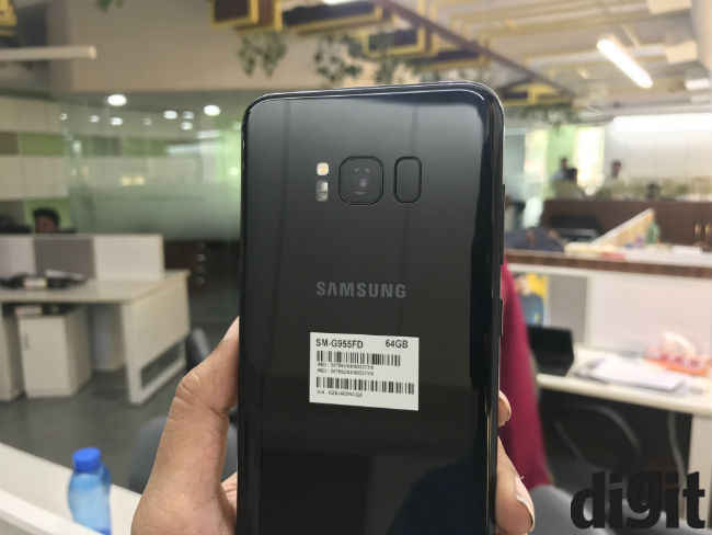
The rear of the smartphone looks a bit underwhelming, particularly considering how stunning the front of the phone looks like. It is certainly built well, but the rear panel looks exactly like how previous Samsung smartphones have looked like. The fingerprint sensor has been moved to the rear, just beside the primary camera lens. This is certainly an odd placement for the fingerprint sensor, and I often needed to look for the sensor or alternatively smudge the camera lens. Samsung’s own interface warns against smudging the lens because of the sensor’s placement – in Samsung Health, if you attempt to measure your heart rate or stress level. Surprisingly, the fingerprint failed to pick up my heart rate even once after multiple attempts, giving me prompts to place the finger in the middle of the sensor. The same problem persists with registering fingerprints, where you are repeatedly asked to place the finger in the middle of the sensor.
The placement, though, could not be helped. With a bleeding edge design that leaves no room for paraphernalia up front or at the edges, the only expanse left to Samsung is on the rear. In order to negate your reliance on the fingerprint sensor, the Galaxy S8+ (and S8) house iris recognition, which uses an infrared module to scan and authenticate irises even in pitch darkness. The iris recognition is fast and easy to set up, and is uber accurate – it can even recognise irises in pitch darkness in fractions of a second. It is this mode of biometric authentication that Samsung wants you to use, and only rely on fingerprints as a secondary authentication mode.
Coming back to the display, the 6.2-inch Infinity Display offer a rather tall aspect ratio of 18.5:9, and is set to Full HD+ (2220×1080 pixels) by default. You can downscale the effective resolution to HD+ (1480×720 pixels) or upscale to QHD+ (2960×1440 pixels), alongside adjusting the blue filter (to make the display warmer), or choose AMOLED viewing modes for more vivid colours. At its brightest, the Samsung Galaxy S8+ measures 750 lux on the luminance scale, which is a bit brighter than the Apple iPhone 7 Plus. Watching videos on this display is a treat, although colours do retain a slight sense of oversaturation. Being an AMOLED panel, the Samsung Galaxy S8+ does exhibit shifts in hues, and there is a very notable red tint when you tilt the display forward by about 45 degrees. This seems to be a widely acknowledged issue, and Samsung will hopefully address this in near future.
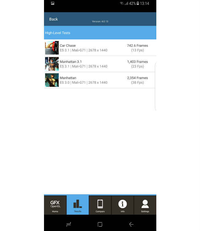
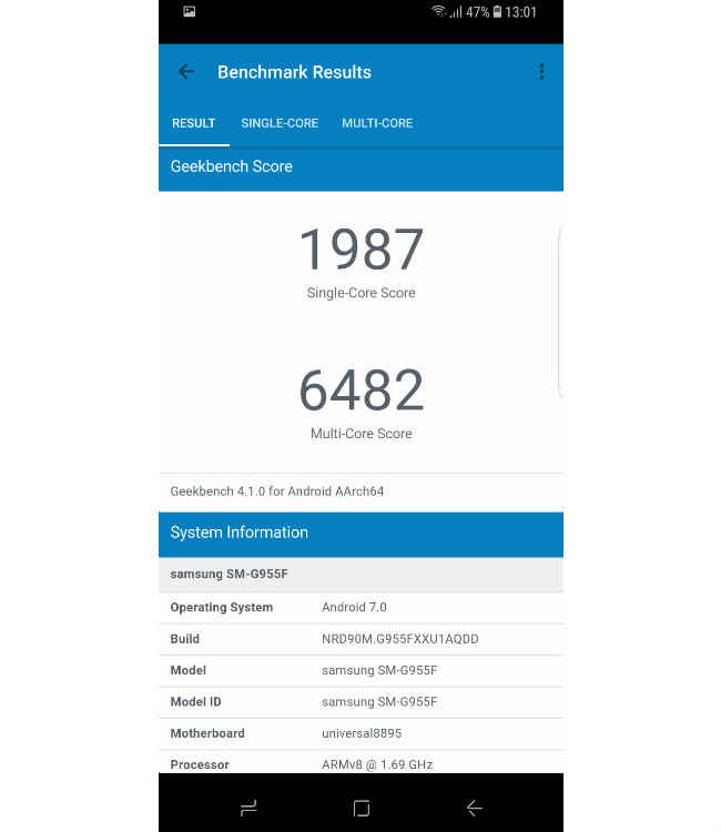
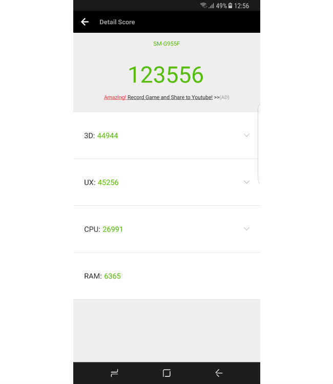
With 4GB of RAM on board and powered by the Exynos 9 processor, the Samsung Galaxy S8+ also seems quite fast. Although we are yet to tax the device heavily, most apps load smoothly, and the fast performance combines with the brilliant display to make content consumption a great experience on the smartphone. Some swipes, like opening Bixby, in-game menus of Asphalt 8 and opening the Facebook homepage still exhibit split-second delays, but for the most part, the Galaxy S8+ fares smoothly. Here’s how the benchmarks fare on the Samsung Galaxy S8+:
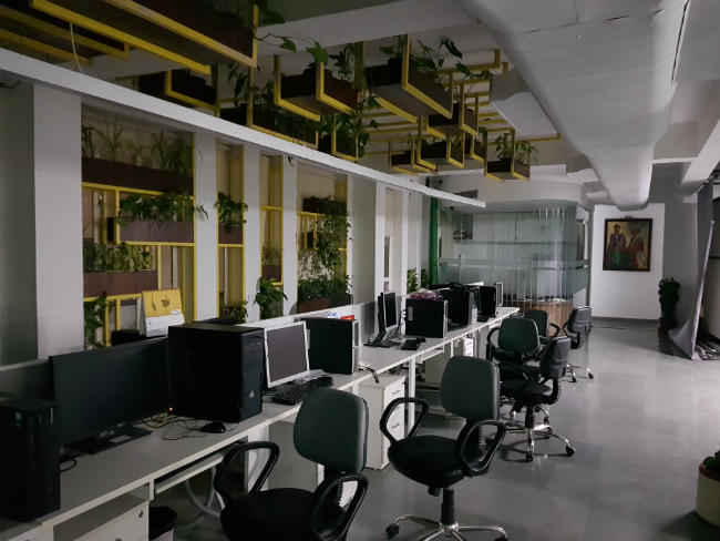
The 12MP Dual Pixel camera not shoots more balanced colours than the Galaxy S7 edge, alongside retaining decent details and superior low light photography. Paired with an f/1.7 lens, Samsung has abstained from software-induced background defocus or dual-camera structure, and you do not miss either of them. The f/1.7 lens does well to produce softer backgrounds when shooting macro, and coupled with decent white balance adjustment, colour accuracy and sharpness, the camera seems set to challenge for the best phone camera crown, yet again. The front camera also gets an f/1.7 lens with wide field of view. An upgrade to the front sensor sees the resolution being bumped up to 8 megapixels, and Samsung’s revamped camera app now hosts a large number of stickers and filters. This can be fun, at times, particularly for selfie aficionados.
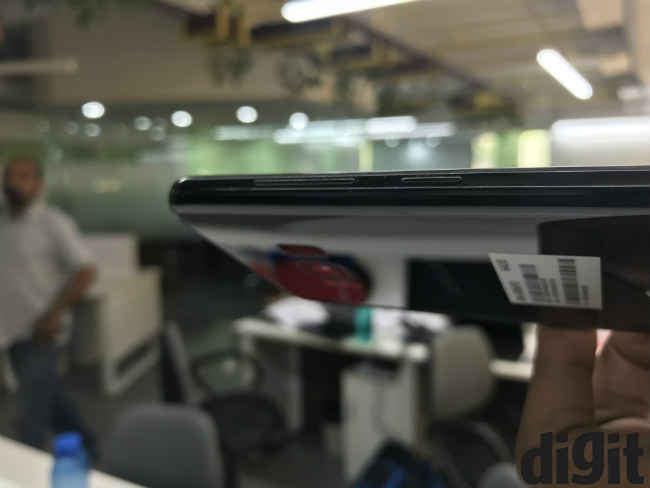
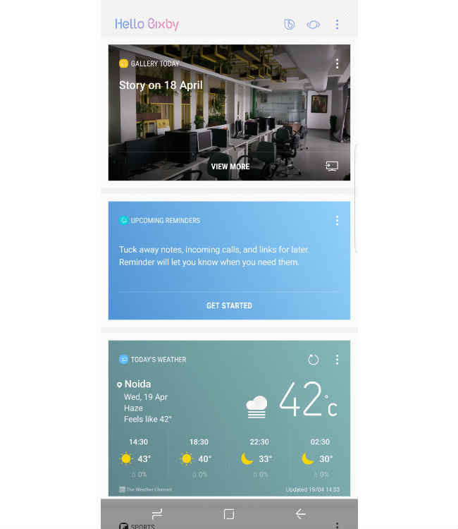
On to the next notable big feature – Bixby. Touted heavily since launch, the Bixby AI assistant replaces the news feed to the left. It also gets a dedicated physical button, on which you can double tap to activate Bixby. You get a card view here, which you can arrange by pinning the most important card to the top. That, though, is the only customisation you get, and the rest of the arrangement is contextual. For instance, Bixby’s present feed shows the recently shot image gallery at the top (that was the last action we performed on the phone), followed by weather and a news feed powered by Flipboard. Yesterday night, the same feed showed me reminders for today at the top, my activity stats for yesterday, and then the news feed with highlights of the day. Bixby can also be integrated with the camera to use it for image searches on Pinterest. For instance, you can point the camera at a dress that you just liked and tap on Bixby Vision, and Bixby will show you the closest matches on Pinterest. These matches have not been very consistent yet, but that also has a lot to do with Pinterest’s comparatively limited gallery. Samsung also states that it has tied up with Pinterest only “as of now”, so we remain hopeful that such integration will steadily improve in near future.
The 3500mAh battery on the Galaxy S8+ gets adaptive quick charging, taking up 30 minutes to charge up to 50 percent. It is certainly too early to comment on battery life right now, but the phone lasted from 4pm yesterday till 2am in the morning with active usage, lasted on idle for the entire night and spent an hour of web browsing in the morning before hitting the 5 percent battery mark (without any battery saver mode switched on). This equates to nearly 11 hours of usage time with 72 percent battery.
The Samsung Galaxy S8 and S8+, to sum up, is the best that Android has ever looked to date. The display up front is gorgeous, although it does have a few niggles in terms of hue shifts. The performance seems to be what you should expect from a flagship, and Samsung has also continued on a good note with the camera. Bixby will take some time of usage to produce refined results, and the battery life seems promising too.
The Galaxy S8 is all about majorly improving on the design and user experience front, and it does so in style. It is now time for its rivals to come up with an answer, and the task certainly seems uphill.
Buy Samsung Galaxy S8 from flipkart at Rs 57900.

