Samsung Galaxy S5: First impressions review

The next flagship device from Samsung, the Galaxy S5, has been officially announced in India and we take an in-depth look if Samsung has truly made it a flagship worthy smartphone
Samsung has made a huge impact on the smartphone industry but it seems that the numbers are slowly dwindling. The Galaxy S range of smartphones has been regarded as a benchmark for Android smartphones and now there is a new one. We first saw the Galaxy S5 at MWC in Barcelona and frankly we were a bit disappointed (again) as we didn’t see anything revolutionary. However, there is more than what meets the eye. We got our hands-on the smartphone and in our opinion the Galaxy S5 is mixed bag. Yes, it doesn’t offer a new design and looks quite similar to the S3 and the S4 but the smartphone has definitely been improved in terms of esthetics, build quality, UI, camera and overall performance
Build and design
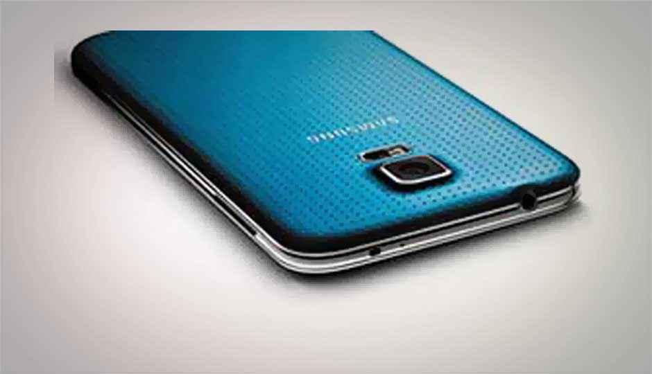
The Galaxy S5 doesn’t seem all that heavy for a 5 inch device. The back panel has a perforated design which gives a nice grip and feels much better than textured finish. The bezels are not too big, although the top and bottom could have been trimmed down a bit. The edges are primarily a metal frame which is now being adopted in almost all the high-end Galaxy devices including the Note series. If not the best, Samsung has done a decent job in the design department with the S5, but we agree to the fact that Samsung definitely needs to bring in a change in its design department as the current line is becoming dry.
TouchWiz UI
The other major improvement that Samsung needed was with its TouchWiz UI. With the 4.4.2 KitKat update, Samsung has made TouchWiz much more responsive, fluid, and better looking. The feature rich UI offers bold colours and they look vivid on the full HD AMOLED display. There have been a lot of changes in icons, menus and of course addition of some useful apps like S-Health, My Magazine and not to forget the support for Gear 2 wearable devices. Some of the icons have be changed into a round format which did look fresh and the setting menu has also been overhauled making it much more easy to access.
Heart-rate monitor and fingerprint scanner
The heart-rate monitor and the finger-print sensors are probably the newest and the most innovative features on the device. Both of the features work well and although the fingerprint scanner did give us a bit of an issue and wasn’t that quick as we have seen on the iPhone 5S. Both of these features sound and look interest and we believe that they could soon become standard features in upcoming smartphones.
In terms of performance we couldn’t judge how much power does the new Exynos chipset provide on the S5, but in the short time that we used the smartphone we didn’t notice any issues and multitasking was super smooth. Now we are not taking sides but we think the Galaxy S5 is a good upgrade from the S4. Expectations are always high when it comes to new upgrades, but after a point the evolution slows down. Hopefully in the coming years we will see some ground-breaking changes in the world of smartphones.
Take a look at the quick video of the Galaxy S5 from the launch event.
|
|
Read more about the Samsung Galaxy S5:
Android flagship battle: Samsung Galaxy S5 vs Sony Xperia Z2 and LG G Pro 2
Samsung Galaxy S5: The Good, The Bad and the Unknown
Samsung Galaxy S5 Camera: The Hots and the Nots
ADVT: Buy Galaxy S5 at TheElectronicStore & save 6% on M.R.P.

.jpg)
.jpg)
.jpg)
.jpg)
.jpg)
.jpg)