Realme 2 first impressions: One step back, two steps forward

In its second attempt at making a budget smartphone, Realme’s focus is on improving the user experience and I’m all for it.
The Realme 1 that launched earlier this year did something really interesting. It managed to bring hardware seen in more expensive phones down to the under-Rs 10,000 segment — Dual cameras, a funky glass design and 6GB of RAM along with a top-of-the-line MediaTek chipset. However, in a market as competitive as that of smartphones in India, the newly-created brand just couldn’t rest with launching just one device. Hence the Realme 2. Between the launch of the first Realme phone and this one, it seems a lot has changed. If the focus of Realme 1 was to bring a beefed up spec sheet to the budget segment, the Realme 2 takes a more reasonable approach with the intention to consolidate its position in the market.
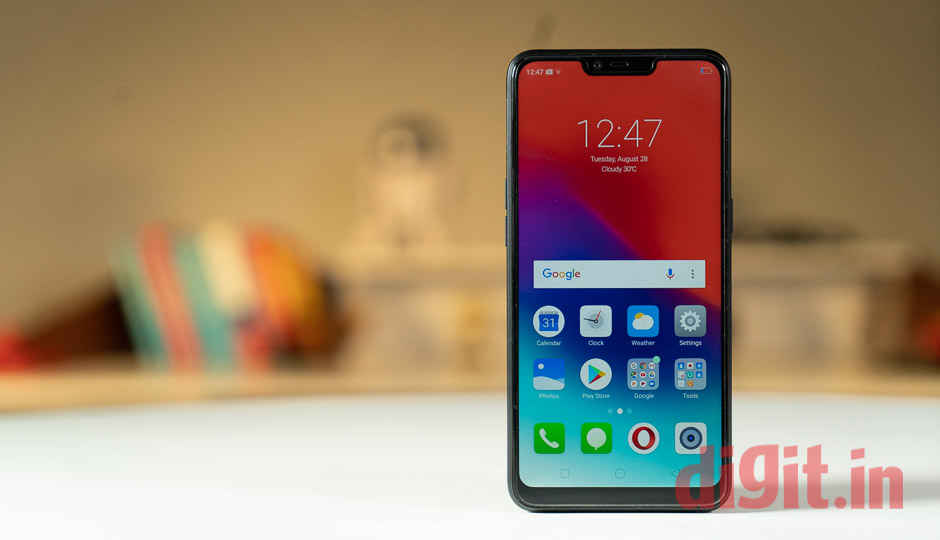
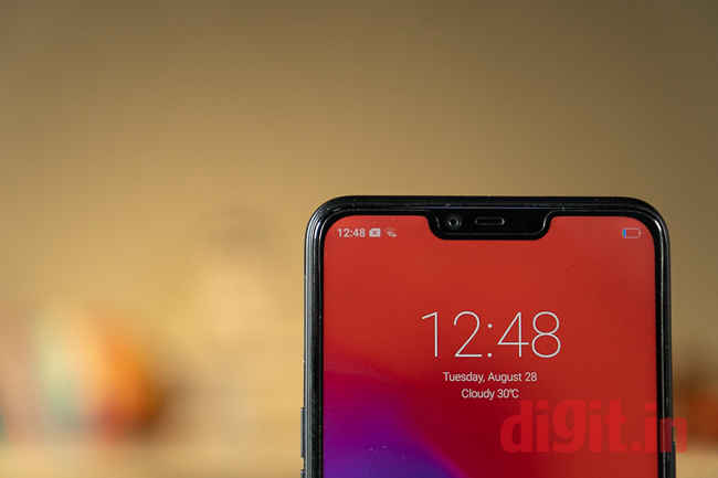
If the Realme 1 brought 6GB of RAM in the budget segment, the Realme 2 introduces the notch. The phone features a 6.2-inch display where the extra 0.2-inch is the notched area. It’s not as big as say the Poco F1, but isn’t as small as the Nokia 6.1 Plus either. Although, despite the notch, there’s significant bezels all around the phone. Seems like the decision to implement a notch was purely cosmetic in nature as it doesn’t have any usefulness whatsoever. You don’t get to use that extra real-estate for watching content anyway.
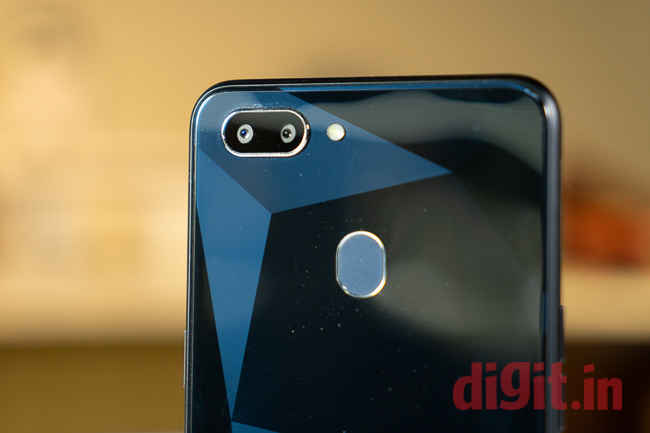
Apart from that, the design is more or less the same as its predecessor. There is now a fingerprint sensor placed at the back of the phone. It retains the diamond-cut glass design seen in its predecessor and now comes in diamond-red and diamond-blue variants apart from the black one we’ve seen before. It’s fairly thick and hefty as well thanks to the large 4,230mAh battery it packs inside.
The Realme 2 also introduces a dual camera unit at the back. While the company was confident with their single-camera approach for the Realme 1, it seems something has changed. The 13+2MP dual camera is now used to deliver portrait shots as the secondary sensor doubles up as the depth sensor. It has the same camera app seen in Oppo phones. In fact, it has the same AI Beautification algorithms from Oppo phones as well. Up front is a 8MP shooter that allows AR stickers, HDR portrait shots and AI-edited selfies.
The hardware powering the Realme 2 seems like a downgrade from last time. While the Realme 1 was powered by the Helio P60 SoC which is MediaTek’s most powerful offering, the Realme 2 relies on a Snapdragon 450 SoC for performance. It loses that exclusivity that the Helio P60 brought in the budget segment as the Redmi 5 and the Honor 7C are also powered by the same Snapdragon processor. Furthermore, the Realme 2 will only be offered in 3GB and 4GB RAM variants. No 6GB RAM this time. The storage remains the same at 32GB/64GB. A dedicated microSD card is present that can expand the storage by up to 256GB.
While the hardware seems to be a bit underwhelming, Realme 2 has some new software features that make it interesting. It is powered by ColorOS 5.1 which is also used in other Oppo phones. The new version of the UI cleans it up by removing the cartoonish icons. It feels much smoother than before. The Settings menu will tell you there are tons of features to explore. What particularly caught my eye are the anti-harassment features that not only includes call-blocking but also as Fake Base Station blocking, a dedicated Kids Space and Payment Protection. There’s an option to turn on Floating Windows (which also allows pop-up ads!!!) and a couple of other nifty security-centric features. Realme also offers multiple ways to use gesture navigations along with the option to unlock your phone using your face. There are a lot more which I’m exploring and will talk about in the review scheduled for later this week.
Overall, the Realme 2 seems like a step back when you compare it against its predecessor on paper. But spec-sheet doesn’t give the full picture anymore. The three new things — Dual cameras, fingerprint sensor, and a better UI will count a lot more than just a beefed-up spec-sheet. In its second attempt at making a budget smartphone, Realme’s focus is on improving the user experience and I’m all for it.


