Nothing OS 3.0 Beta: A Bold New Direction
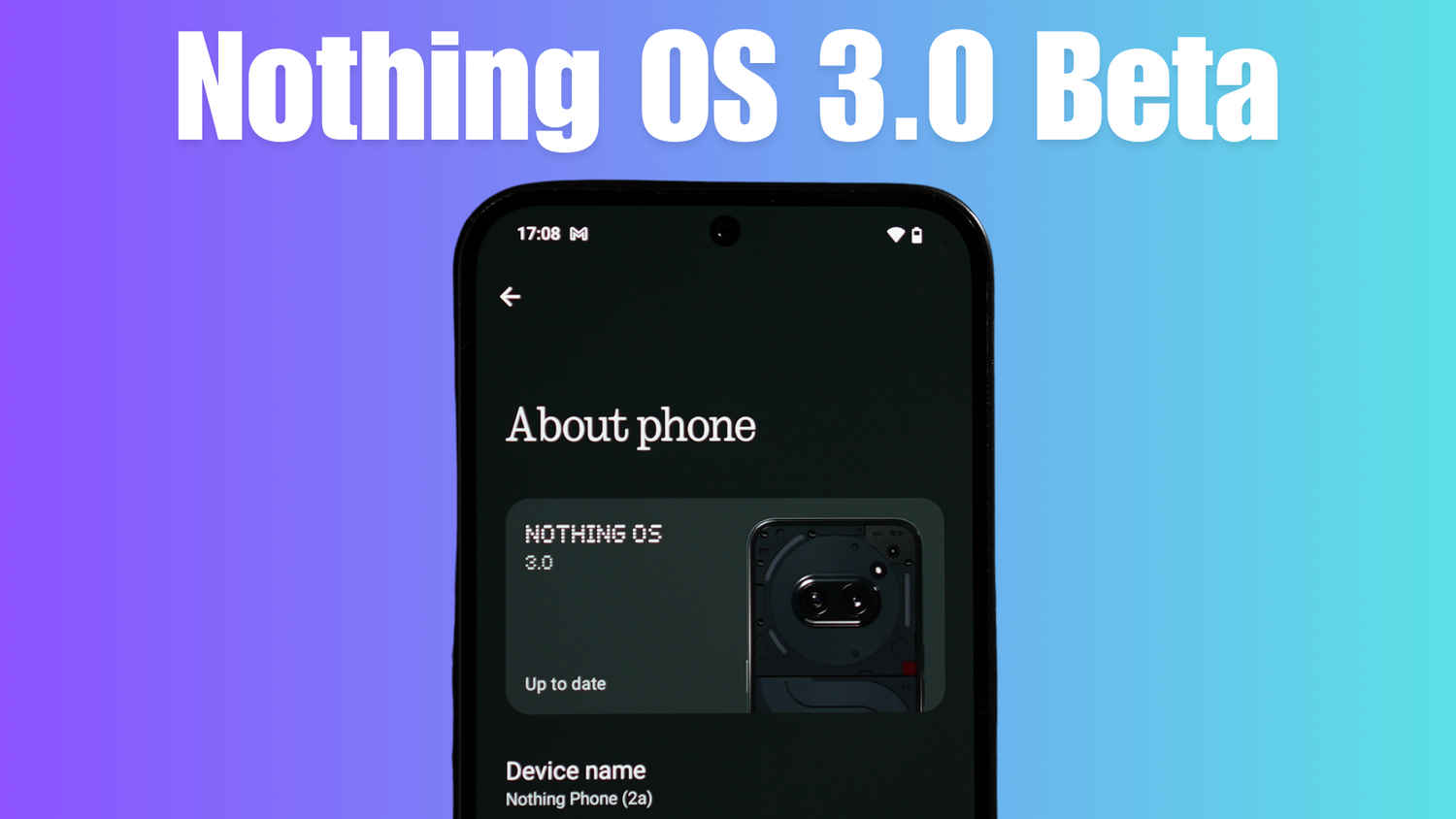
In a world of monotonous Android updates, Nothing has decided to break the mold. Enter Nothing OS 3.0 Beta—a refreshing upgrade exclusive to the Nothing Phone 2a, and it’s turning heads. Despite being based on Android 15, which itself hasn’t brought any revolutionary changes, Nothing OS 3.0 is anything but ordinary. With significant design overhauls, camera improvements, and a new lock screen customisation experience, it’s an exciting step forward. Let’s dive into the best features of this beta release.
 Survey
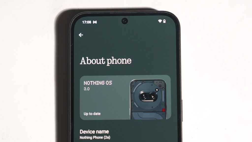
How to Install Nothing OS 3.0 Beta
First things first: how do you get this update? The Nothing OS 3.0 Beta is currently only available for the popular Nothing Phone 2a. Here’s a quick guide on how to install it.
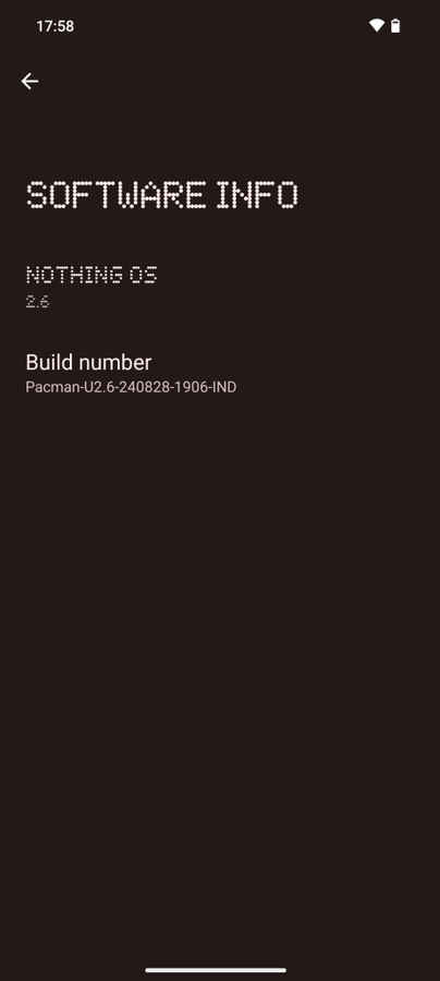
Ensure your phone is running Nothing OS 2.6 with the correct build number (shown in the image above). Then, download the APK from the Nothing Community page. After installing the APK, navigate to Settings > System > Update to Beta Version, tap on ‘Check for new version,’ and voilà! The Nothing OS 3.0 Beta download will be waiting for you. Simple, right? Now, let’s get to the fun stuff—what’s new in Nothing OS 3.0.
Nothing OS 3.0: Redesigned Quick Settings
One of the most noticeable upgrades in Nothing OS 3.0 is the revamped Quick Settings. The brightness slider now sits lower on the screen, making it more accessible, and there’s a handy Auto Brightness button for quick adjustments.
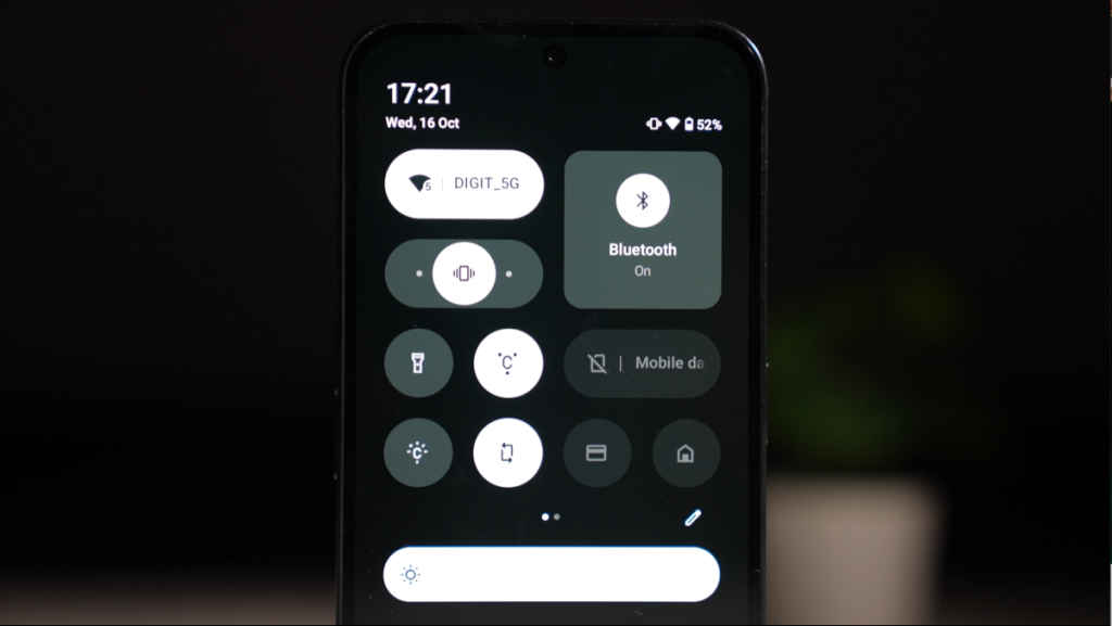
The tiles themselves have undergone a facelift—you can resize them to your liking, although, oddly enough, you’ll need to manually fill the gaps left by resizing. The new ringer tile is another welcome addition, giving you quicker control over your device’s sound settings. While some adjustments could be smoother, this update brings a fresh, more customisable feel to the interface.
Nothing OS 3.0: App Drawer Overhaul
Nothing OS 3.0 makes navigating your apps easier and more aesthetic. With the ability to pin unlimited apps to the top of your app drawer, you can now quickly access your favourites. This is especially useful if you’re using the sleek Nothing Icon Pack, which can sometimes get confusing to use with its monochrome look.
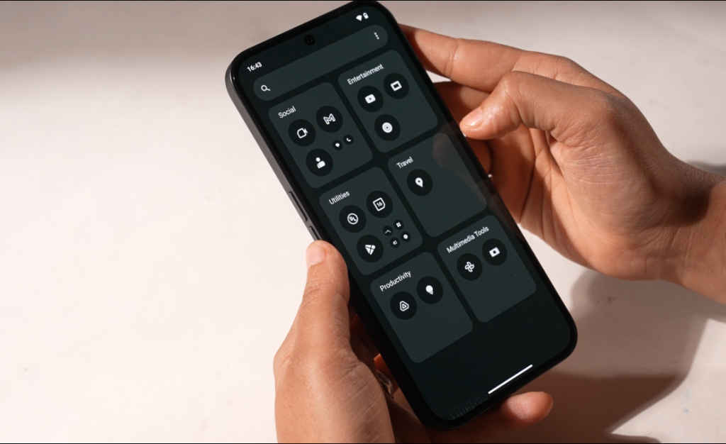
For those who like a more organised look, the Smart App Drawer List automatically categorises your apps into folders, much like iOS. While this feature might not be for everyone, it’s a helpful tool for users looking to declutter their home screens.
Nothing OS 3.0: Faster HDR and Portrait Processing
Photographers, rejoice! The Nothing OS 3.0 Beta improves HDR photo processing times, meaning you’ll get your final image much faster after snapping a shot. Portrait mode has also seen a boost, with the software now processing the blur effect based on the subject’s face size—giving your photos a more professional look.
The camera app itself launches quicker, though it still suffers from occasional hiccups. Additionally, the new zoom slider design is sleek, and while Nothing claims that low-light photography has improved, we’re eager to test this further in a long-term camera review. Stay tuned!
Nothing OS 3.0: Lock screen Customisation and New Widget Page
Customization is a key theme in Nothing OS 3.0, and the lock screen is no exception. A simple long-press on the lock screen allows for direct customization, making it easier to tweak your phone’s aesthetic. New clock styles have been added, though not all of them are perfect—the Dot Matrix style, for example, can be hard to read.
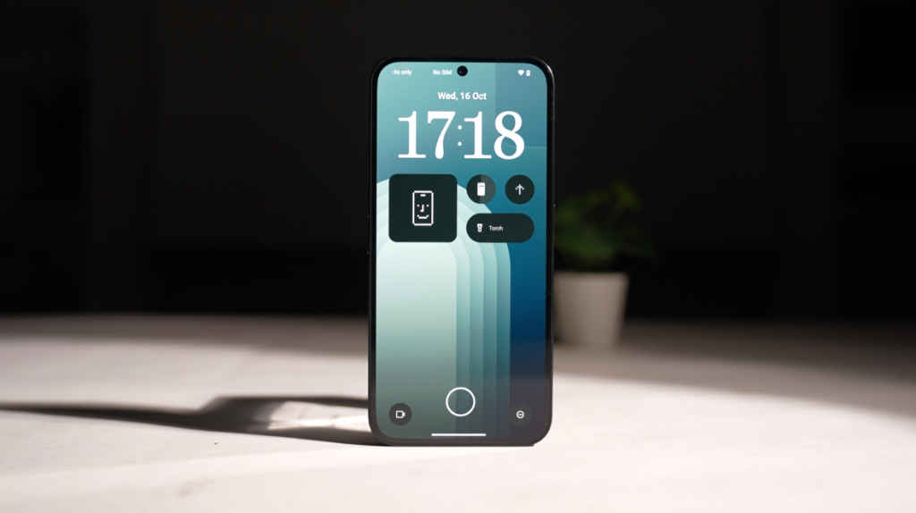
You can also adjust your widgets or expand the widget area for more functionality, although this means sacrificing your clock display. Despite a few quirks, the lock screen’s enhanced flexibility is a welcome change.
The new widget page also looks fantastic, with larger icons giving it a cleaner, more modern feel. We love it!
Miscellaneous Features
Beyond the big changes, Nothing OS 3.0 introduces some minor tweaks that enhance the overall experience. The signature Dot Matrix font has been removed from most areas in favour of a cleaner Sans Serif look, although it still pops up in animations like the fingerprint scanner.
There’s also a movable pop-up window that can be pinned to the side of your screen—though it’s a bit buggy at the moment, which is understandable in a beta version. Other useful additions include Partial Screen Sharing, Smart Cleanup in Storage, and a Charging Assistant that informs you when your phone is slow charging.
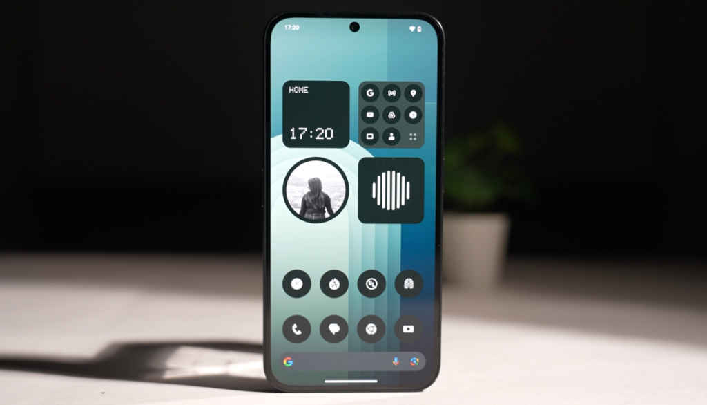
One standout feature is the new Nothing News Reporter widget, which reads out the latest news based on your selected preferences. It’s small touches like these that make this update feel polished and forward-thinking.
Upcoming Features to Watch Out For
Not all features are live just yet in the beta, but there are some exciting updates on the horizon. The charging animation and weather app will both adopt the Dot Matrix design, maintaining Nothing’s unique branding. The much-anticipated Nothing Gallery App will bring AI-based suggestions for your photos, and a Countdown widget will let you keep track of important dates.
Perhaps the most intriguing upcoming feature is Shared Widgets, which allow you to share widgets with friends or family who also use Nothing phones. They can react to these widgets with stickers, making it a fun, collaborative experience.
A Refreshing Update
Nothing OS 3.0 Beta is a breath of fresh air in the often dull world of Android updates. With its revamped interface, improved camera functionality, and exciting upcoming features, it’s clear that Nothing is carving out a distinct identity in the Android ecosystem.
What do you think of the new Nothing OS 3.0 Beta? Is it a game-changer, or do you think other OSes are still leading the pack? Let us know in the comments, and if there’s anything specific you’d like to see in a follow-up review, drop a suggestion!
Dhriti Datta
Perpetually sporting a death stare, this one can be seen tinkering around with her smartphone which she holds more dear than life itself and stuffing her face with copious amounts of bacon. View Full Profile