HIGHLIGHTS
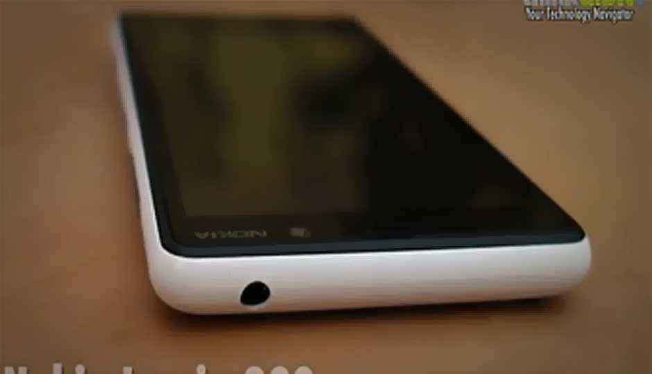
We put all new phones through their paces for our final reviews, and the Nokia Lumia 820 was no different. While we finish, we have a video review for you to check out, with our initial thoughts.


Somewhere between the excitement of the Lumia 920 and the potential of the Lumia 620, the Lumia 820 got lost in the noise. We believe it is a very competent smartphone, particularly if that is what the outer limit of the budget is, and Windows Phone 8 is all you want. We quite like the build quality of the 820, but that comes with the rider – it is slightly on the heavier side. I personally do not like the back cover opening mechanism. In trying to give it a fake unibody look, Nokia completely forgot the basics of designing the cover opening mechanism. You need to wedge a nail between the display and the panel on one of the spines, and hope it opens without breaking either the fingernail or the panel itself.
 Survey
The display quality on the 4.3-inch real estate is very good, which is surprising, considering most of us turned up our noses when the 480×800 pixel resolution was revealed. Text is amazingly clear to read, and at full brightness, can still get through all the reflections you might face outdoors. Very good black depth makes all other colours look better than they have done on most of the rival smartphones’ displays.
The Lumia 820 is powered by a dual core 1.5GHz processor and 1GB of RAM. There is 8GB internal storage and a microSD slot for storage space expansion. At the price of around Rs. 26,000 in the markets, this is competing with fairly competent devices. Would you buy one? You may want to wait for our detailed review of the Lumia 820 before deciding, but here is a quick video review to get an idea of what the product is all about.