Motorola Xoom: hands-on with Android Honeycomb’s platform lead device

Finally, the much-awaited Motorola Xoom has arrived in our test centre. The tablet does come with a certain bit of history with it – being the platform lead device with Android 3.0 Honeycomb when it was launched earlier this year, and later becoming the first device to receive the Android 3.1 update as well. The Xoom is one of the most important warriors from the Android stable in the battle against the
Before we do a detailed review, here are our quick first impressions, if you may, of the Xoom:
The Xoom comes in a package that is bound to remind you about a scarlet Ferrari sooner rather than later! Solid packaging though! The box includes the Xoom tablet, wall charger, USB cable and the usual gamut of printed stuff- product manual, safety guide etc. Interestingly, the charger that Motorola have packed in with the Xoom is pretty similar to the one we get with most netbooks – not very portable then, eh?
[RELATED_ARTICLE]
Emerging from good-looking packaging, all 10.1-inches of the Xoom is dressed in glossy black and classily bordered by silver. The silver has a matte finish, but the blacks around the tablet are extremely susceptible to fingerprints, smudges and scratches.
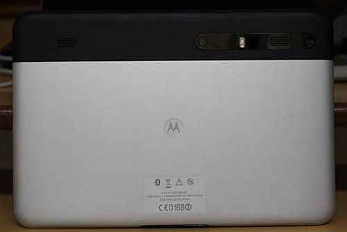
Power isn’t where you would expect to find it! The power key, usually on the top or side panel of smartphones and tablets, isn’t there in the Xoom. Turn the tablet over and near the top right of the rear panel is the power button. It is accompanied by the 5MP camera, the LED flash and one of the two speakers. The rear panel is mostly silver, with a strip of black towards the top.
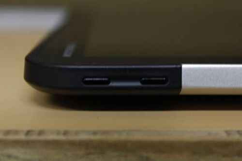
We had heard a lot about the volume keys and their design as being too depressed. Well, while they are well hidden away and don’t protrude out all the time, they aren’t uncomfortable to use.
If the Xoom is in landscape mode, and when the Motorola logo is on the top, you will access a multitude of connectivity ports on the bottom panel. There is a proprietary charging port, one for HDMI out and one for USB connectivity. The top panel has the 3.5mm audio jack and the SIM card slot.
Android Honeycomb's completely redesigned interface looks brilliant, and as always, the UI differences from Gingerbread are well-adapted to the tablet form factor — we aren’t surprised one bit that Google had told tablet makers to not use any of their own UI skins. The new interface looked even better on the 10.1-inch display.
We will do a detailed test of this and report back with our findings, but on first impression, we realized that the display is extremely glossy. No matter how hard he tried, our photographer just couldn’t hide his reflection! The reflective nature of the display may just make it uncomfortable for use in brightly lit environments.
Stay tuned for our detailed review of the Motorola Xoom.
Also read,
- Motorola Xoom vs. Samsung Galaxy Tab 10.1, pick your Android Honeycomb Tablet
- Motorola Xoom tablet arrives in India, starting from Rs. 32,990

.jpg)
.jpg)
.jpg)
.jpg)


.jpg)
.jpg)
.jpg)


