Hands on with the Nexus 5: A lighter, slimmer Nexus phone

We take a look at the design changes and upgrades that Nexus 5 brings to the table and compare it to its predecessor, the Nexus 4
The Nexus 5 is in the house and boy-o-boy are we excited to use it! Most of the excitement however fizzled out in the first 10 minutes when it came to the looks! The Nexus 5 lacks the jazzy design and the curved display the Nexus 4 brought to the phone. Google and LG have played it safe with the design and build of the Nexus 5. Here is a breakdown of everything the smartphone has to offer in terms of its design. To put things into perspective, we will compare the Nexus 5 with its predecessor, the Nexus 4.
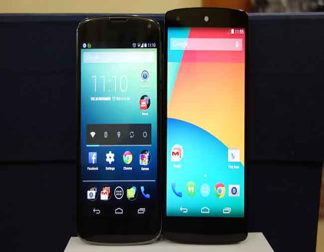
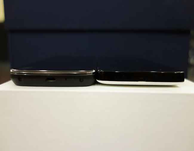
Let's get some of the basics out of the way. The Nexus 5 is 8.6mm in thickness, weighs 130 grams and has a 5-inch display. The Nexus 4 is 9.1mm in thickness, weighs 139 grams and has a 4.7-inch display. On paper it’s slimmer and lighter than its predecessor but when it comes to real world usage, both of them feel slim and light.
 |
 |
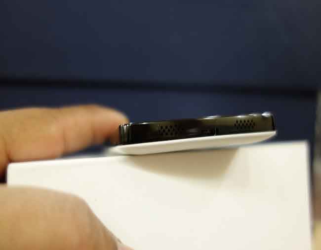
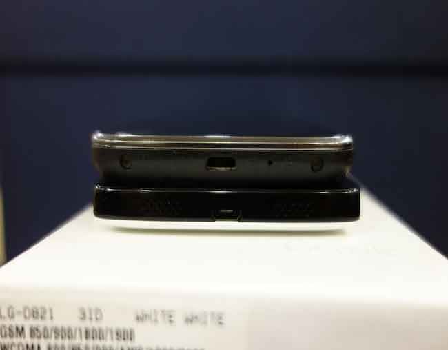
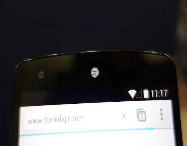
Coming to the design, the Nexus 5 has played it very safe. It has a standard candy bar form factor and really has no design elements to distinguish it from the crowd. The display, unlike the Nexus 4, isn’t curved around the sides. Above the display you have the prominent white earpiece and the front facing camera. The left has the volume rocker and the right has the power button. The top has the headphones jack and the bottom has the microUSB port. One design element of the Nexus 5 that we really like, and we think LG got the idea from the iPhone 5’s design, is that the bottom of the smartphone has stereo speakers on either side of the microUSB port. The Nexus 4 had the loud speaker at the back and this muffled the audio when the smartphone was kept on a table.
Check out our video review of the Nexus 5 in the video below.
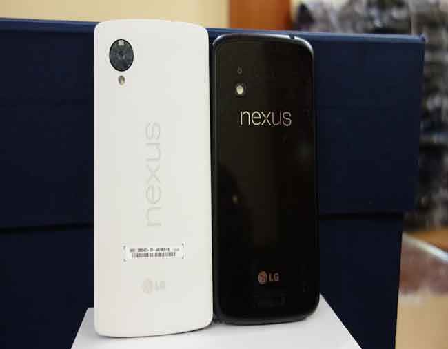
Moving to the back, this is where we think the smartphone is disappointing. When Samsung made the Galaxy Nexus, they gave the smartphone a teardrop design, which looked breathtaking. The Nexus 4 had the textured back with a glass panel, which definitely turned heads when the smartphone was placed on a table in a coffee shop. The down side to the Nexus 4 was that the back of the smartphone could break in a single drop.
 |
 |
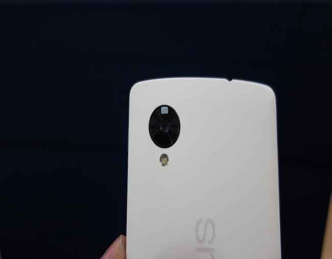
The back of the Nexus 5 has a rubberized finish with “Nexus” written horizontally (when held in landscape mode), just like we have seen on the Nexus 7 2013. The device comes in black or white and the review unit we received is the white one. It’s very plain, simple and carries an understated look, a very different approach compared to the Nexus 4. We got mixed reactions about the looks and build, while some termed its subtlety as 'class', others were disappointed by the lack of its visual flair.
Coming to the utility of the device, it is extremely comfortable to hold and use. We have seen the LG G2 in the past that has a 5.2-inch display but it doesn’t feel like you are holding a smartphone with such a huge display. Similarly, despite having a 5-inch display, I found the Nexus 5 to be ergonomically well built and comfortable to use.
 |
 |
Overall, Google has played it safe this time around. The build of the smartphone is sturdy but the design is boring. It’s comfortable to hold and use but wont turn heads in a crowd. Stay tuned, as we will bring you our in-depth review of the smartphone soon.
 |
 |
Sameer Mitha
Sameer Mitha lives for gaming and technology is his muse. When he isn’t busy playing with gadgets or video games he delves into the world of fantasy novels. View Full Profile


