Five iOS 14 features inspired by Android.
iOS14 will be available later this year.
iOS14 Public Beta to be available in July
iOS14 will be compatible with iPhone 6s and newer
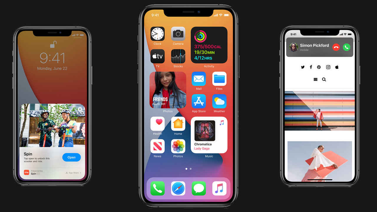
We all saw the announcements Apple made at its annual World Wide Developer Conference and while the news of Apple moving to its own silicon for Macs was the main highlight, we also got a glimpse of what’s in store for iPhone users. Craig Federighi, Senior Vice President of Software Engineering at Apple showcased some of the features that will be a part of iOS 14, launching this fall. However, as the presentation went on, there was an air of familiarity with many of the features. Here’s a list of the popular features coming to iOS 14 that seem to have been directly inspired by Android.
 Survey
Widgets
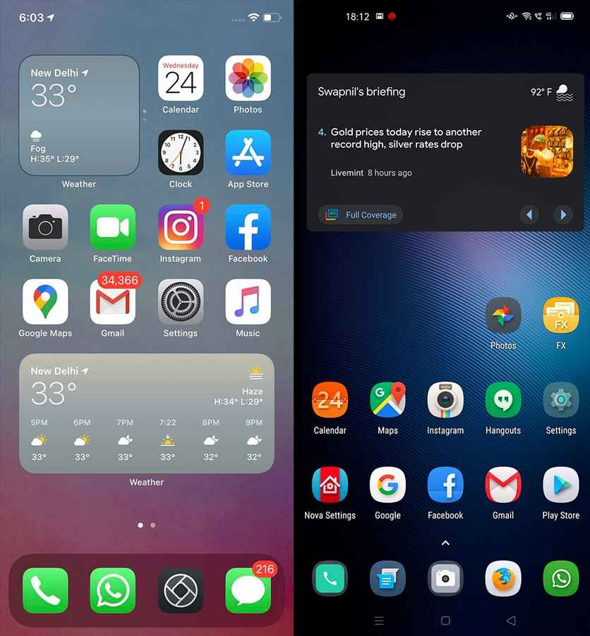
Widgets have been an integral part of Android since the operating system’s very inception. People have wanted widgets on iOS for the longest time so much so that there’s a massive thriving library of widgets available in the Jailbreak scene. It has taken Apple nearly a decade to bring widgets to iOS, and as of now, these widgets only correspond to stock apps. Also, unlike the widgets of Android, iOS widgets are still restricted in their shape and size but do allow you to stack one on top of the other for a more space-conscious layout.
App Gallery
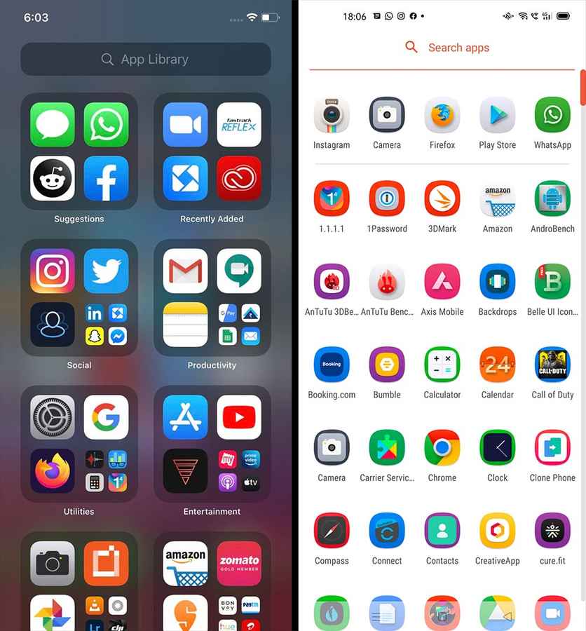
One of the biggest niggles of iOS has been that all the apps you download get populated on the home screen. The lack of an app drawer has often been the stuff of nightmares for some of us who are obsessed with the idea of minimalism. Finally, we get App Gallery, Apple’s version of the “app drawer” from Android. App Gallery consolidates all your apps into various folders based on the genre of the app. In the app gallery view, you can even access a list of all the apps listed in alphabetical order for convenience.
Call UI
One of the most absurd UI elements of iOS has been the overly intrusive call screen. If you got a phone call, regardless of what you’re doing, the call screen would take over the phone, unless you rejected the call or accepted it. This also meant that if you wanted to ignore someone, you just had to let the phone ring itself out, making the thing unusable for the next 30 seconds or so. Thankfully, iOS 14 will borrow Android’s minimal “incoming call UI” in the form of a simple, narrow bar at the top with controls to accept or reject calls. The best part, you can continue doing whatever it is you were doing.
Picture-in-Picture
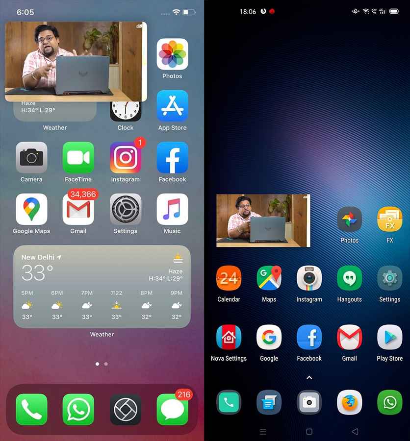
During the WWDC 2020 keynote, Apple announced that iOS 14 would also bring picture-in-picture to smartphones. The video windows can be moved around the entire UI. The video window will remain persistent while letting you run any other app or even navigate the home screen. Android got this feature with Android Oreo back in 2017 and iOS users get to enjoy it later this year.
Siri’s minimal UI
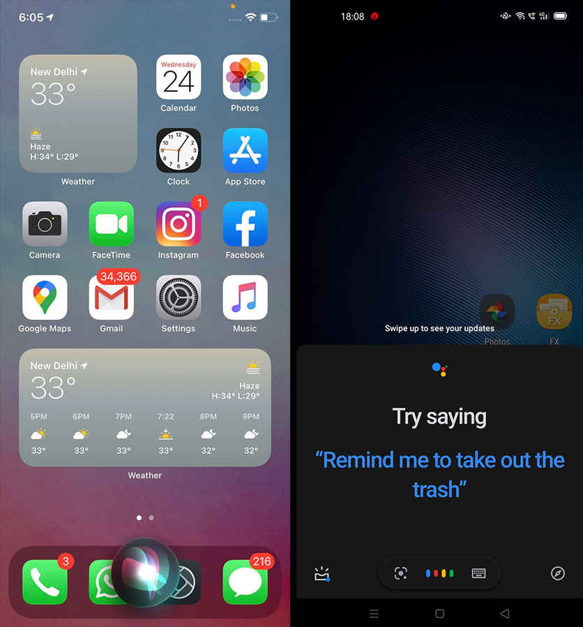
Just like the call interface soon iOS 13 (and before), invoking Siri would mean the digital assistant taking over the entire screen. Google Assistant ditched this behaviour in favour of a very minimal screen overlay a couple of years ago and now, Apple has recognized the benefits of doing so. At WWDC 2020, Apple announced a number of changes and improvements to Siri, one of which was that it would no longer take over the entire screen, but would instead just be a small, translucent overlay.
For the last few years, every time Apple has shown off new features that would be a part o the next iOS update, there have been memes and jokes about how Cupertino continues to borrow from not just Android, but even Windows Phone for that matter. However, another way of looking at it is that Apple has not shied away from introducing features into iOS that users have expressed a desire for. The company is known for hardly ever being the first to bring new features to the market, but instead, sets the bar for how things should be implemented when it does. iOS 14 is going to be available to the public later this year when the company launches its next iPhone, while the public beta is expected to be available in July.
Swapnil Mathur
Swapnil was Digit's resident camera nerd, (un)official product photographer and the Reviews Editor. Swapnil has moved-on to newer challenges. For any communication related to his stories, please mail us using the email id given here. View Full Profile
