First Impressions: Sony Xperia Tipo
By
Vishal Mathur |
Updated on 08-Feb-2018
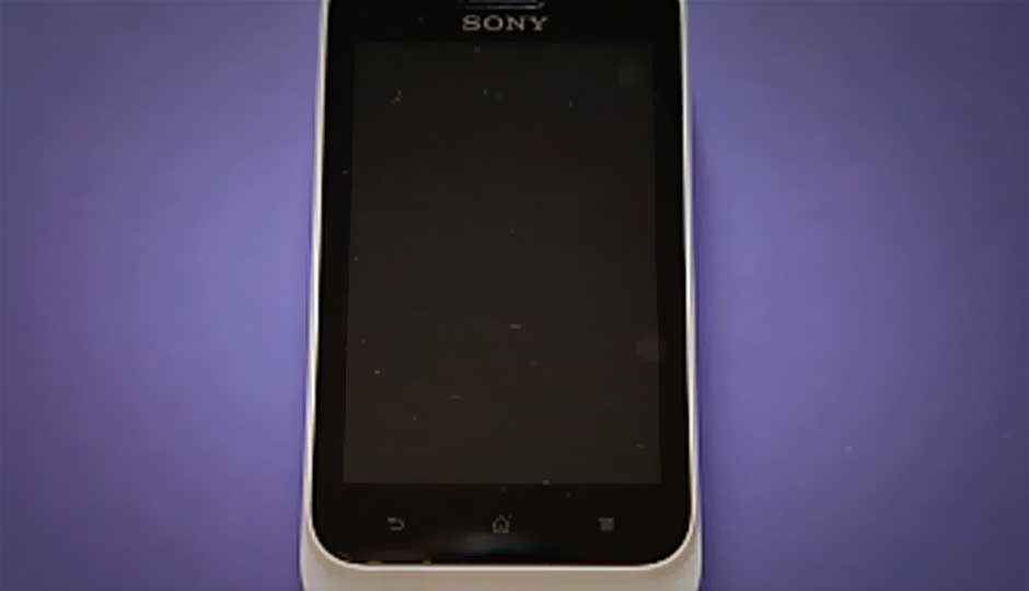
The Xperia Tipo is the first Xperia smartphone to be launched in the entry-level category.
 Survey
✅ Thank you for completing the survey!
The Xperia Tipo is retailing now in stores for around Rs. 9,449, and is aimed at the young demographic, with the majority buyers getting their first smartphone experience.
Here are some initial impressions of the phone, and we must say, we are quite impressed with what we have seen.
- The Xperia Tipo is available in two versions – single SIM and dual-SIM. There is approximately Rs. 1,000 price difference between the two versions, with the dual SIM one being more expensive.
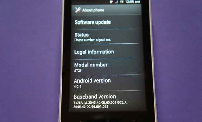
- Both phones come with Android 4.0.4 preloaded. Not many phones in this price bracket offer that.
- There is a single-core 800MHz Qualcomm Snapdragon processor powering the Xperia Tipo. From what we experienced, this phone's UI is slightly slicker than the Samsung Galaxy Y – that has an 832MHz processor but comes with Android 2.3 out of the box.
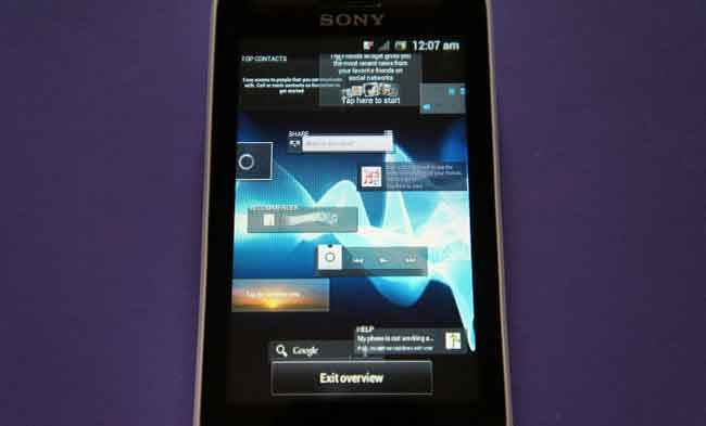
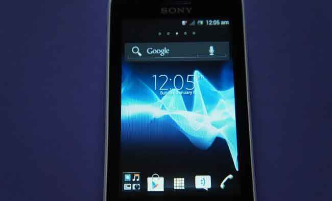
- The Timescape UI is exactly the same as what we saw on the much more expensive Xperia Ion recently, albeit this is fit into a smaller display size. The range of widgets is impressive, but still doesn’t match the variety that HTC throws along with the Sense UI. The most important part is that it seems very well optimized with the hardware and the slickness while using it is a testament to that fact.
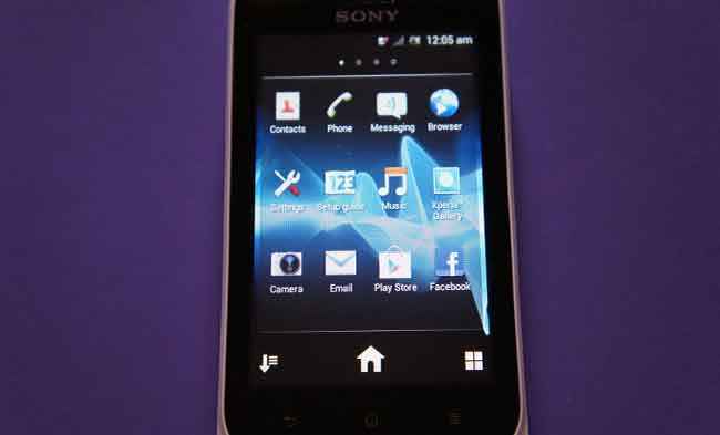
- The 3.2-inch display does give the phone rather compact dimensions. The quality of the display is satisfactory. Quite bright, and colour depth is adequate. The crispness is slightly off, and certain smaller text (like app names) can seem a little off.
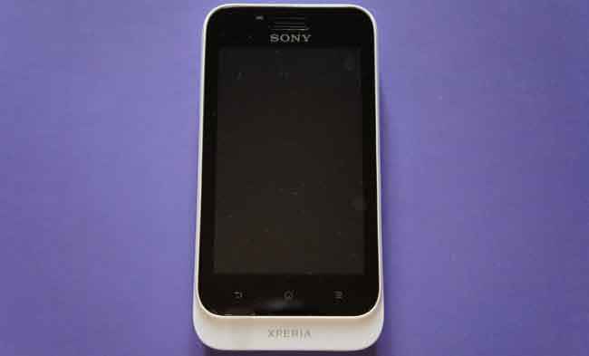
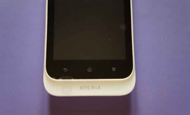
- The build quality is much better than expected. On the front are three touch sensitive keys below the display, and below it starts the colour line. The front and part of the sides have the enamel finish, while the battery cover has a plain matte finish. This isn’t the slimmest phone around, but even with the battery inserted, feels very light.
We will run this phone through the regular benchmarks and test processes, and will have a detailed review of this phone very soon.
In the meantime, you can check out some images of the Xperia Tipo.
Very elegant design, which looks sporty while being minimalist. There are four colour options to choose from, white, red, blue and black.
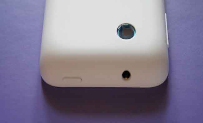
Top down, rear side. You see the camera and the 3.5mm jack.
Three touch sensitive keys below the display.
The widgets across all screens.
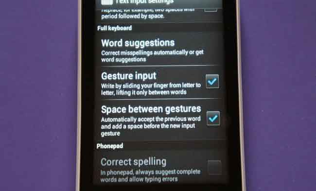
The swipe to type feature is carried down from the more expensive phones, and that is a real value addition for someone who will text a lot.
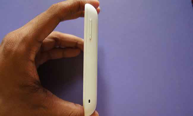
The right spine with the volume rocker. They have the same colour as the rst of the battery cover.
The micro USB port on the left spine. Notice the curve on the top and the bottom, We feel this lends it a more sporty look.
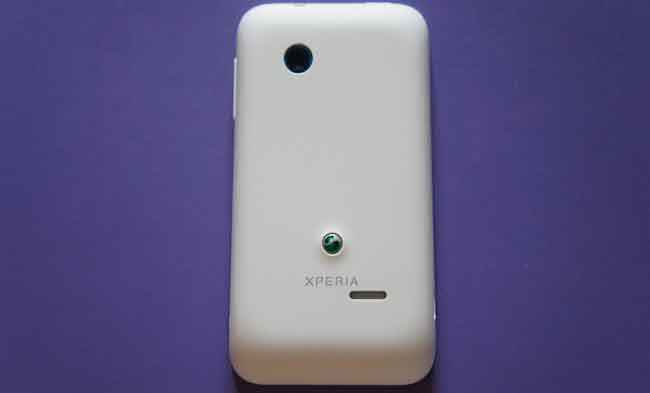
The battery cover has a plain matte finish. The opening mechanism is not the most elegant one, prise out with nails!.
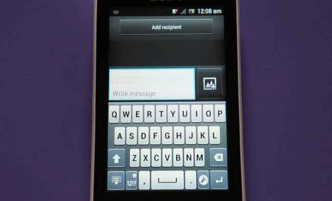
Surprisingly, the on-screen keypad is a delight to use. It isn't cramped, as most are on small displays.
Smaller text, like the app labels do seem have lost out on the crispness though.
No Mobile Bravia engine, as seen on the more expensive siblings.
Comes with Android ICS out of the box. Did someone just say Jelly Bean_ Expecting too much, eh!.
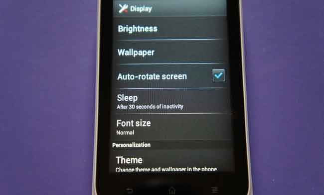
Basic specs for the display, but does well in terms of brightness and colour depth..
