First Impressions: Sony Xperia Ion
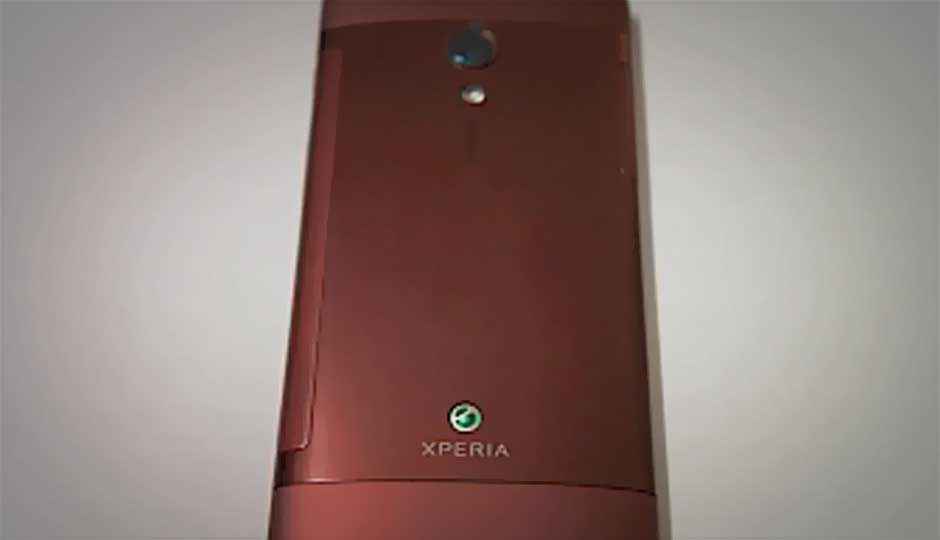
Sony’s latest flagship phone has arrived in India, and bang on schedule, it was in our test labs!
 Survey
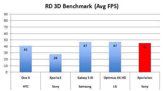
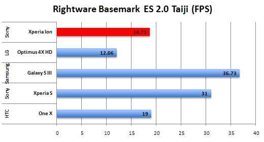
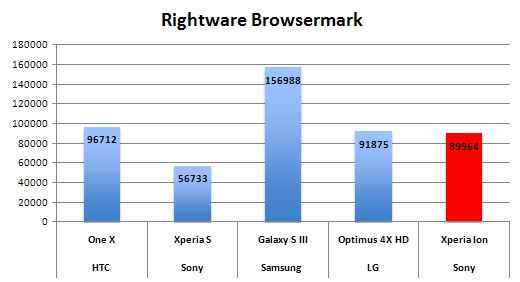
We have put the phone through some benchmark tests, and compared this to the flagship predecessor, the Xperia S (read our review) as well as some rivals in the same price segment.
From the little time we have spent with the Sony Xperia Ion, here are some initial impressions.
1. This is still a dual core smartphone, and Sony clearly does not believe in quad-core processors are necessary for smartphones. Their focus has always been in providing adequate power to allow for a pleasant user experience. While we agree that user experience and the quality of the final product is more important than just raw processing power, we aren’t sure how some consumers on the shop floor will decipher the spec sheet comparison in favour of the Xperia Ion. Particularly at this price.
2. The Sony Xperia Ion is priced at Rs 36,999, and is competing in the same price bracket as the Samsung Galaxy S III (read our review) and the HTC One X (read our review). Incidentally, both the S III and the One X are powered by quad core processors. A dual-core 1.5GHz processor and Adreno 220 GPU power the Xperia Ion. There is 13.2GB usable internal memory, and a micro SD slot for expansion, something that was missing in the Xperia S.
3. The dimensions of the Xperia Ion are only slightly bigger than the Xperia S, but that is expected because the Ion has a display size of 4.55-inches as compared to the 4.3-inches on the Xperia S.
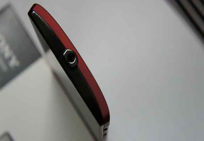
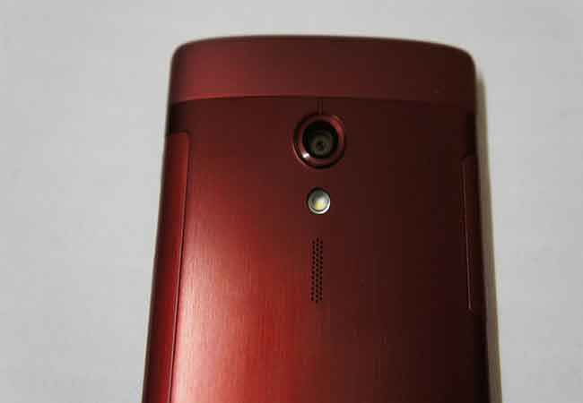
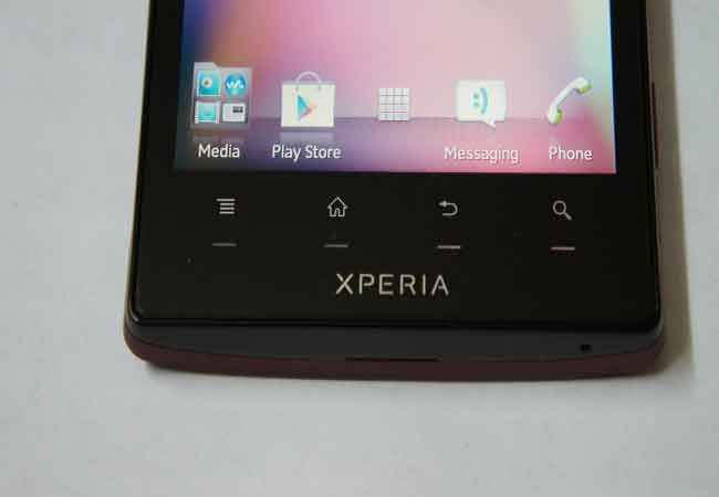
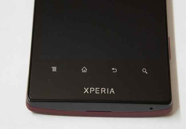
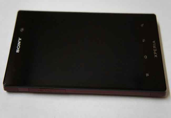
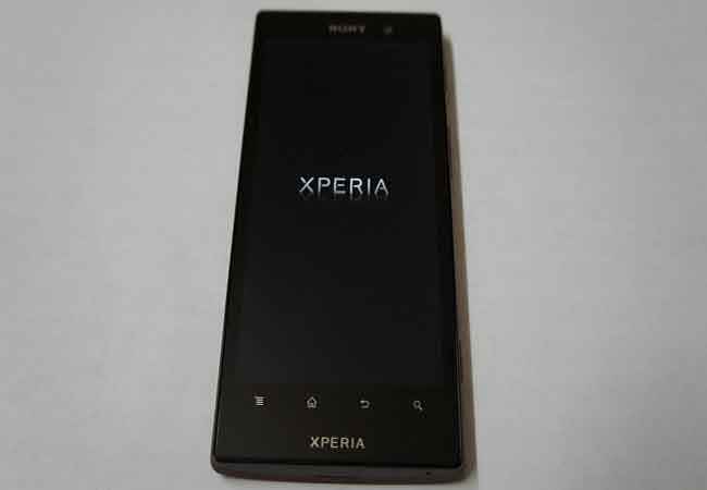
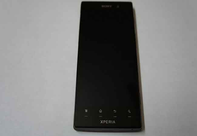
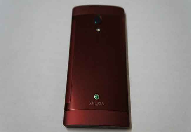
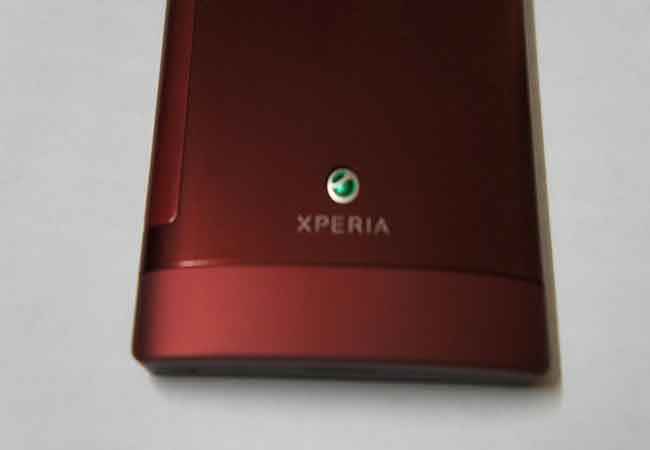
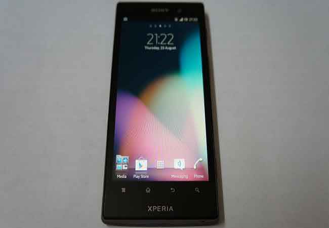
4. However, the design and the finish of both phones – completely different. The Xperia Ion doesn’t seem to carry forward any design elements from the Xperia S. While the predecessor had a classy rubberized finish, with a transparent strip adding a unique visual element, the Xperia Ion has a more conventional design on the front – the display along with four touch sensitive keys below it. No transparent strip, no part rubberized lower portion and no dual color tone. The back of the phone is of a different colour though, red in this case, and has a slight outward curve towards the middle. This red spills over to the spines as well, as well as partly on the top and the bottom.
5. The rear panel of the Sony Xperia Ion also has a dual finish combination – part brushed metal look, and part soft colour.
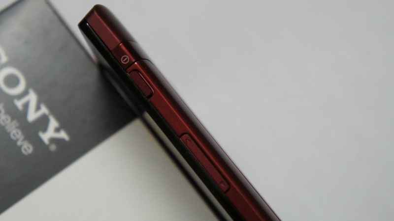
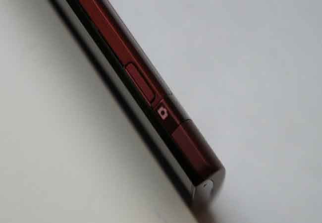
6. The left spine has the micro USB and the HDMI ports, with a well-designed flap cover. While this has dual rubber hinges, we would recommend being careful when opening and closing it. The right spine has the power key, volume rocker and the dedicated camera key.
|
Power key and the volume rocker are quite close to each other, but never seem to get on each other's way.
|
The dedicated camera key on one side spine.
|
7. The Sony Xperia Ion’s 4.55-inch display is a bigger version of exactly the same display we saw in the Xperia S. This is a very cool display in its own right, and we don’t see much wrong with it. However, this is a plain-Jane LED backlit LCD, and surely the rivals sporting varieties of AMOLED and higher versions of the LCDs will definitely have an advantage. However, for anyone who isn’t obsessed with the spec sheet, this will surely be a good enough display for most tasks.
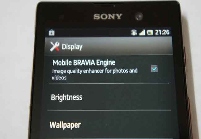
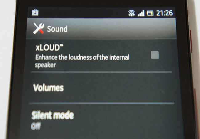
8. Just like the Xperia S, the Xperia Ion also has the Sony proprietary goodness – Bravia engine and xLoud. However, it misses out on the auto brightness setting as well, something that still perplexes us.
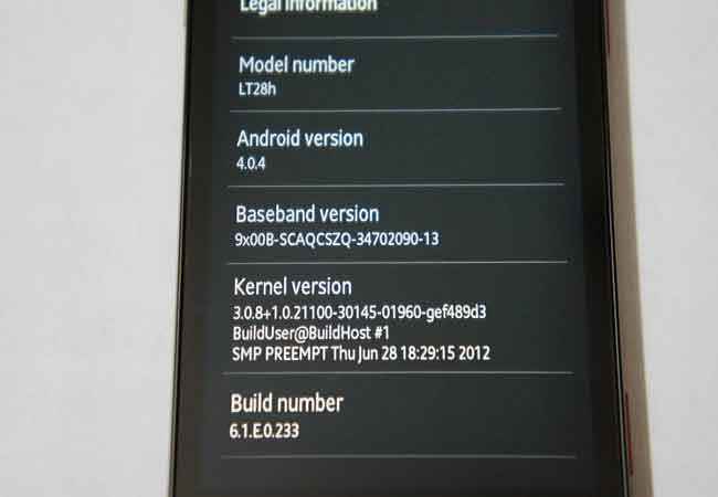
9. The Xperia Ion comes with Android ICS 4.0.4 out of the box, unlike the Xperia S that received that as an update this summer.
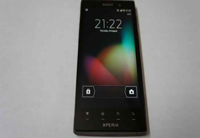
10. TimeScape UI remains largely the same on the Sony Xperia Ion, and we like the un-intrusive nature of the skin, unless you configure it to show up Facebook, Mail and Twitter updated. It doesn’t slow down the phone performance as much as an HTC Sense, and can be compared by installing any third party launcher and using that as the home screen.
|
The lockscreen, as it always has been, with TimeScape.
|
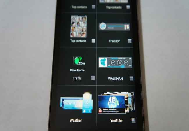
Quite a good widget range, but not as appealing as that on the HTC Sense UI.
|
We have put the Sony Xperia Ion through some initial benchmark tests, and you can check out how it stacks up against some of the rivals in the graphs below. We will have a detailed review of the Xperia Ion very soon on our website. In the meantime, you can check out some more products shots, on the next page.
Visit page two of First Impressions: Xperia Ion, to check out some more product shots, and more observations…
Check out some Sony Xperia Ion product shots, below:
.jpg)
.jpg)
