First Impressions: Samsung’s Galaxy Note 3 and Galaxy Gear smartwatch
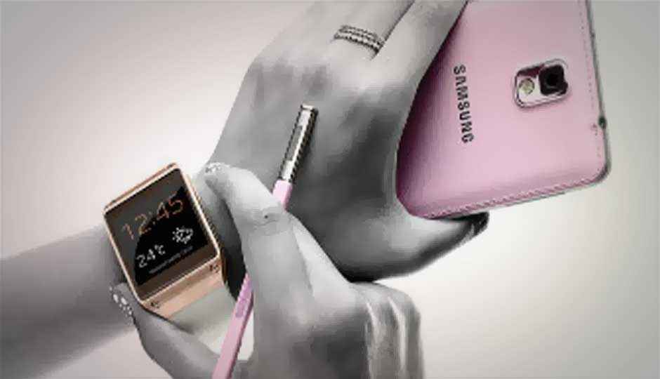
We get our hands on the two newest Samsung Galaxy devices- the Galaxy Note 3 and the Galaxy Gear smartwatch.
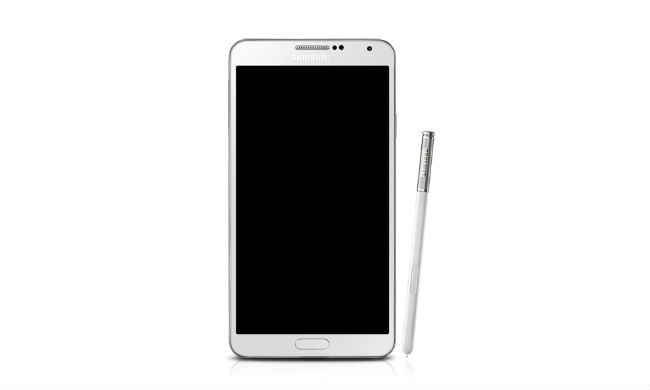
Samsung today launched the Galaxy Note 3 in India, the third iteration of the popular large-screened Android smartphone. The Note 3 will be launched in stores in India on September 25 for Rs. 49,900 along with the Galaxy Gear Smartwatch, which will cost Rs. 22,990. Till the actual launch date, Samsung will let interested users walk into select stores and try out the device.
Fortunately, I was able to get my hands on both devices at the launch event itself and spent some time with both of them to form some initial impressions. Here they are:
Samsung Galaxy Note 3
Looks, Design
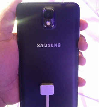
All the criticism directed towards Samsung with respect to the use of plastic on its expensive flagship devices seems to have made a difference. Samsung executives made a point to repeat that design and build were very important for the Note 3. As a result, the Note 3 does actually feel and look much better that its previous iterations. The Note 3 has a textured leather back with stitching around the edges that’s reminiscent of a leatherbound notebook. The Note 3 is also very, very light for such a large device which came as a pleasant surprise. Overall, I still wouldn’t call the Note 3 a good looking phone (it still has this tacky looking glossy metallic rim around the entire body) but it’s good to see Samsung at least try to make something aesthetically pleasing.
Display
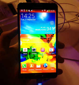
As per tradition, the Note 3 comes with a Super AMOLED display that’s very vibrant, so much so that colours look unnatural, especially in the default interface which itself is packed with a colourful wallpaper and icons. The vibrancy meant that under low lighting, the display looked brilliant but that may differ when the Note 3 is brought under regular lighting.
Usability
I played around with the Note 3 for a couple of minutes and predictably, didn’t run into any issues. The interface is smooth, the UI uncomplicated and the deep feature-set is hidden from the user until he/she wants to access it. There aren’t any great changes in the interface especially if you’ve used the Galaxy S4. Whether that’s a positive or a negative, is up to you. The S-Pen has also been given some extra functionality including the ability to directly save any webpage to a customized digital ‘scrapbook’, adding contacts by writing their info, searching through handwritten content created over the last 30 days among others. Unfortunately, while these were shown off during the presentation, I was unable to test out all of them on the Note 3.
Samsung Galaxy Gear Smartwatch
Looks & Design
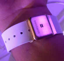
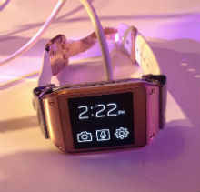
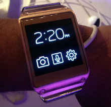
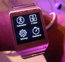
At first glance the Galaxy Gear looks like a hybrid of what could be described as both cool and cute. However, that impression quickly wore away as I spent more time with the watch. There is something about the watch that just does not feel premium, and especially not worth Rs. 23,000. The watch’s clasp looks cheap and not very well designed as it’s significantly larger than the strap. I’m not sure if I, personally, would want to wear this watch.
Usability
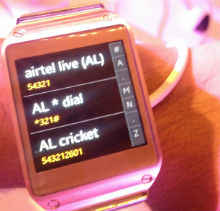
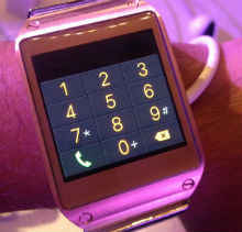
Samsung has very intelligently incorporated swipes to navigate the Gear’s interface instead of relying on touch buttons. Also, by employing a grid of four or just a single icon at times on the screen, you never feel that the watch is too small for touch input. The interface does lag a bit though, and you’ll notice that a page will only have scrolled halfway through even if your thumb has made it 3/4ths of the way across the screen. Often, you’ll also get no feedback to a swipe until you complete it, something that I’m used to on smartphones.
Symbiosis
The Galaxy Gear is designed to be a product that exists in an ecosystem with other Galaxy devices and even though you could use it simply as an overpowered watch, why in god’s name would you want to? Currently, the Galaxy Gear will work out of the box with the Note 3 and in case of the Galaxy S4, you’ll have to download the Gear app. Thanks to the Bluetooth 4.0 connectivity, the pairing between a Note 3 and the Gear is excellent. I played songs on the Note 3 using the Gear, received notifications on the Gear when the Note 3 got messages, and within this limited context, the experience felt great as if I was experiencing something genuinely innovative. Unfortunately, the pricing of the Gear pretty much ensures that those who will be able to afford it, won’t care about it, and those that care about it, won’t be able to afford it.
Image Gallery
|
|

