First impressions: Gionee Elife E6 Android smartphone
We got to spend some time with the Gionee Elife E6 at its launch event. The device has a unique UI overlaying the Android OS, has a 1080p 5-inch display and 2GB RAM.
Gionee today unveiled the Elife E6 Android smartphone. The smartphone is available to users in India for Rs. 22,999 in two colours – black and white.
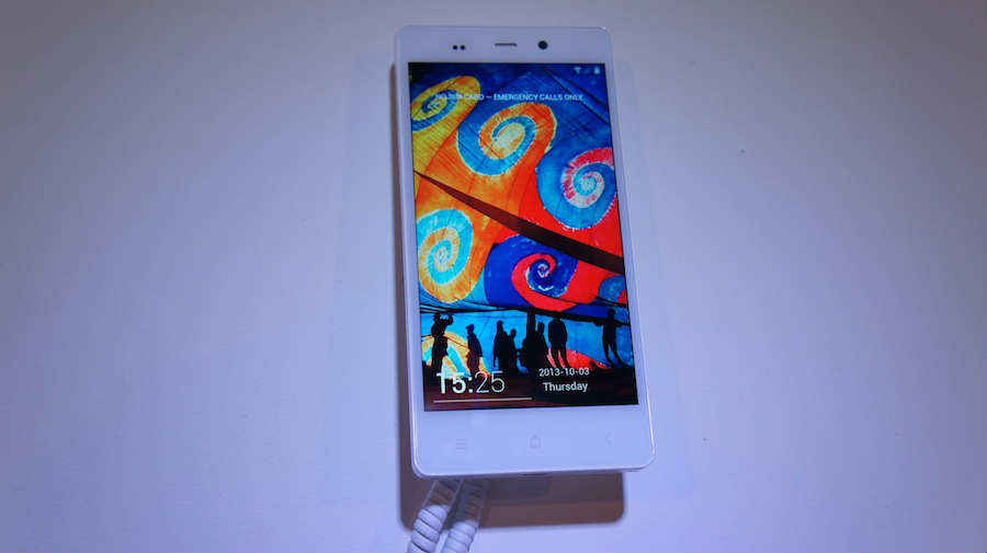
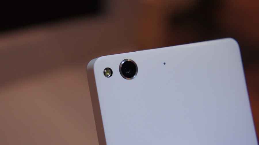
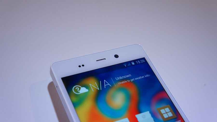
Getting the specifications out of the way, the Elife E6 runs on the MediaTek MT 6589T chipset with the CPU clocked at 1.5GHz coupled with 2GB of RAM. It houses a 5-inch display with a 1920×1080 pixels resolution. The rear houses a 13MP camera and the front has a 5MP camera for video calling. The smartphone runs on Android 4.2 Jelly Bean and has 32GB built-in storage with no expandability options. A 2020mAh battery powers the E6.
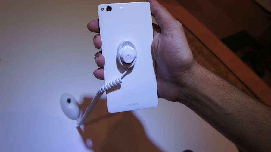
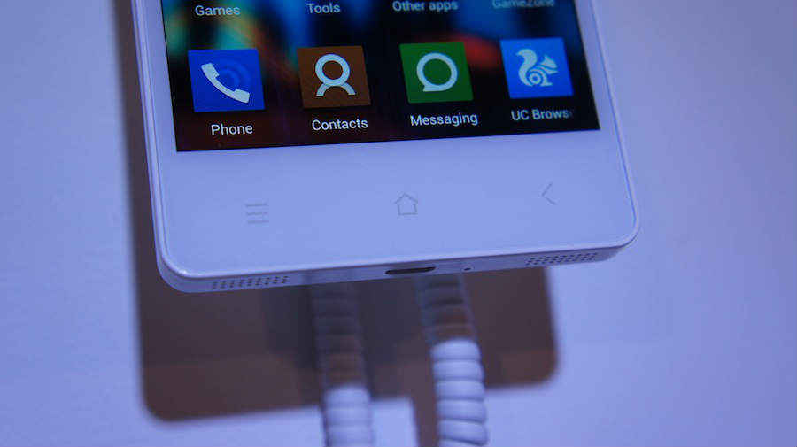
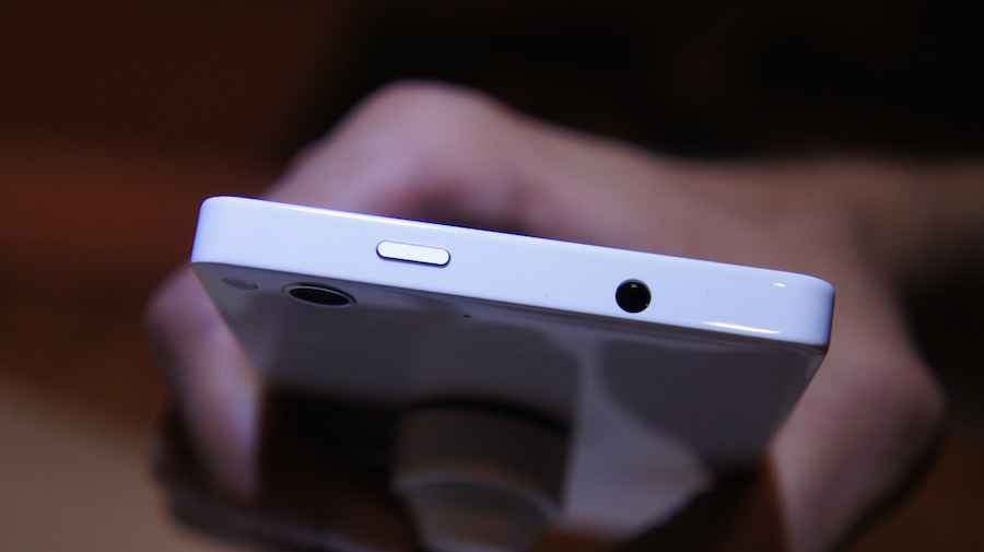
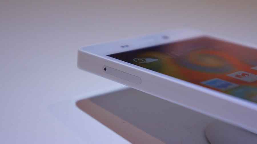
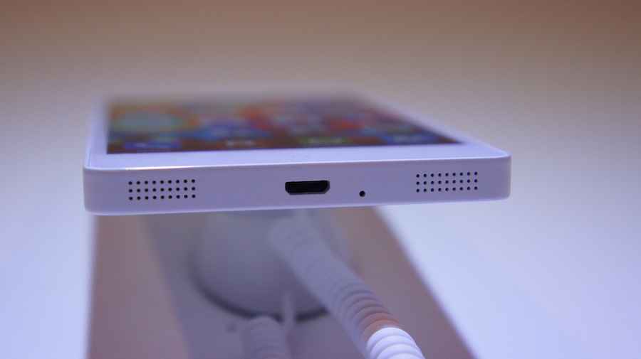
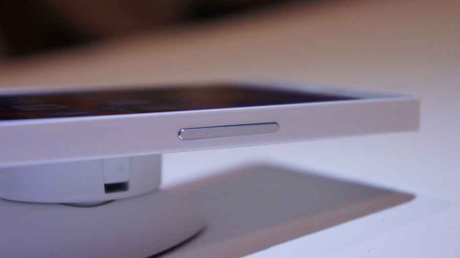
The Elife E6 is relatively light at 128 grams and is a mere 7.9mm in thickness. It has a unibody design, which means that you don’t have access to the battery. Overall the design of the E6 is very rectangular and it has a candy bar form factor, something we started appreciating with the launch of the iPhone 4.
 |
 |
 |
 |
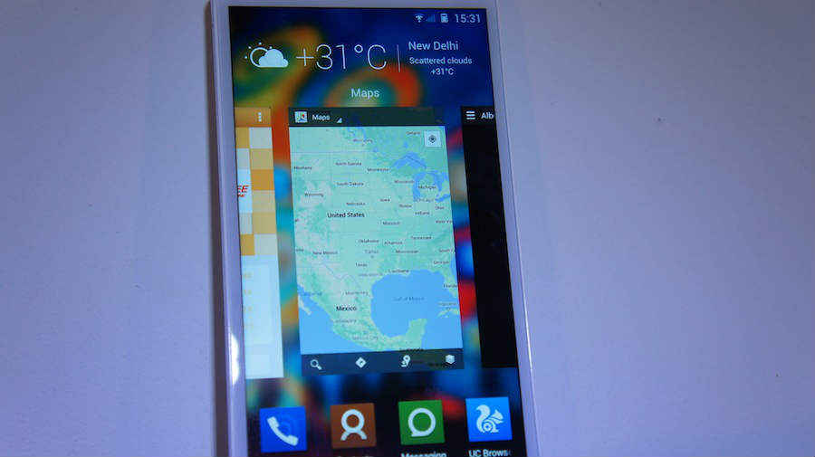
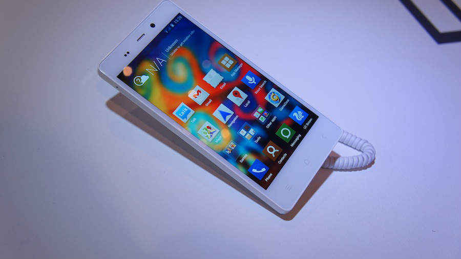
Coming to our user experience at the launch event, the Elife E6 has a skin overlaying the Android OS. This is evident from the lock screen itself. Starting with the home screen, you don’t have the apps listing page, which is found on all other Android phones. Just like we have seen on the Huawei Ascend P6, the smartphones houses all the apps on the home screen itself – very iOS in nature. Another thing the E6 borrows from iOS 7 is the way in which you kill running apps. Bringing up the multitasking menu on the E6 gives you the same multitasking view we have seen in iOS 7. It displays running apps as cards and you can swipe up to kill a particular app.
The Gionee Elife E6 also has a bunch of gesture controls that we have seen on the Micromax Canvas 4. You can look away from the device to pause a video, lift it to answer a call, turn the device to silence the alarm, so on and so forth. A feature that we have seen on the Lava Iris 504Q, the ability to wave your hand in front of the display to cycle through the gallery has also made its way onto the Elife E6. These controls can easily be switched on or off through the settings menu.
 |
 |
 |
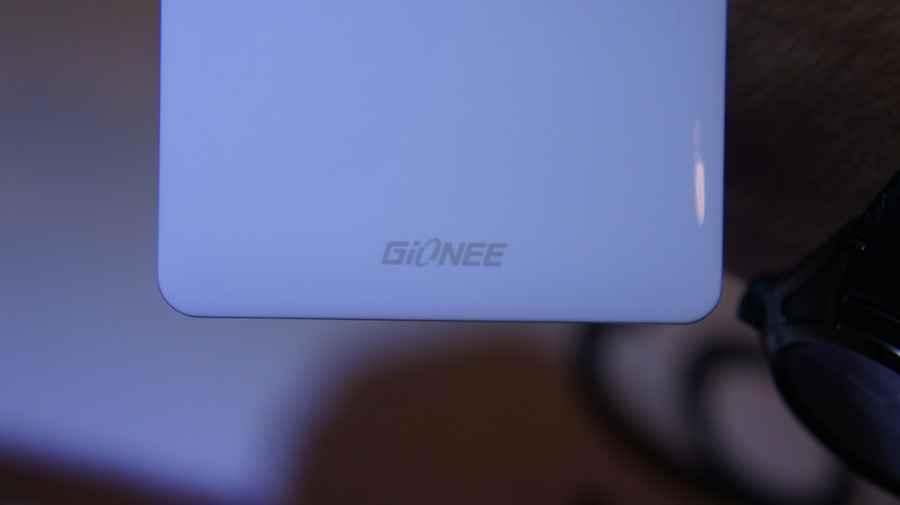 |
The unibody design, though made of plastic makes the smartphone look quite interesting. The UI too is a refreshing change even though it borrows elements from smartphones we have already seen. What we want to find out is how the device performs with every day usage. It has a 1080p display, which will require quite a bit of memory to render content. There is 2GB of RAM, which is comforting, but the 2020mAh battery makes us a bit sceptical about the battery life. Stay tuned, as we will bring you our final verdict of the Gionee Elife E6 in our review.
 |
 |
 |
 |
Sameer Mitha
Sameer Mitha lives for gaming and technology is his muse. When he isn’t busy playing with gadgets or video games he delves into the world of fantasy novels. View Full Profile


