ColorOS 13 Hands-On Review: A more streamlined experience
Oppo recently unveiled ColorOS 13 which is based on the latest Android 13
ColorOS 13 comes with visual changes, added features, and privacy and security tweaks
The rollout of ColorOS 13 will begin in September in India, starting with the Oppo Reno8 Pro
Oppo recently unveiled its latest ColorOS iteration – ColorOS 13. As the nomenclature suggests, ColorOS 13 is based on Android 13 that runs alongside, under the hood. While it is named ColorOS 13, this is, in actuality, Oppo’s tenth major version of its OS. Oppo synced the numbers to match the Android version of the year back when ColorOS 11 launched. Oppo’s ColorOS 13 puts its own spin on Android 13, especially in the visual department. While the global version of ColorOS 13 is now live, it will slowly be rolled out to Oppo devices. It will first be available on the Oppo Reno8 Pro 5G in India.
ColorOS bears similarities to OxygenOS, and while the idea of unifying both operating systems has been scraped, you can still see some obvious similarities between the two. Since its inception, ColorOS has evolved into becoming quite feature-rich and pretty user-friendly. There are some issues though such as rampant bloatware and ad notifications. With that said, let’s get into the meat of the matter. We tested the Beta version of ColorOS 13 for an entire week, and here’s what we think about Oppo’s latest OS iteration.
Note: We tested a Beta version of ColorOS 13 on the Oppo Find X5 Pro that was loaned to us by Oppo India. The company had no input into the contents of this article.
ColorOS 13: Visual Changes
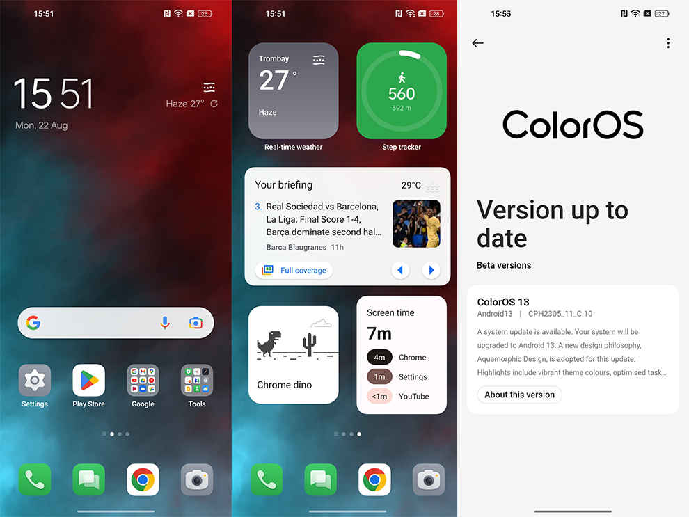
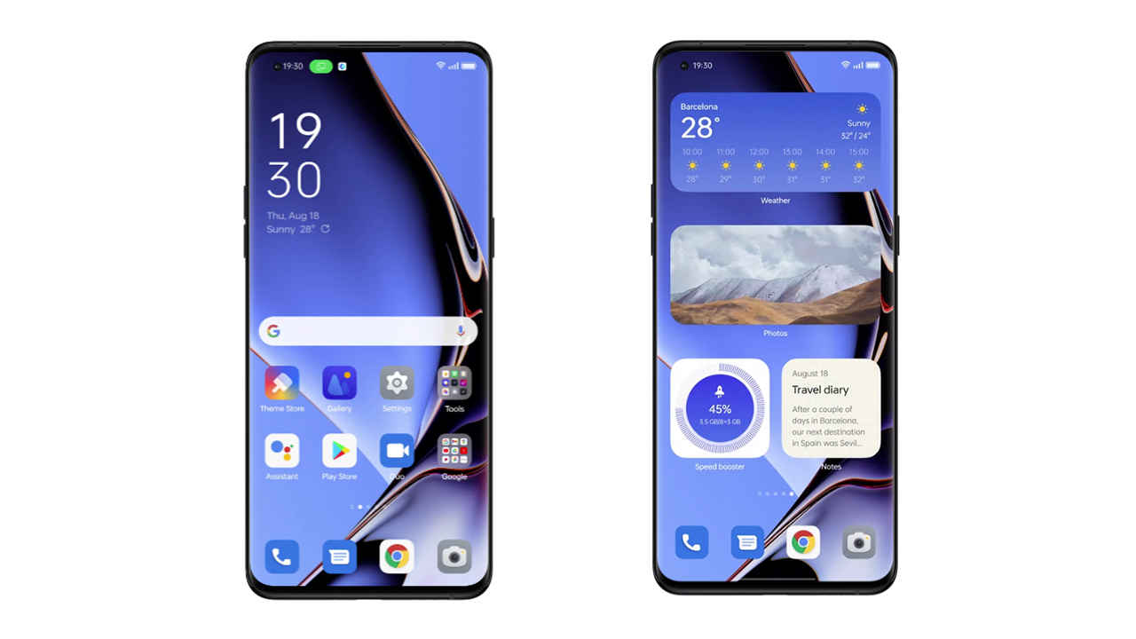
Oppo has brought a visual overhaul to ColorOS 13 and a couple of iterative upgrades over ColorOS 12. It makes sense since Android 13 is also a comparatively small, iterative upgrade to Android 12. ColorOS 13 has adopted a design language dubbed “Aquamorphic Design” which is inspired by water and its motion. This is apparent in the smooth transitions and animations, and the use of more rounded shapes for icons, folders, and widgets – meant to emulate pebbles.
ColorOS 13 with more rounded app icons and widgets
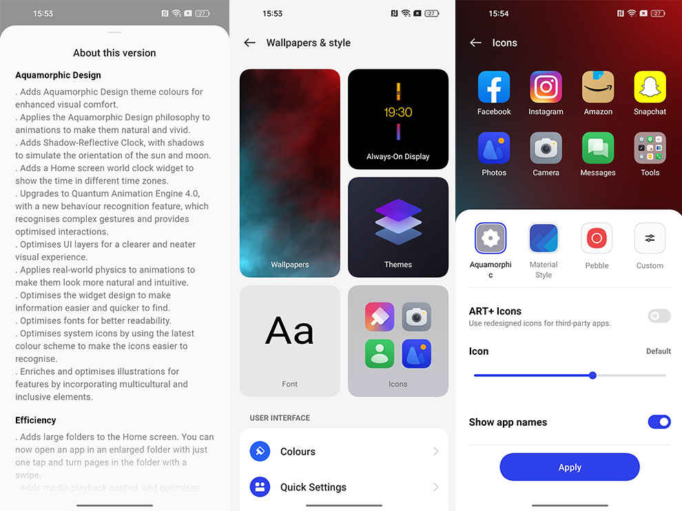
The design isn’t too different from the one on ColorOS 12 but there are enough small tweaks to make it feel fresh. If you so wish, you can choose to use Material Style icons in Settings rather than using Oppo’s new Aquamorphic style of icons. Additionally, there are tons of customisation options available. You can edit shapes, colours, text sizes, and more as per your preference. Not just Oppo and Google apps, but third-party app icons can also be styled to a certain extent. Users who are fond of customising their devices can easily sink hours into customisation.
As for colour palettes, you can customise that as you please too. The preset palettes follow the aquatic theme and nature-inspired theme, with shades such as yellows, oranges, and blues being the dominant ones. The shade also changes throughout the day, to emulate sunrise and sunset times. You can change the system colour based on your wallpaper, but the implementation isn’t solid, and sadly, there’s no Material You implementation yet as well.
There is a new Live Wallpaper that follows the “Aquamorphic Design” template as well. This wallpaper is called “Blossom” wallpaper and it provides an interesting way to measure the time spent on your time. You can set a phone usage target in hours within the wallpapers’ settings and as you use your phone, the plant will blossom. But once you exceed your allotted time, the plant will begin to wither. It’s a pretty interesting take on alerting users about their screen time.
ColorOS 13 customisation
The user interface has a card layout for easy visual separation. This also kind of continues the rounded “pebble” theme as seen on icons and widgets. Sometimes though, the rounded-boxy card interface minimised how much information could be placed. If the corners of the cards were tightened up a bit more, there would be more space to fit in additional information or more notifications on a single screen.
Nevertheless, we quite enjoyed the revamped look of ColorOS 13. It looks a lot more classy, fluid, and simple. Although it’s not quite as simple and minimalist as Stock Android or even One UI, this is a step in the right direction.
ColorOS 13: Home Screen and Control Centre
The newly-designed app icons, that we spoke about above, are meant to be more recognisable and readable – even for people with visual impairments, according to Oppo. While we wouldn’t go that far, we can definitely say that the contrast has been upped to make icons more recognisable. Also, the new ‘Oppo Sans’ font looks great with the Aquamorphic theme.
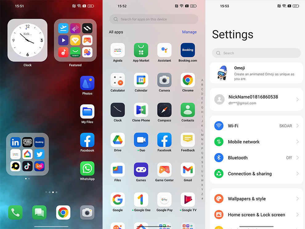
ColorOS 13 home screen, app drawer, and settings
Oppo has also added a new type of folder to the home screen called Enlarged Folders. These folders eliminate the step of having to tap on the folder and then click on the app you’re looking for. Instead, these folders are 2×2 folders that house app icons (without the names) that can be tapped on to directly open them – no extra steps are required. You can also swipe within the folder to access more apps. We found these enlarged folders quite nifty, but since they eliminate the app’s name, you should use these with easily recognisable app icons to avoid confusion. Oppo drew inspiration from iOS here and that’s clear, but it’s still nifty nonetheless.
ColorOS also comes with a Shelf that’s very similar to OnePlus’ Shelf. You can pull down anywhere on the screen to access it. There’s not a lot you can do with the Shelf at the moment except add some custom widgets and Spotify integration.
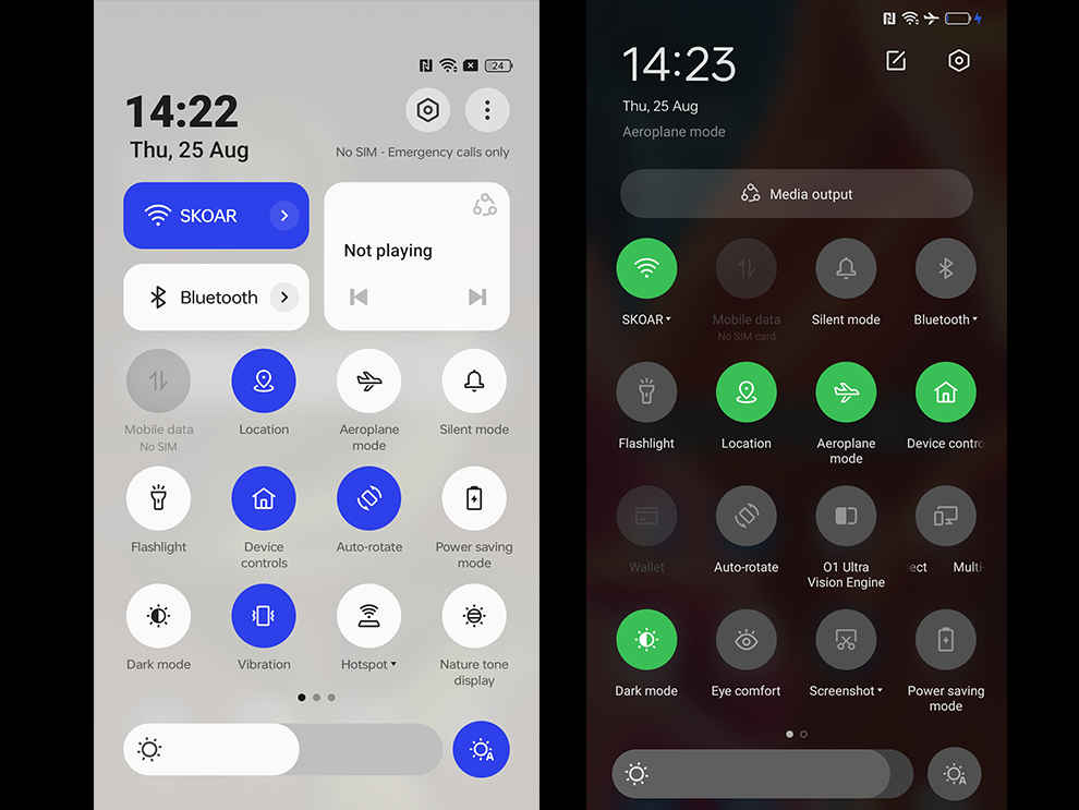
Control Centre of ColorOS 13 (left) vs Control Centre of ColorOS 12 (right)
The Control Centre has been redesigned as well. The top part of the Control Centre houses two large toggles on the left and a media playback widget on the right. These toggles alongside the top five tiles are available even if you swipe down the notification bar just once, making them easy to access. The names of the small tiles are omitted when you swipe down once, but when you swipe down again to open the expanded control panel, the names appear. This helps keep things uncluttered and clean.
Another nice touch is the changes in the Control Panel or Centre in landscape mode. The Control Panel and Notifications Bar take up the whole screen in landscape mode now which looks much better compared to the panel with tons of empty space on the sides in ColorOS 12. Additionally, the Control Centre moves to the left while the Notifications Panel is situated on the right in landscape mode which makes it slightly easier to respond to notifications without having to scroll too far down.
ColorOS 13: Always-on Display
Oppo has revamped its Always-On Display as well. Users can access and control Spotify and show relevant information from food delivery apps such as Zomato and Swiggy, all without unlocking the screen. We used the Spotify integration and found it to be a bit buggy, double-tapping to access the music controls menu would take a bit too long to show up. Hopefully, this gets fixed when the OS is out of Beta.
Food delivery apps’ integration is pretty great. The screen displays information such as “Order accepted”, “Meal Picked Up”, the distance to the destination, and more, so you don’t have to constantly check these apps to know where your food has reached.
Insight Always-On Display
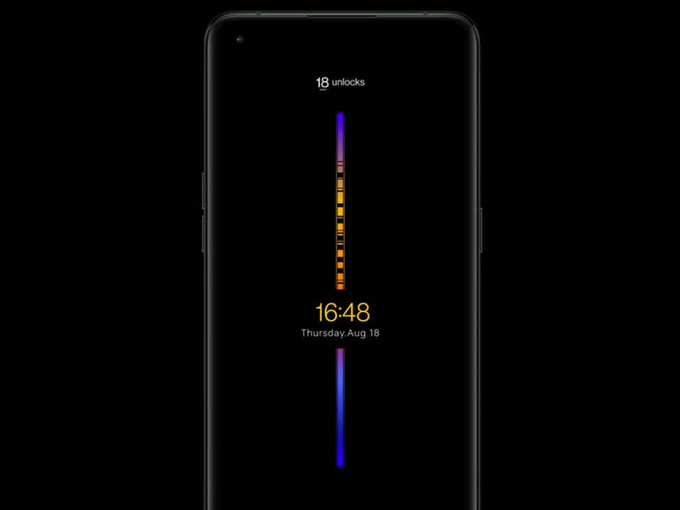
Oppo has also added extra Always-On animations featuring animals and nature. One wallpaper depicts changes in animals’ homes due to temperature changes based on the daily temperature change in your area. It’s a pretty cool concept, albeit a bit gimmicky. There’s also an Insight Always-On display that tracks the user’s number of phone unlocks in a day. There’s a coloured line running across the screen and every time you unlock the phone and spend time on time, it creates a little dink or groove in the line.
Lastly, Oppo has continued Bitmoji integration with ColorOS 13. You can display your own Bitmoji on the Always-On Display in various states such as working, listening to music, eating, and more. We personally don’t see ourselves using this feature much and find it a bit unnecessary but some users may enjoy it.
All in all, Oppo has expanded the use cases of its Always-On display adding some meaningful features such as Spotify, Zomato and Swiggy integration. However, we really hope Oppo adds support for additional music players in the future since limiting this feature to just one music player seems wasteful.
ColorOS 13: Privacy and Security
ColorOS 13 has integrated some of the underlying privacy capabilities of Android 13 such as deleting clipboard history after a designated period of time. There’s also the Nearby Wi-Fi feature that allows users to use Wi-Fi without revealing any specific location information.
Aside from Android 13 privacy and security features, Oppo has integrated some additional ones from their side as well. Firstly, there’s the Auto Screenshot Pixelate feature. If you’ve ever wanted to take a screenshot of a conversation and share it, you may find this feature very useful. ColorOS 13 can automatically pixellate avatars and names in screenshots of chats. It uses AI algorithms to intelligently predict which part of the chat needs to be blurred out.
When we used this feature, it seemed buggy since there were many instances when the phone just gave out an Auto Pixelate error. Nevertheless, at times, it did work as advertised. Hopefully, the feature gets more stable and reliable over time since it is something that’s pretty useful. This feature is available in Oppo’s Messages app, WhatsApp, and Facebook Messenger for now.
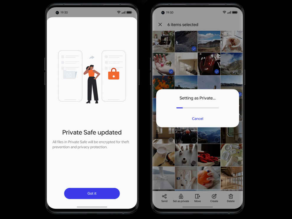
Private Safe on ColorOS 13
Another privacy feature added by Oppo is the Private Safe. This is a folder that is encrypted using the AES algorithm that stores the files in a private directory.
ColorOS 13: Miscellaneous
Oppo’s cross-device collaboration feature dubbed ‘Multi-screen connect’ has become more powerful in ColorOS 13. Multi-screen connect was first limited to Windows PCs, but it can now be used on an Oppo tablet too such as the Oppo Pad Air. The feature allows you to seamlessly transfer files between your phone and connected device. ColorOS 13 has added support for more file types. You can also directly edit files stored on your phone from your PC or Oppo tablet, which is very useful.
The newest addition to this feature in ColorOS 13 is the ability to get all of your notifications synced and to be able to fully control your phone remotely. At times, we found that clipboard sync was a bit buggy, where the clipboard data did not show up on the connected device, but most times, the feature worked quite well.
ColorOS 13 also sports a feature called ‘Meeting Assistant’. It includes features such as simplified or less distracting banner notifications during online meetings, note-taking in a pop-up window, and background network optimisation for video calls.
Aside from these, Oppo also claims that its new software is more battery efficient. The company also states that more apps can remain active in the background due to improved memory management. We haven’t tested these claims thoroughly yet, but when we do, we’ll surely update this article with our findings.
ColorOS 13 Rollout Schedule
Due to Oppo’s close ties with Google on the Android OS front, Oppo users usually benefit from earlier and timely updates for their devices. Oppo has shared a tentative ColorOS 13 rollout schedule that is subject to change, so take it with a grain of salt. Oppo notes that all of these upcoming ColorOS 13 updates will be based on Android 13. Here’s the tentative rollout schedule:
- From September 2022: Reno8 Pro 5G
- From October 2022: Reno8 5G, Reno7 Pro 5G, Reno7 5G, Reno6 5G, F21 Pro, K10 5G, A76
- From November 2022: Reno6 Pro 5G, Reno6 Pro 5G Diwali Edition, Reno5 Pro 5G, F21 Pro 5G, F19 Pro+, K10, A96
- From December 2022: Find X2, A74 5G
- From H1 2023: Oppo Pad Air, F19 Pro, F19, F19s, A77, A57, A55, A53s 5G
ColorOS 13: Verdict
Oppo continues its trend of improving its OS year after year with ColorOS 13, be it in terms of aesthetics, features, or security. While there are still some bugs and tons of bloatware, ColorOS 13 feels more fluid and responsive than its previous renditions. The visual flair and tweaks are quite elegant yet they don’t feel garish. Additionally, features such as multi-screen connect with notifications sync, auto pixellate, AOD improvements, and others are not just gimmicks. These are features that we actually found to be quite nifty in real life. Overall, ColorOS 13 is the best iteration of Oppo’s operating system yet.

Dhriti Datta
Perpetually sporting a death stare, this one can be seen tinkering around with her smartphone which she holds more dear than life itself and stuffing her face with copious amounts of bacon. View Full Profile

