Android L overview and what it brings to Android
The developer preview for the new version of Android is now available and here's what's new about it.

We know it only as L right now, but Android L brings some major changes to Google’s design philosophy along with some other new features. According to the company, this is the biggest update to Android made till date. Here’s a quick look at the changes, but read on for a detailed report.
 Survey
– New flatter ‘material’ design UI
– DALVIK runtime scrapped for ART
– Support for 64-bit processor architectures
– New Google keyboard resembling the one from Windows
– New themes
– New APIs for custom shadows and animations for developers
– New notifications and lock screen
Google has already made the developer preview available with all the above changes. According to comments made on the Google+ developer preview page for Android L, it is available for the Nexus 5 and Nexus 7 2013 WiFi only. But enough about that, there’s a lot to cover and we’ll get right down to it.
Material Design
Google’s ‘material’ design entails a flatter look, which in some cases (like the new Google keyboard) is very similar to the Windows and iOS platforms. It is perhaps best explained through the following:
Notifications
Perhaps the biggest change in Android L is in terms of the UI. Google goes for a flatter card-based system, which up untill now has been seen on its Google Now assistant. This new design is more apparent on the notifications and lock screen, both of which have card based views on them.
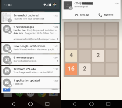
The standard drop down menu has been done away with on Android L, to be replaced by a drop down card. This is followed by a thin line in between, which differentiates each new notification and other ongoing processes (like Connected to a media device etc). Further, you can swipe down again to reveal the quick settings menu, which contains Wi-Fi status, Auto Rotate and other settings.
The menu doesn’t reach till the bottom of your phone’s screen, showing the home screen in the background. Google has also added a ‘Do Not Disturb’ function to the notifications menu, which allows the user to silence notifications for a designated time period.
The company has also taken advantage of the ‘heads-up notifications’ feature in Android. Since the introduction of JellyBean, Android allowed apps to mark their notifications under high, low, default, min, max priority. The heads up notifications will show up even while you’re playing full screen games etc. based on the priority the app gives to them. So, you can get a small actionable notification on the top of the screen notifying you about calls and texts (Right side of image above).
Lock Screen
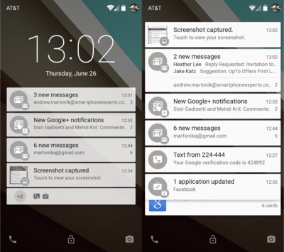
Your lockscreen now gives you the lock/unlock, phone and camera options at the bottom, which will perform their designated activities. On the top you see the battery status, services provider and profile picture. Below this, is the clock, which takes up approximately a fourth of your screen.
The major change though is below the clock, where the top four notifications will show up in the same card format mentioned above. These will be accompanied by a ‘+’ sign or a number, showing the notifications available below it.
Google Keyboard
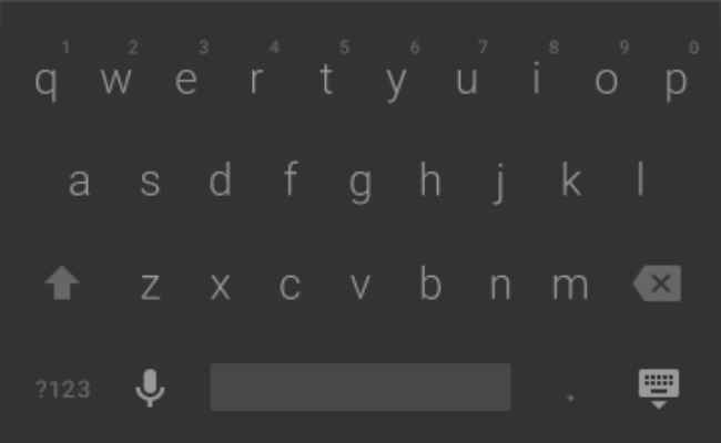
The keyboard now uses a slate-grey theme with borderless keys, which looks almost exactly like the Windows keyboard seen on Lumia devices. Google has also packed some other themes for the keyboard and you can also shift to the standard keyboard you currently see on KitKat.
Out with DALVIK in with ART
With the launch of KitKat, there was some talk of Google allowing users to shift from the default DALVIK to ART runtimes (do this from ‘Developer Options’ on Settings). Well, Android L brings ART to the forefront, obliterating DALVIK completely.
ART is a cross-platform runtime that allows you to run apps on MIPS, ARM and x86 architectures simultaneously. The difference between the two runtimes is in how they process code, with DALVIK processing only the code that is needed (just-in-time), while ART processes code ahead-of-time.
This makes ART much faster than DALVIK and allows for smoother performance. Moreover, ART is compatible with the present app ecosystem, which means that developers don’t really have to make any major changes for it. It also supports 64-bit systems.
Of course, this is only the developer preview of Android L and there’s a lot that can still happen till the OS is actually rolled out to users.


