
One of the most significant updates to iOS 6 is Apple’s new Maps application, which replaces Google Maps as the default, pre-loaded app. It’s widely believed Apple did this to scale back its reliance on a major competitor for a key part of its mobile operating system.
It’s less likely, though still possible, that Google’s licensing terms became too onerous, or that Apple wanted to activate voice navigation for free and Google refused, since the built-in, voice-enabled Google Maps Navigation app has been one of Android’s traditional competitive advantages.
Whatever the reason, I was hoping Apple was going to come out of the gate strongly with its own Maps app. After all, Apple has a pretty good history of doing just that. It looks at the market, see what other competitors have done, and then comes in with its own product that often upends existing ideas and with an extra dose of polish.
Unfortunately, it appears that we didn’t get this at all. Apple Maps looks gorgeous, and functions well enough on a basic level. But early impressions are that it’s a 1.0 app in a 6.0 OS.
For example, reports are already pouring in saying that Maps is coming up with some strange ideas about how to get places. Google went through this sort of thing years ago. Waze is going through this now, as crowd-sourced directions are great for avoiding traffic, but not so good at optimizing routes when behind the wheel. It takes years of refinements to get this right. So far, it appears Apple’s vague mix of TomTom, Waze, and other sources isn’t panning out so well yet. It sure isn’t TomTom’s fault, incidentally; its devices have been great at routing for years.
We’ll be testing iOS 6 Maps much more heavily over the next week, particularly as the iPhone 5 arrives. Existing iPhone 4S owners who upgrade to iOS 6 get the same feature set, while those with the iPhone 3GS and iPhone 4 get most, but not all, new iOS 6 Maps features – like voice navigation and flyovers. But even today, just with some basic testing, it’s clear Google Maps retains a serious advantage in many key areas:
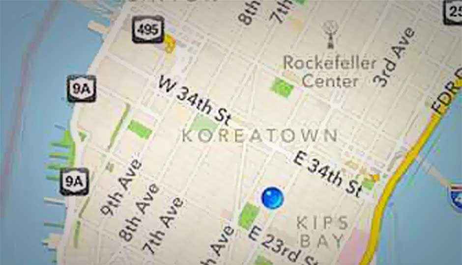
The maps themselves. The city maps we’re seeing in iOS 6 Maps certainly look attractive, but they’re also kind of bizarre. For example, zoom in and out, and Apple’s app has a really curious way of deciding which neighborhood names and landmarks are important, and which aren’t. In the above screenshot, I’d probably pick four or five neighborhoods before highlighting the tiny Koreatown and Meatpacking Districts: Chelsea, Gramercy Park, Murray Hill, Midtown…
Poor address location. Right here in Manhattan, the app is proving it has trouble finding points of interests as well as even basic street addresses. Even when it has my location nailed on East 28th Street, I typed the full street address of the building I was standing in front of, and the type-ahead search brought up five examples in Brian Head, Utah. I ran a search on a street address on East 15th Street in Manhattan, and it delivered a red pin on Marlborough Road in Brooklyn—not only was that incorrect, but it defaulted to Brooklyn, since Brooklyn has an East 15th Street, instead of Manhattan. I put in my father’s old store, which has been open in Brooklyn since 1976, and Maps lists it as a Jewish Center in the middle of the block. He didn’t own a Jewish Center. Around the Web, people are noticing it gets entire neighborhoods wrong, and someone found it gives the wrong city name for Berlin in Germany.
No street views. Google Street View started as a fun and curious experiment in San Francisco years ago, but has since blossomed into something truly extraordinary that works in many major metropolitan areas. Google added it to show destinations during voice navigation, too, although that’s minor in comparison to its day-to-day importance on the ground. It’s gone. Apple’s flyovers are really cool, but they only work in a couple of cities; it’s probably going to take Apple just as long as it did Google to build this into something truly useful.
Missing public transit information. This has already been widely reported, and it’s a big one if you live in a major city. There’s no bus, subway, or train information—schedules, stops, and transit times are all gone. It essentially means that if you’re on foot, you can no longer rely on the Maps app to give you directions or even show you nearby stops to head to. Fortunately, you can still access Google Maps for this info via the browser, although that’s decidedly less convenient, and it doesn’t allow for simultaneous GPS location as you’re walking.
Poor 3D driving interface. Aside from possible routing issues, Maps doesn’t offer a useful 3D interface while driving. It features the next step prominently in a fake green road sign, and the distance to it; that’s great. But the ETA and distance remaining is crammed into the top status bar with a very tiny font. There’s no current road speed or speed limit display. You can’t tap the display to repeat a voice command in case you didn’t hear it. There’s no traffic info on screen. Google Maps Navigation isn’t perfect, but a lot of this stuff is present, and the interface works well on the road.
Poor traffic reporting. I’ve really come to rely on Google’s shaded traffic reporting, which is based on three colors (green, yellow, red) and shows at a glance exactly what you’re up against before you start driving. That’s gone with Apple Maps; instead, you get some red dotted lines showing… something. I’m assuming congestion. This being Manhattan, that’s not very helpful. There are a lot of people here. There’s always congestion.