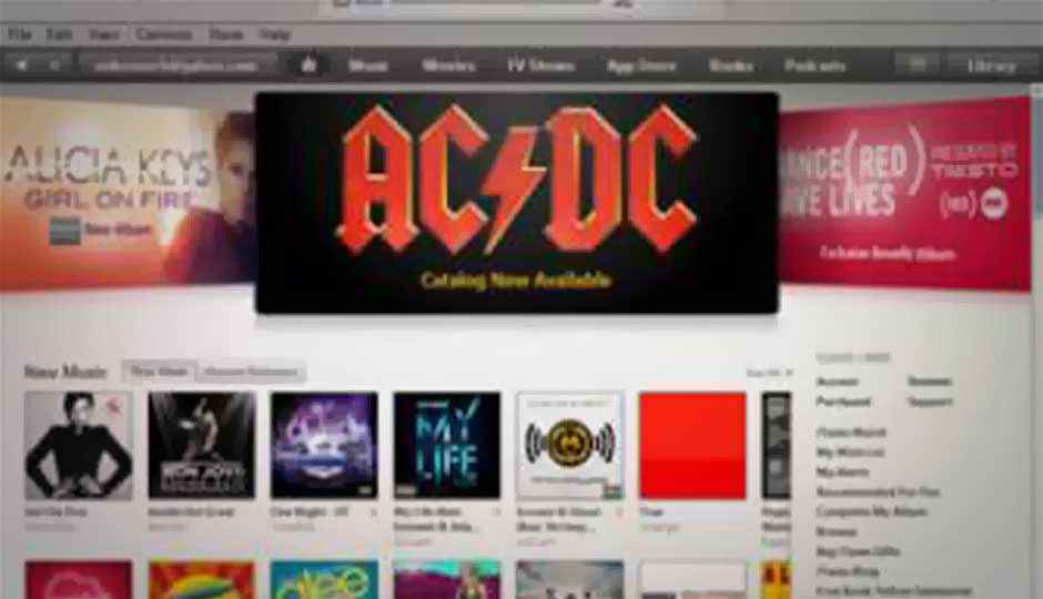
5 cool features in Apple’s iTunes 11

On Thursday, Apple released iTunes 11, the latest update to its music and video service.
Love it or hate it, Apple’s new version of the software recognizes that music playing is as much a mobile activity as it is at the desktop. The new update attempts to provide a look and feel more in sync with Apple’s iOS. Gone is the left-hand nav bar; playlists and radio now appear in the top menu. If you’d like to access a movie, TV show, podcast, or various attached devices, you must click on the drop-down menu underneath the “Music” icon. There’s a new edge-to-edge design that’s reminiscent of iOS, which dominates music sales; Eddy Cue, Apple’s senior vice president of Internet Software and Services, has said that more than two-thirds of iTunes downloads now come directly from iOS devices.
Apple showed off iTunes 11 at its iPhone 5 event in early September, as well as a revamped version of the iTunes Store for iOS, which has been live for some time. The revamped iTunes was originally scheduled to go live by the end of October, but Apple said at the time that it needed a few more weeks because “we wanted to take a little extra time to get it right.”
In the next few pages, we’ve highlighted a few of the cooler features in the new iTunes. And stay tuned for our formal review.


