Windows 8: Sleek UI but not ready for the desktop
For a little more than a week now, I’ve been using the Windows 8 Developer Preview both on the Samsung tablet Microsoft passed out at the Build conference and on a standard desktop PC. So far, the operating system shows a lot of potential as a new environment for tablets and even for more standard machines. However, it still needs a lot of work before it’s ready for end-users.
[RELATED_ARTICLE]To some extent, that’s to be expected. Microsoft was clear at the conference that this was a developer preview, not a customer beta. As such, it comes with a variety of developer tools. Visual Studio Express, Expression Blend 5, a remote debugger, and very little in the way of consumer applications give developers a number of sample applications written by Microsoft interns. It gives the feel of the basic user experience, so I set off to add programs I’m likely to run.
Windows 8 seems to boot very quickly and resume from sleep almost immediately on the tablet. Even on an older desktop (without the UEFI replacement for the BIOS) it seems to boot faster than Windows 7.
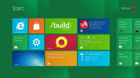
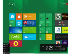
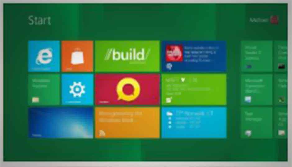
Once booted, the first thing you see is the new Start menu. It’s the most obvious part of the new “Metro” interface, with icons for Internet Explorer, the traditional desktop, Windows Explorer, the store, and more.
You can log into the computer normally, or use a Windows Live account. Your login name appears in the upper right hand corner of the first screen. From here, you can lock the computer, log off, or add other users. From the log off screen, you can also restart or shut down the computer.
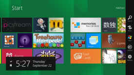
You can swipe from side to side to get to more icons, and a feature lets you pinch and see a “Semantic Zoom” thumbnail view of all the icons in groups. (It was shown at the conference, though it wasn’t working in this build.) You can select a tile to remove or unpin it, and theoretically move it elsewhere on the start screen by holding down with one finger while scrolling with the other. Again, that doesn’t seem to be working yet.
New applications written for the new Metro UI show up as tiles automatically. You can click on these to start the application.
The best thing about the tiles is that they can be “live,” with updated information appearing within them. For instance, Tweet@rama, a reasonable but basic Twitter client, shows the latest tweets in your feed, while Socialite, a Facebook client in which links don’t seem to work, shows photos of your Facebook contacts. A weather application, a stock application, and a news reader are constantly updated as well.
In the long run, this should result in a more useful start screen—one that can act as a dashboard for your applications. For desktop users, this may eventually turn out to be the biggest advantage of Windows 8, though it depends which applications really take advantage of it.
You can swipe from the left hand of the screen to show other running applications and drag them into the center to run them. By simply moving them out just a bit and holding them, you can pin them to either the left or right side of the screen. It takes a little practice to master placement of the applications, but it can be quite useful. For instance, you can pin the Twitter client next to the browser.
At any time, you can swipe from the right hand side of the screen to bring up a command menu. It lets you search or share content, return to the Start menu, control your devices, or change the settings on the system (such as logging on to a different network). This shows off one of the great new features of the Metro UI— the ability for applications to use common “contracts” to share and search. Using this, you can search the content of any application or share information via e-mail or a social network.
The Samsung tablet has a hardware Windows button below the screen that you can push to return to the start menu. A Windows button on a keyboard has the same function.
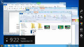
One of the tiles brings up the “desktop,” effectively the same desktop that Windows users used for years. On Intel- and AMD-based machines (x86), you should be able to run existing Windows applications. In my tests, the basic applications seemed to run just fine. Microsoft hasn’t been completely clear on this, but it seems like developers could cross-compile desktop applications for ARM-based versions of Windows, though we don’t know how well they would perform. Instead, Microsoft emphasizes creating new “Metro” applications that would work on both x86 and ARM-based systems.
In the desktop view, the Start menu remains in the lower left hand corner. Pressing it brings you to the main Windows 8 start screen. While it’s consistent, it doesn’t seem quite as convenient as simply bringing up a list of all your applications like in older versions of Windows. But, as in traditional Windows, I was able to pin applications to the task bar. You can add shortcuts to the Windows desktop, and those do help.
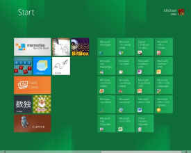
When you install new desktop applications, they typically show up on the Start screen, as expected. (Again, Microsoft showed how to easily reorder your Start Screen styles at Build, but it’s lacking from this version of the software.) I tried Microsoft Office and Live Essentials; both seemed to work just fine.
Missing from the desktop and the initial Start screen was a list of the traditional Windows accessories, such as notepad, paint, and the calculator. These are included in the operating system, but inconspicuous on the start menu.
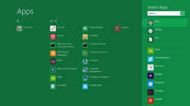
You can hit search, then choose Apps and see all of your applications— Metro apps, desktop apps, accessories, developer tools, etc.—and pick these from there. Alternatively, from the desktop, you can find them in the Windows/system32 folder. These all worked fine and once pinned to the task bar, were easy enough to bring up. However, it’s ambiguous. Similarly, you can use the Windows Explorer icon in the task bar to bring up your pictures, documents, and pictures, but it’s not as simple as it was when it was on the Start menu. These are things I hope Microsoft will address later.
The developer preview includes a number of sample Metro applications, ranging from a picture stream (Picstream) to alarms to a number of games. Again, these were mostly written by interns fairly quickly, so they lack some depth, but many of them are quite fun. Seemingly designed mostly to be examples, the real versions of the operating systems might shake them.
At this point, the Windows Store is inoperative, so you can’t add outside Metro apps. (Although of course, this being a developer release, you could create one.)
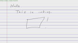
One of these applications, called Ink Pad, works with the pen included with the Samsung tablet. It shows how a pen can be used for more precise control than a mouse. When I tried this on a desktop, I was able to use the mouse to the same affect.
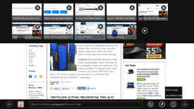
Windows 8 includes the Internet Explorer 10 web browser. In an interesting twist, there are actually two very different experiences for using it. From the Start menu, you bring up the Metro version, which looks like a tablet or smartphone browser, normally showing you the page with no menus or anything else around it. Swiping up from the bottom brings up a combined address and search bar; swiping down from the top brings up your recently opened windows and lets you see other “tabs.” (Although, it’s not really in a tabbed interface.)
In general, the browser seemed to work well, but there were fewer options than with desktop browsers. Holding the button to open a new tab gives you the option for InPrivate viewing and a document icon next to the search bar lets you “find on page” or “use the desktop view.” That’s important because the Metro version is so limited; it doesn’t have support for plug-ins,like Flash or even Silverlight, or even an obvious print button. However, printer makers are supposed to create “charms” so that you could pull up the side menu, and print from there.
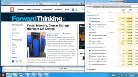
Hit the desktop view and you go to the desktop with the same page open. You get a more traditional desktop browser, complete with support for plug-ins (Flash support worked well), more privacy options, and developer tools for viewing the source.
On the desktop, or a laptop without a touch screen, the experience is a bit different. Of course, you use a mouse to scroll through the main start screen. You can pull up a start menu by positioning the mouse in the lower left hand corner and bringing up the search, share, devices and settings options. Obviously, a list of applications is missing.
Metro apps work with the mouse in pretty much the same way they would with a single finger, in some cases a right click acts as a replacement for swiping. For instance, in the Metro browser, right clicking brings up the address bar and the tab list. A mouse actually works better when you want to select text since its more accurate. Things you would normally do with multiple fingers, like zooming the page, just don’t seem to work.
Desktop applications, of course, have all been designed for a keyboard and mouse, and work exactly the way they always have. The traditional interface still seems better for multitaskingand for frequently moving information from one application to another.
Despite Microsoft’s insistence that Windows 8 is designed to work as well with a mouse and keyboard and with a touch screen, the preview experience just feels a bit awkward.
I think a lot of users of traditional desktops and notebooks, particularly business users, would like to be able to do much more from the desktop screen. – They’d definitely welcome an easier way to bring up commonly used applications and accessories. Many users would like an option to return to the more traditional start menu when you’re on the desktop. I realize Microsoft is trying to move users to the new Metro look, but plenty of users spend the bulk of their days in specific desktop applications and won’t move to the new UI any time soon.
In general, Windows 8 and the Metro UI look quite good on a tablet. They promise an experience that is notably different than Apple or Android tablets provide today. Microsoft needs to get more real applications written for that interface, but that’s why the company has provided a developer release in the first place.
Users of traditional, non-touch screen, desktops and laptops may like the Metro UI as well; it is simpler in many ways. Before this becomes ready for consumers, however, I’d like to see Microsoft simplify it for people who are used to the traditional desktop.
source:Windows 8: Sleek UI But Not Ready for the Desktop

