Asus ZenBook Pro 15 (UX580) and ZenBook Pro 14 (UX480) First Impressions: Something special for the creators
Asus has taken a shot at Apple's primary customer base for the MacBook Pro with the Zenbook Pro 15 and the Zenbook Pro 14 which both come with powerful specifications and features such as 132 percent sRGB and 100 percent AdobeRGB colour gamut and more

During their big announcements at Computex 2018, Asus announced two products that should be of particular interest to a lot of people. The new Zenbook Pro 15 (UX580) and Zenbook Pro 14 (UX480) are the newest additions to the Zenbook portfolio and are aimed squarely at content creators. For the longest time, photographers, video editors and 3D artist have had to choose either between big, bulky gaming machines or Apple’s MacBook Pro. Not a lot of laptops currently offer the powerful hardware required for crunching through terabytes of photo/video data. Additionally, extensive connectivity options and colour accurate displays are still very hard to find, so the Zenbook Pro 15 and Zenbook Pro 14 do fill in an existing gap in options, atleast on paper. We have some time with both the devices at Computex and here are our first impressions.
 Survey
The Hardware
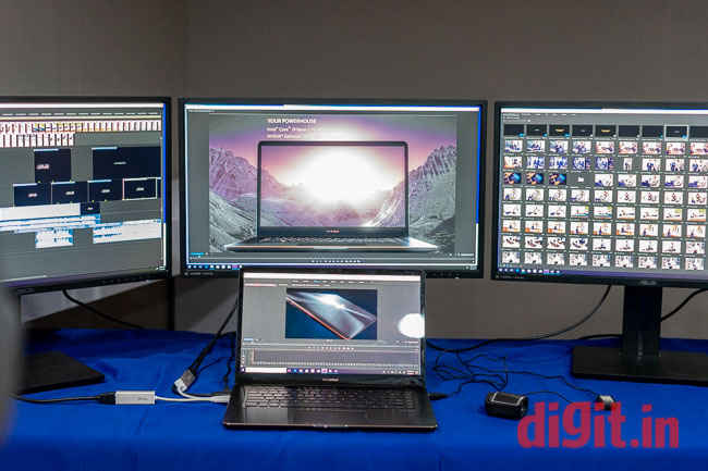
The first standout feature of the Zenbook Pro 15 isn’t its larger 15.6-inch near bezel-less display, but rather that it can be configured to ship with up to the newest 8th generation Intel Core i9 hexacore processor. Graphic intensive duties are performed by a GeForce® GTX 1050Ti GPU, and when it comes to storage, it can come with up to 1TB PCIe x4 SSD. The Zenbook Pro 14, in comparison, is slightly more modest, shipping with a maximum on Intel Core i7 processor mated to a Nvidia GeForce GTX 1050 MAX-Q gpu. Both the machines will come with the same maximum of 16GB DDR4 memory. Where the larger UX580 edges the smaller variant out is when it comes to connectivity options. On the Zenbook Pro UX580, you get two Thunderbolt 3.0 ports which allow you to connect up to 3 external displays with 4K resolution each. This is on top of the built-in 4K display which is Pantone verified and offers 132 percent sRGB and 100 percent AdobeRGB colour gamut. The smaller one only has a single Thunderbolt 3.0 port and comes with a full HD display, although the colour space and accuracy values remain. Both the displays have a ∆E (Delta-E) < 2.0 for colour accuracy, making them a great choice for photographers and colour grading artists right out of the box. We got to test a few different units of the Pro 15 and the Pro 14 with a colourimeter and we consistently got ∆E values of less than 2. Both the machines are definitely packed with the best hardware possible, with the Zenboo kPro UX580 being more of a powerhouse than the 14.
The Design
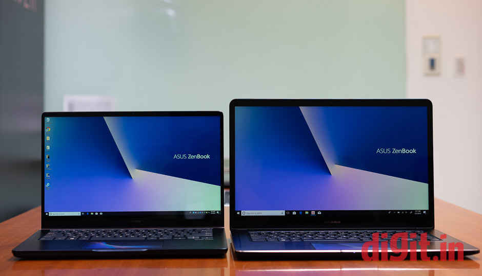
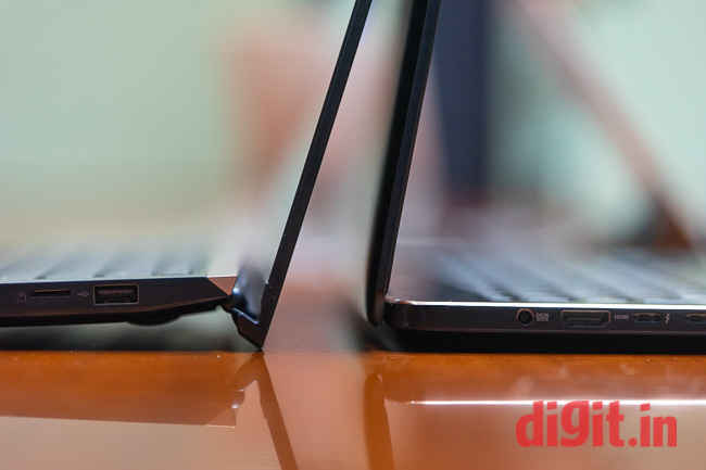
While both the machines share a very similar colour treatment and finish, they have two facets of design that set them apart. First is, of course, the screen size. The smaller 14-inch Zenbook Pro 14 fits into a 13-inch chassis, making it look smaller-than-normal when placed next to the bigger Pro 15. The second difference is in their hinge design. While the Zenbook Pro 15 has a standard hinged lid, the Zenbook Pro 14 has a V-shaped hinge which raises the body from the back by 5-degrees so as to improve airflow. When placed on a desk, the Pro 14 is also bound to offer better typing experience, given the slight raise. Other than that, the two machines look very similar, kind of like twins, with one being slightly bigger than the other. Sadly, only the Zenbook Pro 15 gets a fingerprint sensor, which is a shame, given that the Zenbook Pro 14 is just as premium.
Raising the “bar”
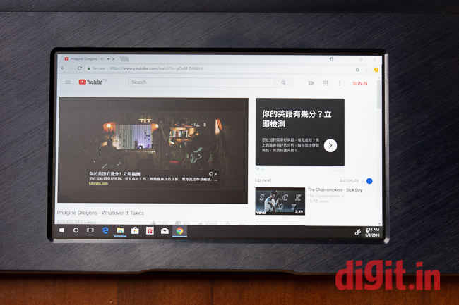
A big portion of the presentation and consequent hands-on experience was spent taking jibes at Apple’s TouchBar, which is still a topic that brings up polarizing views. Asus decided to take things a step further and introduce a full touchscreen-based touchpad, which they call the Screenpad. Essentially, they put a 5-inch touchscreen where the touchpad should be, but it is a little more thought out that that. For starters, you can apply wallpapers to the ScreenPad so that it doesn’t look like a boring surface. You can even turn the wallpaper off, in case you prefer boring over anything else. The ScreenPad can also function as a secondary display, although it doesn’t seem like it would be ideal for anything more than watching a YouTube clip here and there. Navigating content on the ScreenPad with the finger is almost impossible, so an external mouse is a must. Additionally, while it feels like a smartphone screen it doesn’t respond to the same gestures and taps your smartphone would. The third use of the ScreenPad comes in the form of apps that have been designed specifically for it. There are apps like calendar, calculator and a few others that have been designed to be easily accessible from the ScreenPad and work on that surface only.
The ScreenPad in our use felt like a very functional feature that needed maybe one or two aspects tweaked further for better usability. However, for a machine that’s aimed at creators, without integration of most frequently used applications such as the Adobe Suite or DaVinci Resolve, the ScreenPad will get relegated to one of those features that’s not really used a lot. It has to be said, however, that the ScreenPad surface has been treated to feel just like a regular, premium trackpad.
First Impressions
Speaking purely as a photographer and occasional film-maker, this writer can vouch for the lack of good-looking machines in the market that also packed enough power to cut through 4K footage not just in edit, but also in colour grading. Lugging around heavy and bulky gaming machines is not ideal, not to mention, never a great idea to open during a client meeting. Apple’s MacBook Pro is a great machine for artists, but if you’re hell-bent on staying with the Windows eco-system, there are very few options available. We also have machines from a few other manufacturers that are yet to arrive in India, but the Zenbook Pro UX 580 really does appear like it could juggle both work and play with ease. The Zenbook Pro 14 is obviously slightly less powerful and lighter, as Asus aims to woo artists who like to create on the move. While the initial impressions of both the devices are really positive, we will refrain from sharing any kind of verdict or indication of their effectiveness in a production workflow until they’ve been thoroughly tested.
Swapnil Mathur
Swapnil was Digit's resident camera nerd, (un)official product photographer and the Reviews Editor. Swapnil has moved-on to newer challenges. For any communication related to his stories, please mail us using the email id given here. View Full Profile


