Windows 8.1 Update 1: All you need to know about the new features
Just as a reminder, if you haven't, make sure you do it within 5 weeks to get future updates. But those who have already updated, here's what you need to know about the latest features.
The spring update to the latest operating system by Microsoft (Yes, Windows 8.1, no points for guessing) has been out for a while now. And for those of you who are still confused whether or not to go for it, here’s a detailed walkthrough of all the features it sports. Then you can decide if it’s worth it or not. Although we do recommend updating, since:
- Microsoft insists that you do it within the next 5 weeks. (Read more about this here)
- It’s free, and who doesn’t like free updates
- It doesn’t require you to take a backup and install, you simply update, restart and you are done. Not much of a hassle.
Without further ado, here are the new features in brief, and how the update overall will make it a more usable operating system for non-touch devices:
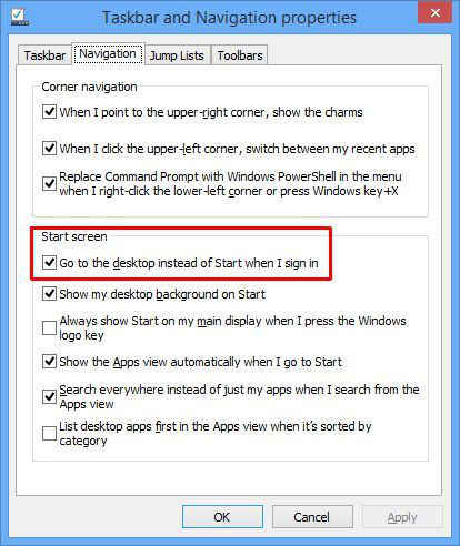
Boot to Desktop
Mouse-users rejoice! You finally don’t have to see the modern UI anymore when you boot your system. Although it still is the start menu, but booting directly to your desktop makes the look more bearable. And windows allows you to change this setting too, if you are a fan of the modern UI.
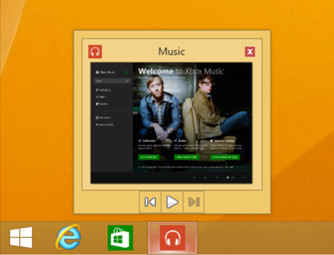
Modern UI Apps and the taskbar
You can now pin your modern applications to the taskbar. So both desktop and modern apps can be seen on your taskbar now. And what’s more is that you can see a preview just like when you hover over a desktop application pinned to taskbar. Also you can access the taskbar while using metro applications by moving your mouse pointer towards the lower end of the screen. So a win-win situation for non-touch devices.
The charms menu and the application switcher
The hot corners, as they are known, are there for the reason of making some shortcuts more accessible. But sometimes, an unintentional hover towards those corners and all these menus popping can be irritating. With the new update 1, this hatred can be reduced to some extent at the very least. To reduce the ‘false positives’ the OS takes a bit more time for triggering the charms menu and application bar when you move your mouse to the corners.
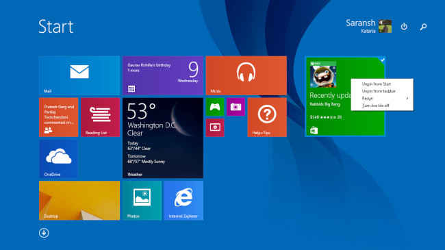
Right click context menus in start menu
A very important and simple addition has finally made its way into the update. You can now right click tiles in the start screen to access a context menu which offers various options. This gives the metro applications a more like desktop look and feel.
Although this is a welcome addition, but it has only been added to the start screen. The right click work doesn’t work anywhere else in the ecosystem, which is very inconsistent by Microsoft.
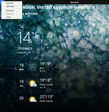
Modern application Title bar
This one has been a great addition. The modern applications now have a title bar which allows you to access various options like splitting, minimizing and also closing the application. When you move the mouse pointer to the top of the screen, a title bar appears.
Note that although the close button to the top right should behave as a close button, it actually suspends the application (it keeps running in the background). You can read more about it here.
Tweaks to start screen
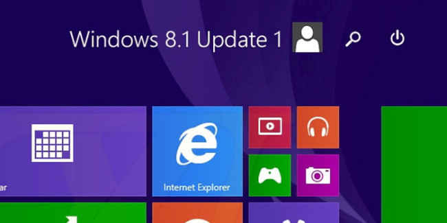
Many users were unable to follow how to use the power search on modern applications and also they weren’t able to find out a way to turn their machine off. Microsoft addressed this issue by adding dedicated power and search buttons to the top of the start screen, next to the user’s name and avatar.
Default applications are desktop applications
The default applications to launch in desktop mode were modern applications even if the user was using a non-touch based device. This made no sense and was irritating at times. This has been changed in the update and now the default applications set to launch are the desktop applications after the update.
Apart from all these changes, Microsoft had teased a revamped Start menu at Build, which is yet to make an appearance. Considering this update does not have it, it is very much possible to be revealed in the next update scheduled in May. If it does, expect a start menu comeback which will coincide with the Windows you are used to. Let’s see what happens in the future. Till now these are the major changes that the update has to offer.
Did you update? How do you find the experience? If not, after reading this post, are you going to?

