Windows 8.1: Is it finally worth the upgrade?
What do Windows 8 and Justin Bieber have in common? Well, apart from provoking extreme emotions, both give you the feeling that they haven’t quite matured yet.
Windows 7 was great. So great, in fact, that it quickly overtook its predecessor, the venerable Windows XP, to become the most used desktop OS in just two years. It improved on the mistakes of Vista and brought back the stability and reliability of Windows XP – something desktop users recognised and embraced. Things were going great. There were no more Blue Screens of Death, it was more secure and it ran just about anything you threw at it. We take for granted some of its newly introduced features – to the extend that it’s impossible to remember a time when they didn’t exist. Things such as ‘AeroSnap’, which would maximise a window simply by dragging it to the top edge of the screen, ‘Jump Lists’, which allowed you to pin your most used files to the application itself, libraries for organising all of your media and universal search right from within the Start menu are features you don’t know you need until you’ve used them. It was almost too good to last.
Windows 8 shortcomings
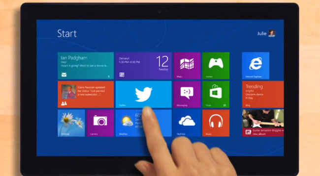
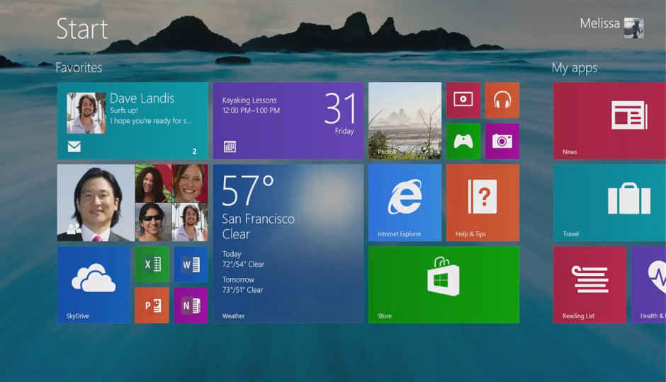
Microsoft had been trying to carve off a chunk of the mobile phone market with Windows Phone 7, but the fact that it was struggling was confirmed when it tried to shove the same ‘Metro’ (later, Modern) UI down our throats in the form of Windows 8. In the days leading up to the Windows 8 release, leaked screenshots and rumours showed what appeared to be a radical departure from the age-old desktop metaphor. Gone was the familiar Start button and the My Computer and Recycle Bin icons, which were replaced by large, bold and flat icons. The layout suggested a touch-first approach, so it came as no surprise to anyone that desktop users began to feel neglected by a company they’d stood behind for more than a decade.
To start with, the Windows 8 setup required you to sign in using a Microsoft/ Outlook/Hotmail account. Having your sacred PC forcefully tied to a cloud account (one that most of us had forgotten about, to be honest) wasn’t seen as a friendly move. On signing in, you were greeted by brightly coloured tiles, most of which accomplished nothing a browser couldn’t do. ‘Apps’ to check your mail, read the news, check the weather or look up directions on a map were redundant – these were things a Google search could do just as well, if not better. If you finally made it past the mess of a Start screen (Just WHY a desktop user would want horizontal scrolling is beyond us) and got to the ‘traditional’ desktop, you’d be in for a mild shock.
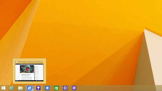
Windows 8 now lets users pin apps to taskbar
The Start button in the bottom-left corner is missing – a signature feature of Windows that had been a comforting presence since the days of Windows 95. Clicking on what should have been the Start button (or the Windows key, for power users) would lead you back to the Start screen. If you thought this was your only hurdle, good luck trying to do something as basic as shutting down or restarting your PC. We were embarrassed when we couldn’t figure it out on the first try, but it turns out we weren’t the only ones. If your mouse pointer lingered on one of the right-hand side corners, (such as while closing a window or going back to the desktop) you’d end up activating one of the ‘hot corners’ that would bring up the Charms menu. This housed shortcuts to Search, Settings, Devices and a Share option, which might have been useful on a tablet, but was downright annoying on a desktop.
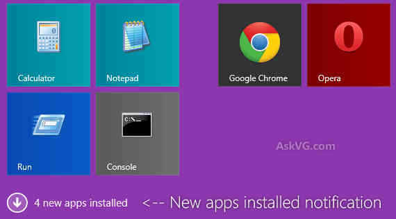
A handy notification informs you of newly installed apps instead of auto-adding them to the Start menu
The resulting outcry over Windows 8 was pretty loud – some compared it to Windows Vista while others said they preferred DOS (no, really). Microsoft was listening, so they tried to address some of users’ woes in the next point release. Windows 8.1 included a Start button, but this was a case of treating the symptom rather than the cause. Clicking on this new Start button would bring you back to the abomination that was the Start screen, so a real Start menu was still lacking. One notable improvement, though, was that Windows now included an option to boot straight to the desktop, if you’d rather avoid the Start screen. This, coupled with one of the many third-party replacements for the Start menu meant that Windows 8.1 was now usable again.
Windows 8.1 Update 1
Windows’ newest 8.1 iteration, Update 1, improves on the operating system’s attempt at making Windows 8 usable by adding many subtle features and enhancements, many of which are aimed at desktop users. Announced at Microsoft’s Build 2014 conference, Windows 8.1 Update 1 (can we just call it Windows 8.1.1 already?) brings the much needed improvements for mouse and keyboard- driven interaction on the Start screen. Scrolling through the list of tiles is easier and feels more natural, and the size of the app icons in the app list can be made smaller to accommodate more of them on a large desktop display. The full- screen Windows 8 apps can now be pinned to the Windows taskbar, which is now ever present (it auto-hides if you’re using a full screen app). Modern app also has a title bar which lets you conveniently minimise or close an app without hunting around for the right gesture. For those of you who spend a lot of time on the Start screen (if you’re using a touch-enabled laptop, for instance) you’ll be pleased to find a power button and a search button on the Start screen with this update.
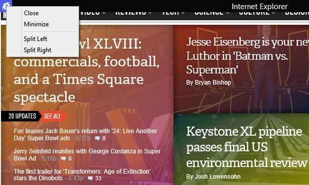
Windows 8 apps now have a title bar to quickly minimise or close apps
What really caught our attention with this update, though, is that Windows has become much smarter and more responsive. It recognises the type of device it’s running on – desktop PC, server, tablet or smartphone – by means of a setting in the firmware that’s specified by the manufacturer. This setting, called the Power Platform Role, tells Windows what type of device it’s running on, and Windows adjusts itself accordingly. If you’re using a desktop, for instance, Windows will automatically boot to the desktop, skipping the Start screen entirely. (This, and all other defaults can be changed by the user). That’s one setting less for someone who’s setting up a new Windows 8 machine. Similarly, the Search and Power icons on the Start screen aren’t universal – their presence depends on the size of the screen, and is a privilege reserved only for devices with generous amounts of screen real estate. Smaller tablets won’t see the setting, but larger tablets and laptops/desktops, will. The improved behaviour of Windows 8 apps shows just how much thought Microsoft has put into this update. For instance, only apps started with a mouse or a keyboard will have the Windows taskbar/title bar integration. If an app is started with a touch gesture, (even on a touchscreen laptop) it won’t sport this feature, as the system assumes you’re using the device as a tablet rather than a PC.
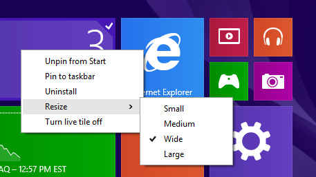
Right-clicking on a tile brings up a handy contextual menu
The annoying Hot Corners feature has been fixed in Windows 8.1 Update 1, which introduces a small (but significant) delay on mouseover before popping up the Charms menu.
Windows 8.1 Update 1 is, without doubt, the best iteration of Windows 8 so far, improving the operating system on nearly all fronts. The only area that could use some attention is the Start menu, but Microsoft is rumoured to be working on a Start menu replacement for its next update.
For now, one of the many Start menu replacements such as Start 8 or Classic Shell will do just fine. The better desktop integration for Windows 8 apps vis-a-vis the auto-hidden taskbar and title bar is a great step towards making Windows 8 apps more visible and accessible for desktop users. So far, the Windows 8 Store has been all but neglected by desktop users, but we’re hoping this update will change that and encourage developers to make better apps, now that they have a wider audience.
1. Access the taskbar from anywhere
The taskbar now auto-hides when you’re running a Windows 8 app that’s been started using a keyboard/mouse. This allows quick access to your open apps, the time, Wi-Fi signal strength and your battery-level, among other things.
2. Minimise/close full screen Windows 8 apps
Similarly, an auto-hidden title bar means that Windows 8 apps can be minimised or closed with ease, as opposed to guessing the right mouse gesture in Windows 8/8.1.
3. Pin Windows 8 apps to the desktop taskbar
Windows 8 apps are now more desktop-friendly, and can be pinned to the taskbar alongside regular Windows programs.
4. Boot to desktop – by default
Windows will now directly boot to the desktop on PCs and laptops, skipping the Start screen entirely. If you’d rather have it the old way, you can change this setting.
5. Right-click menu on Start screen
Right-clicking on a tile on the Start screen now gives you the option of pinning it to the Start screen or taskbar, or even completely uninstalling it. We can’t believe this feature didn’t exist earlier!
6. Be notified about app installations
It’s small details like this one that show how much effort Microsoft is really putting into improving Windows 8’s usability. Earlier, installing a new app or program would automatically add it to the Start screen, which would lead to the Start screen getting cluttered pretty quickly. That doesn’t seem to be the case anymore though, as a subtle notification informs the user of any newly installed apps with a link to the app drawer.
7. Find Power and Search buttons easily
We’re not sure why this wasn’t always the case with Windows 8, but the Start screen finally shows a Power and a Search button – so, no more fiddling around with the mouse trying find the correct pixel that will shut down your PC. The visibility of these buttons depends on the size and type of your device – smaller tablets and phones won’t show them, while bigger devices like laptops and desktops will.
8. Decrease app size
Another subtle improvement, the size of the app icons in the app drawer can now be decreased, allowing a greater number of apps to fit on the screen.
Should you upgrade?
The big question is, of course – should you update? The answer’s slightly complicated. If you’re perfectly happy with your Windows 7 setup and don’t want to go through the hassle of reinstalling your apps and reconfiguring your settings, there’s no need to update (particularly if your business has critical applications that depend on Windows 7 and would require extensive testing/ rewriting to ensure compatibility). Windows 7 will be supported until at least 2016, by which time Windows 9 should be out. If, however, you were previously on the fence about the upgrade, we say go for it. Windows 8 has finally reached a point where most of the annoying niggles have been ironed out. It’s also generally snappier than Windows 7 running on the same hardware, so there’s no real reason to hold back.

