
Wide Colour Gamut displays are now quite popular and available across several consumer devices ranging from smartphones, 4K HDR TVs, laptops and more. Innovations in display technology such as OLEDs, quantum dots, laser diodes, phosphors, and other narrow-band light sources have enabled displays to achieve a wider colour gamut which allows for a more faithful reproduction of vibrant colours. This offers content creators an expansive palette to better convey their artistic intent, which they may or may not use as backward compatibility with older generation devices is often a tradeoff.
However, consumers may find themselves misled by marketing jargon and technical specifications that don’t always tell the full story. In this article, we will discuss Wide Colour Gamut basics, how a WCG display will impact your experience, and how the WCG stats can sometimes be misleading. Let’s start with the basics.
What is colour?
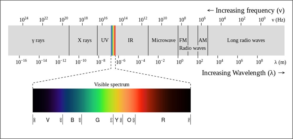
Visible light is just a small portion of the electromagnetic spectrum. So, how much do we really see?
Colour is essentially how our eyes perceive light reflected from different objects. This visible light is a small portion of the electromagnetic spectrum which is detected by the eyes and interpreted by our brain. So, it’s all inside our heads which also makes it a little difficult to objectify. This is also why colour science is referred to as psychophysical.
However, researchers have done their part and devised different colourimetric systems that help us geometrically represent colours in space – this is what we call a colour space.
Confused? Stay with me a bit longer, and let’s clarify that.
Also Check: RGB to Tandem OLED – 8 Different Types of OLED Display Technologies You Should Know About
For objectively measuring colours, we look at three components – Chroma, Hue, and Luminance.
- Hue – Hue is actually what most people mean when they say ‘colour’. This specifies if we are talking about red, green, blue, purple and so on.
- Chroma – Chroma is the intensity, richness or saturation of a hue. On the CIE Chromaticity Diagram, different hues are on the edges of the triangle. If you connect a hue on the edge, say 100% red to a point in the middle (white). You will be moving from 100% red (fully saturated) to White in the centre (unsaturated) as you decrease Chroma.
- Luminance – Luminance is the lightness or the darkness of a colour. At very low luminance levels, colours can appear washed out or dark, and may even be perceived as black. Conversely, at very high luminance levels, colours can become overpowered by brightness and may be perceived as white.
Where is luminance on the CIE Chromaticity Diagram? Well, it’s the third axis or dimension that can not be shown in a 2D diagram. Colours with luminance can be visualized in 3D colour volume graphs as shown below.
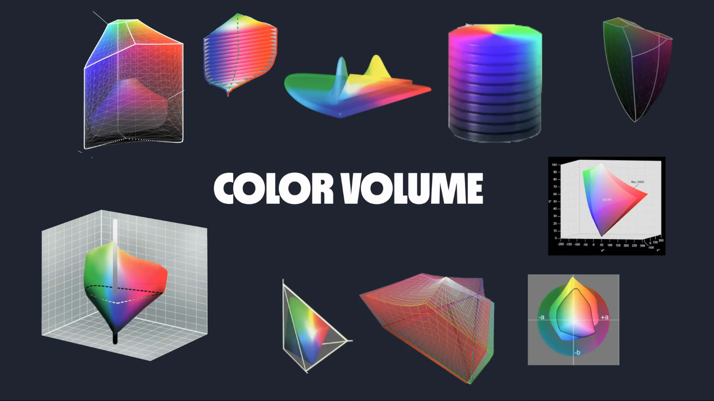
This luminance axis not visible on the Chromaticity diagram is a big limitation of Wide Colour Gamut display measurement because this way we do not get to judge the colour gamut the display can support at different brightness levels. We will address this in more detail in a bit.
Also Read: Dolby Vision and Dolby Vision IQ explained – What makes them better than HDR10 and HDR10+?
What is Wide Colour Space? How is it different from Wide Colour Gamut?
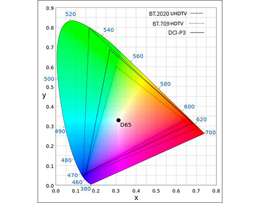
So, essentially, a Colour Space is the defined triangle on the CIE 1931 XY Chromaticity Diagram. Simply put, a wider colour space means a bigger triangle on the CIE Chromaticity Diagram.
Pure red in BT.2020, sRGB and DCI-P3 will be represented by (255,0,0) but the pure red of BT.2020 will be a different shade than sRGB or DCI-P3 due to the different primaries used in each colour space.
sRGB is the most common colour space used on the internet and for consumer devices like monitors, printers, and cameras. Any colour space larger than sRGB qualifies as a wide colour space. Modern cinema standard is to use DCI-P3 colours mapped within the BT.2020 container or using BT.2020 coordinates.
Also Read: What is VESA ClearMR certification and logo program? Here’s everything you should know
Any display that can reproduce a large portion of a Wide Colour Space qualifies as a Wide Colour Gamut display. The higher the bit depth of your display, the more brightness levels it can address and the more distinguishable shades of a colour it can display.
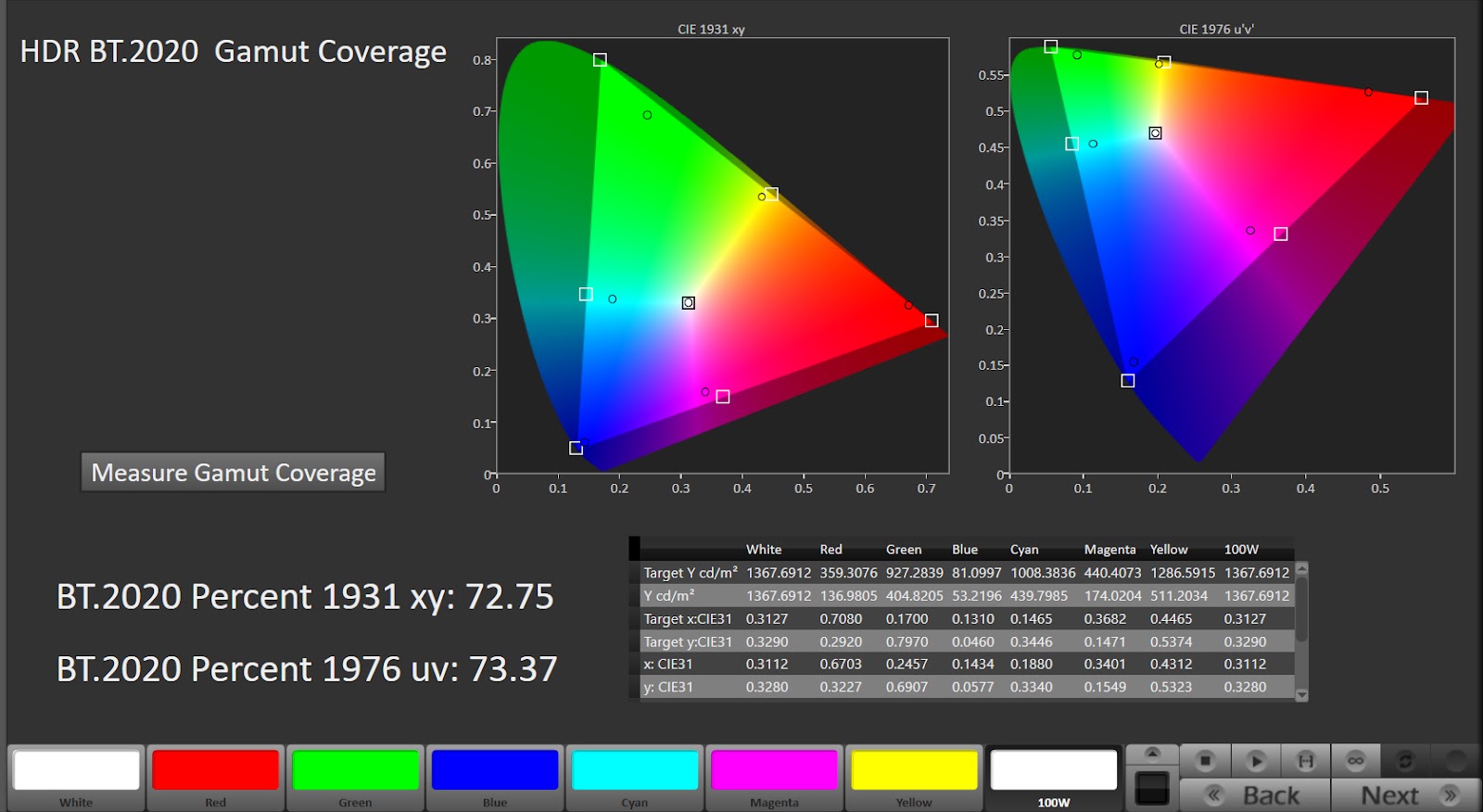
When we use the word “gamut,” we essentially refer to the ability of a device to reproduce a range of colours within a colour space. Typically, a display that can cover 90% or more of DCI-P3 or 95% or more of Adobe RGB is referred to as a wide-colour gamut display.
By “cover,” we mean the area within the chromaticity triangle it covers, as defined by joining the 100% Red, Blue, and Green vertices.
Why Wide Colour Gamut Percentages Can Be Misleading
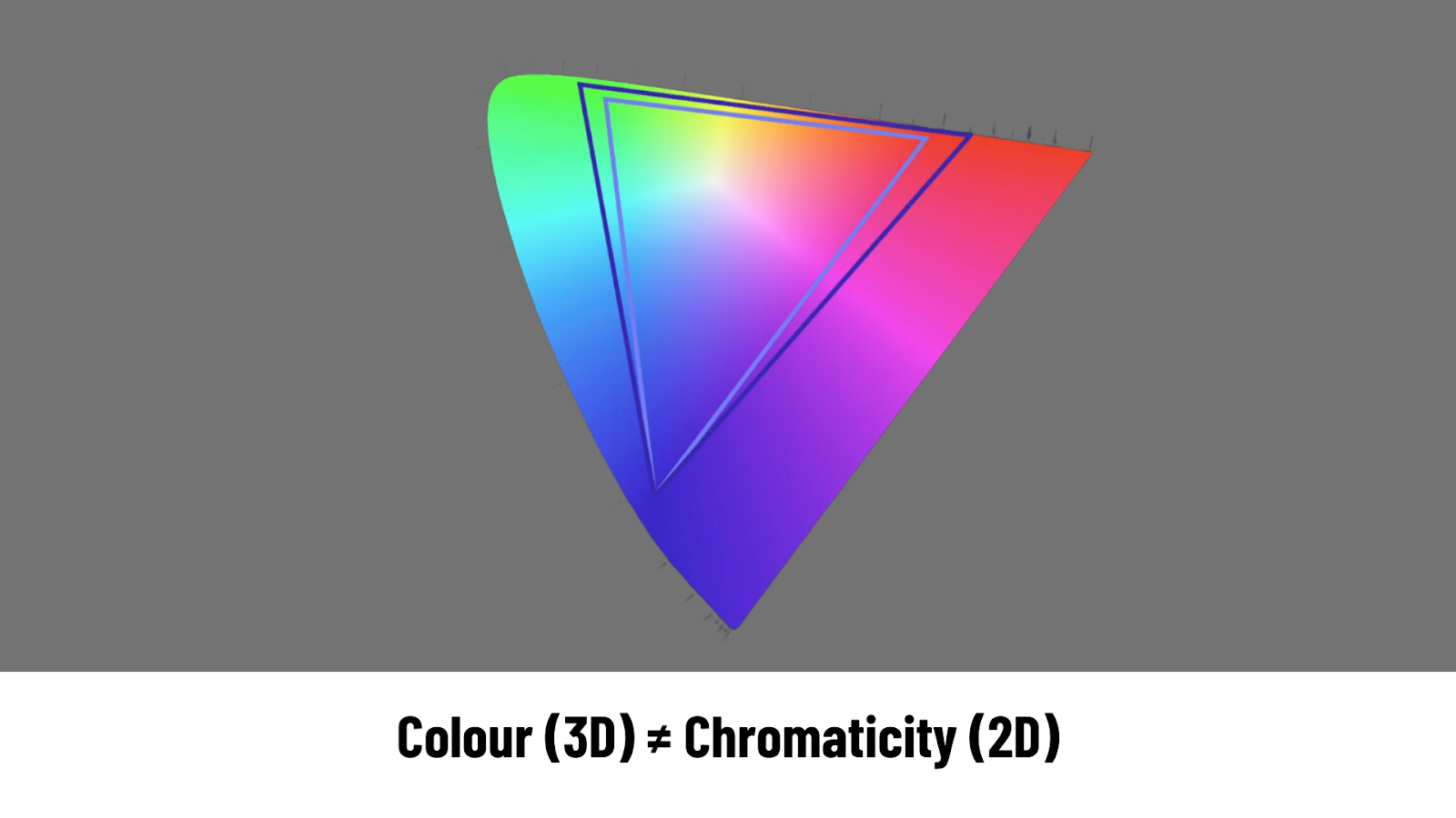
It is a general misconception that the 2D Chromaticity triangle whose area we measure to express the colour capability of a display encompasses all colours in the colour space. In fact, you won’t be able to spot even critical memory colours like skin tone shades, rust colour, forest green or the yellow of a banana peel on the chromaticity diagram!
This is because Chromaticity is 2D (Hue, Chroma) and is different from Colour which is 3D (Hue, Chroma, Luminance). The Chromaticity diagram overlooks luminance, a crucial dimension for mapping colours.
The true colour gamut is represented by colour volume charts as was recognised by CIE in 2021. Still, because these 3D colour volumes are difficult to compare across devices, comparing the areas covered by triangles on Chromaticity diagrams remains an accepted industry standard.
Also Read: Best Mini LED TVs to buy in India
The image below demonstrates the problem. As you can figure out, the Chromaticity Diagram for the three scenarios shows the same colours, but the actual scene differs. This could also be the case while viewing the same picture on three different displays.
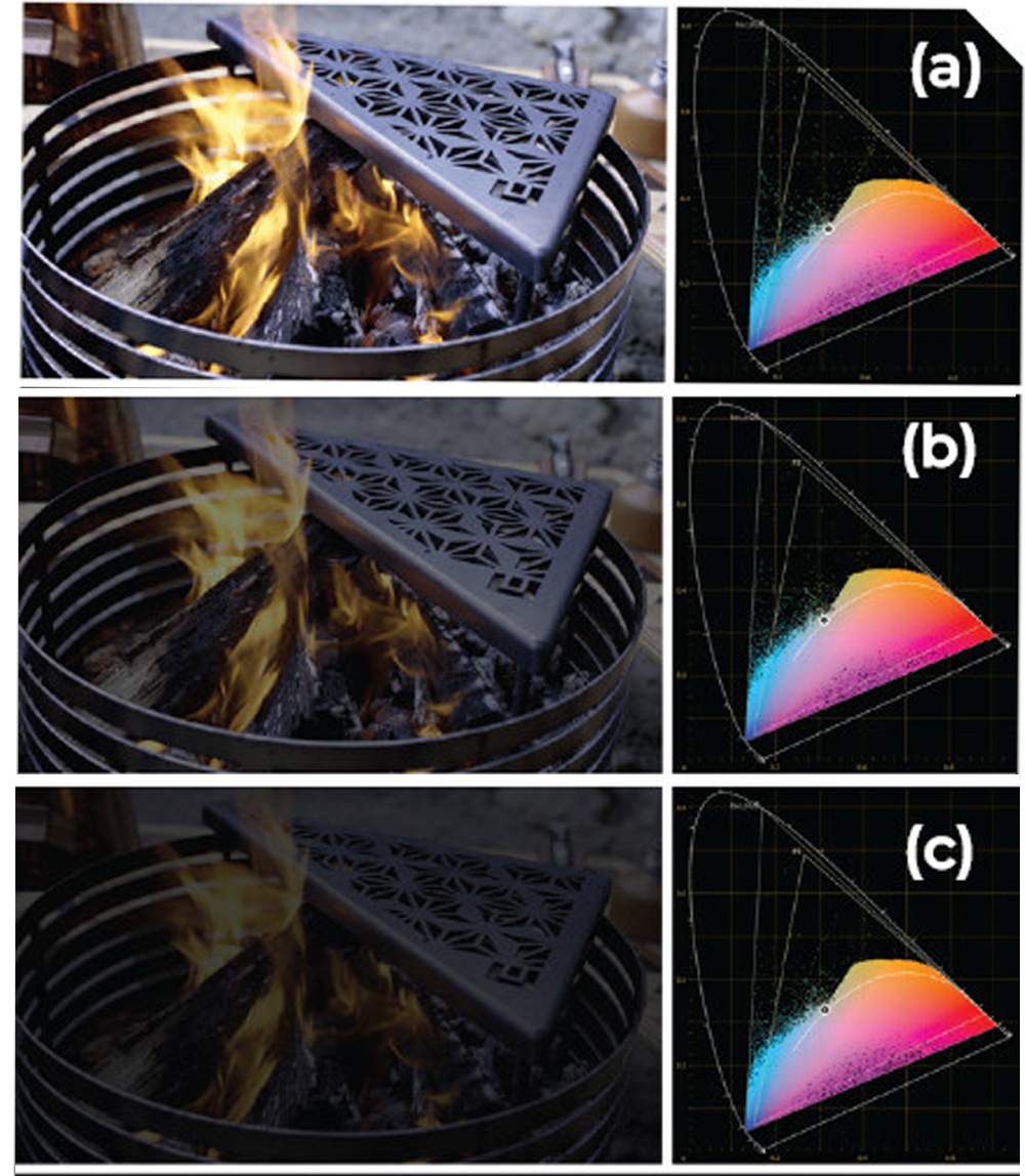
To address the problem, colour scientist Dr. Kenichiro Masaoka who also helped define the primary co-ordinates for BT2020 colour space developed a gamut ring scope that simultaneously visualises the distribution of lightness, chroma, and hue attributes in a single 2D diagram.
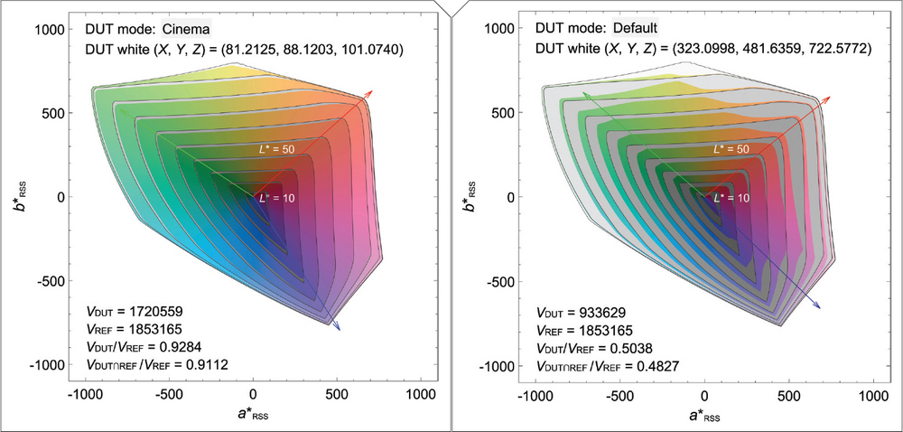
As you can see, grey areas represent where the device can’t meet the reference standard in terms of luminance and colours
The point is that stats like 99% DCI-P3 or 86% BT.2020 coverage can sometimes be misleading, and you should be cautious about purchasing displays based on seemingly impressive WCG specifications.
Also, the colour gamut of your display can shift with a change in colour temperature and colour profile that you are using. The coverage stats that manufacturers claim might not be true for the most colour-accurate profile.
Also Read: QNED vs QLED vs OLED TVs – What’s the difference?
Advantages of wide colour gamut displays
The imperfections in popular measuring techniques for a wide colour gamut do not mean that a wide colour gamut is not useful. Having wide colour gamut support means your display can be accurate and vibrant at the same time. This means consumers won’t feel the urge to switch to less accurate but punchy colour profiles, and most content can be viewed as intended. However, this requires proper software support for a wide colour gamut throughout the content and software pipeline.
While streaming properly graded HDR content, wide colour gamut colours make a noticeable difference, even when most colours are still chosen from the sRGB space. This becomes apparent when you compare the SDR and HDR grades side by side, making HDR useful even on TVs that may not offer high peak brightness or proper tone mapping.
While sRGB colours remain more prevalent, DCI-P3 adoption has increased across consumer hardware, and software is slowly following suit. Apple’s iOS and macOS, for instance, have DCI-P3 colours sprinkled throughout the OS, while Windows and Android are known to follow a relatively more conservative approach perhaps for backward compatibility.
Deepak Singh
Deepak is Editor at Digit. He is passionate about technology and has been keeping an eye on emerging technology trends for nearly a decade. When he is not working, he likes to read and to spend quality time with his family. View Full Profile