Our Windows 10 experience – first things we noticed about the latest OS

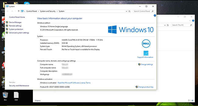
After about a few hours with the latest operating system, here’s what we noticed first about Windows 10!
We have known almost everything about what’s going to be new with Windows 10 for some time now, and here it is for us to experience. We’ve spent a couple of hours fidgeting around with it, and here’s our thought after some time of usage:
Speed
Windows 10 has been really, really fast till now. Booting to the desktop takes 35 seconds on average, including entering a 10-character password. We have been working with 22 tabs open on Chrome, Adobe Photoshop and VLC Player running in the background, and there is no hint of a stutter. Photoshop took about 25 seconds to launch after restart. Successive restarts of Photoshop took barely three seconds. Everything from navigating through folders to launching an application and playing a new movie is so far a breeze, and Windows 10 seems to be the most responsive Windows till date.
Layout
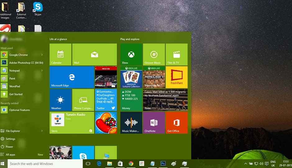
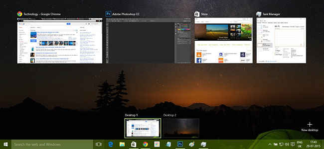
Microsoft has made a number of changes with Windows 10’s layout. The Start menu is back, featuring a look similar to Windows 8’s Start screen. Neatly categorized into a number of sections, the Start menu features live tiles for applications, a most-used listing and action shortcuts. The user account settings are on the top-left corner of the Start menu. The hidden Search and Actions panel that used to float in from the right in Windows 8 has been replaced by a universal Search panel on the taskbar, and a notifications panel that can be accessed from the System Icons tray. Notably, the notifications panel has a layout similar to Windows Mobile. Windows now has a new Task View feature – Mac-esque view that shows all the open and running windows in one screen.
The icons have been updated, and the windows now have narrow, redesigned borders. The Windows logo is also new, and there is added transparency in notifications and connections panels.
Edge
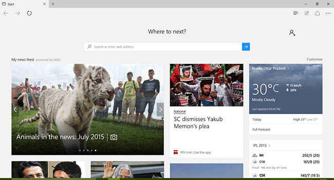
Microsoft’s new browser looks neat. Microsoft has really worked on refining layouts and making the entirety of Windows 10 look seamless. Browsing seems fast, and Microsoft has added InPrivate browsing mode – equivalent to Chrome’s Incognito. However, it isn’t as fast and smooth as Microsoft claimed. There were a couple of stutters while switching between tabs, and pages took comparatively more time to load than Chrome. It is, however, a huge upgrade over Internet Explorer, and it is a very noticeable upgrade over Microsoft’s old browser.
Other features
The welcome screen that precedes the sign-in screen while loading Windows gives you an option to like or dislike photos that come in automatic stream, which will lead to Microsoft providing you with a curated stream of photos on the welcome display.
There is also the new Action Centre, which has a mobile format layout, with all of its settings arranged into a grid. Notifications also appear in a mobile-like view. The Windows Store has been reshuffled and presented in a smoother format. Cortana? Not for India, as of now.
Microsoft seems to have done well with Windows 10. There still are a number of glitches, but with Microsoft having stated rolling updates to Windows 10, we can expect the gaps to be filled. Stay tuned for a further, detailed look into Windows 10.


