Vivaldi: a new Web browser rises to take on Google Chrome
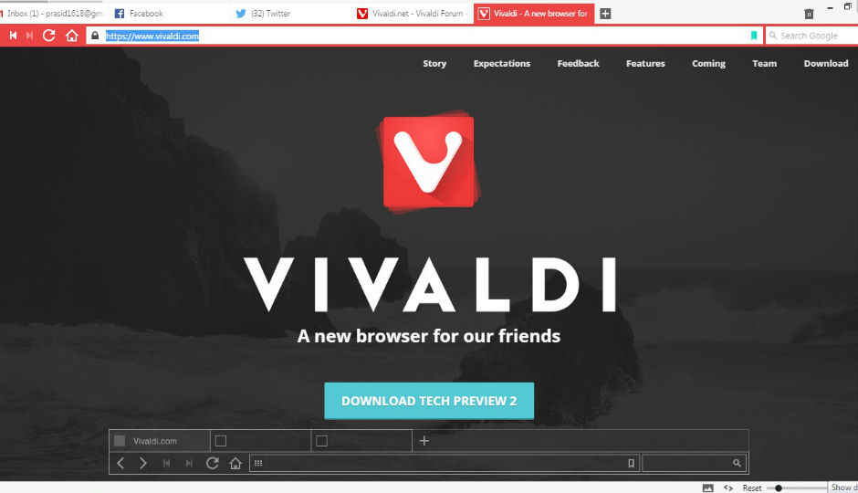
It's been a while since a new web browser has come into the market. Vivaldi looks to take on the entrenched Google Chrome.
The quest for the best Internet browser had seemingly been won by Google back in 2008, with the launch of Chrome for Windows. But let’s face it, even though almost all of us use Chrome as our primary browser, it’s far from being perfect. Microsoft’s upcoming Spartan browser may be a worthwhile competitor, but no one really knows yet. So, when an unknown browser named after one of the most famous composers in history comes to the party, you don’t exactly trust it.
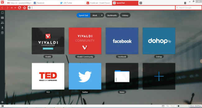
A few minutes with Vivaldi though and that perception starts to change. Of course, there’s a lot of work left and the software is only in its second tech preview right now, but Vivaldi shows signs of greatness. Based on the Chromium project, the browser is similar to Chrome in many ways. If you do plan to move from Chrome to Vivaldi, even if just to try it, you won’t have any issue.
Also, Vivaldi isn’t exactly an unknown product. The project is led by Jón von Tetzchner, former Opera CEO.
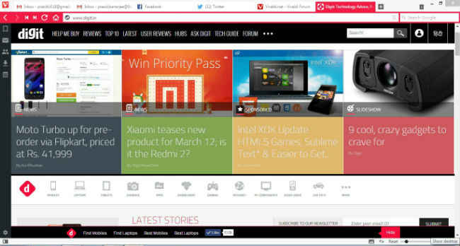
I miss the extensions for now, but the developers say they’re working on it. Their goal is to create a browser which doesn’t take up a lot of resources and is fast and easy to use. I’ve only used the browser for about three hours now and there are things that I do like a lot. For example, the browser employs a ‘Fast Forward’ and ‘Rewind’ buttons, in addition to the regular Back and Forward. These two buttons recognise whether the page you’re on has a related ‘next page’ and lets you toggle between them. Basically, you can flip through pages of search results on Google, without having to scroll all the way to the bottom every time. It doesn’t work with all websites right now, but should be fully functional in the final version.
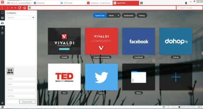
There’s also a mail functionality, which is being integrated into the browser right now. The Vivaldi developer team is still working on the mail feature, but being something I don’t need, I would be disappointed if it makes the browser heavier than I want it to be.
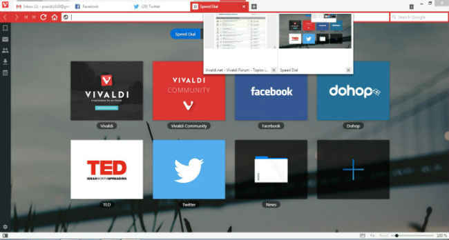
There are also features like stacking tabs on top of each other and taking down notes in the browser and a Firefox like Search box. The overall design is similar to Chrome, but Vivaldi is more colourful and a tab takes its colour from the icon of the webpage it's displaying. For example, opening Google Docs or Facebook turns your tab into a different shades of blue, while Gmail takes Red. Tabs not in use are always kept white.
Vivaldi says it's aimed at power users as well, which is perhaps why the spatial navigation feature has been included. When you’re on a web page, you can hold down the Shift key and use the arrow keys to navigate between links on the page. Keyboard users would appreciate this feature.
While the above mentioned features are promising, what Vivaldi really had working in its favour is something Chrome had originally done. When first using Chrome, I didn’t mind the shift from my then browser, since the new one gave me a better overall experience. I was thinking as a layman user and doing the same now, I really don’t mind using this browser. It brings a fresh new look and adds to what Google Chrome already gave me.
Of course, the finished product will decide whether I actually move or not, but not thinking like a ‘techie’ for a while, the most important thing in favour of Vivaldi is that it doesn’t make me learn anything new, yet gives me some new features.
On top of all that, the developers have also added support for Chrome Extensions, meaning you can download them directly off the Chrome Web Store and add them to Vivaldi. It seems a little glitchy now, but I see extensions like Pocket are already compatible.
It’s been a long time, but Google Chrome may finally have a true competitor, that not only us geeks, but the regular user, would also like. You can download the tech preview for Vivaldi here.

