Hands on with Windows 8 RTM
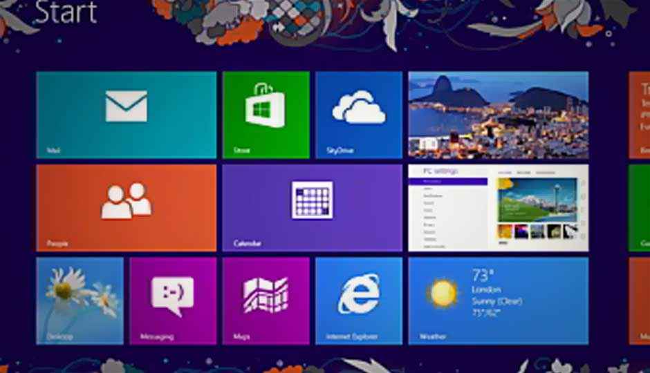
On August 1, Microsoft released Windows 8 to PC manufacturers. Starting August 15, developers can download this final build of the operating system from TechNet or MSDN and reviewers like me are finally allowed to write about the near-final version of Microsoft’s big gamble for the future of Windows. The public release of the operating system and PCs running it won’t happen until its General Availability on October 26. I got an early look, and tested the latest version of the OS by upgrading an Intel-based Windows 8 Samsung tablet to RTM. The public can still get a pretty close idea of what Microsoft’s re-imagining of Windows is like by downloading the Release Preview and installing it on any Windows 7–capable hardware.
Never has there been a more apt application of the acronym FUD—fear, uncertainty, and doubt—when it came to an approaching operating system. Uncertainty can certainly characterize a lot of people’s thoughts about Windows 8, and one of the main uncertainties is that they’re not sure whether it’s a tablet operating system or a desktop one…because it’s both. And that, for some reason, confuses people. Microsoft has often used the phrase “no compromises,” meaning you get the best of both worlds, but a lot of desktop users will feel that their Windows 8 interface is compromised in favor of touch tablets.
Anyone following the computer industry knows that Microsoft would have been foolish to carry on producing only a desktop-centric OS that ignores the sea surge moving computing to the tablet format, with Apple’s iPad in the vanguard. Microsoft made the bold choice of deciding to build one OS to rule them all, offering more than just a tablet OS as the iPad does. People clearly want tablets, but they also want PCs: Since its launch in 2009, Windows 7 has sold over 630 million licenses, compared with 84 million total iPads sold since its launch in 2010. Why not offer an OS for both platforms in one shot?
The tablet and touch friendly face of the OS, formerly called Metro, and now called simply Windows 8-style (and which I’ll call new-style to avoid confusion), can be used to launch the new set of Windows 8-style apps, which run full-screen and are designed for touch with simple and consisent interfaces. But it can also serve as a launcher for the desktop-style apps that Windows users have been accustomed to. In RTM, the Start screen tiles for desktop apps get a slight face-lift, with larger and in some cases redesigned icons.
Before delving into an analysis of Windows 8 RTM, which I’ve had just a day with at this point, let’s take a moment to enumerate what the new OS brings to the party for everyone:
- Much faster startup. Let’s be honest, there’s no comparison with the time it takes to start using an iPad versus a Windows 7 laptop. Windows 8 makes great strides towards eliminating this difference.
- New Start screen with live tiles that update with app info such as arriving emails, news items, weather, and stock tickers. Default apps are included that provide all this.
- Syncing with all your PCs through Microsoft account sign in. This capability syncs personalization preferences, Internet Explorer favorites, backgrounds, WiFi passwords and more with cloud-connected accounts.
- New App Store. The apps sold here will run on both Windows 8 tablets and full PCs. The apps will have to pass standards, and can be updated and installed on multiple PCs in your account (just as with the Mac App Store). They’ll also get the ability to connect with other apps for services like email or social network updating.
- Improved battery life for laptops as well as tablets.
- Faster Wi-Fi reconnect times.
- Faster graphics and text performance, thanks to hardware acceleration.
- A much improved Internet Explorer 10, with far better support for the new HTML5 standards and faster performance.
- New file folder window choices.
- New Task Manager
- Trusted Boot. This prevents malware from loading before the OS, on systems with UEFI boot. In general, security is much tighter in Windows 8 than in Windows 7 (though we’ve heard that song before).
- Built in Consumer apps—People, for social network contacts; Photos, Mail, Messaging, Calendar, Video,
- ISO mounting. The OS can now make a disc image file appear as a drive.
You’ll get all this and more for a mere $39.99 upgrade from Windows XP and later. And don’t forget that Windows 8 runs on any hardware that can runs Windows 7. It will also be able to run any programs that run under Windows 7, unless you opt for a Windows RT tablet, which will only run new-style Windows 8 apps.
What’s New in Windows 8 RTM vs. Release Preview?
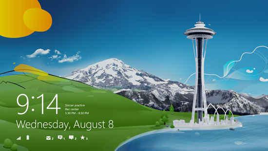
Very little changes from Windows 8 Release Preview to RTM. Microsoft has mostly squashed bugs and made performance improvements. But there are a few visual differences you’ll notice right after upgrading to RTM: The default lock screen now shows the Seattle Space Needle, with mountains in the background and a green hill that evokes the original Windows XP default desktop. And in the desktop view, we can finally see the “flattened” look of the new windows borders, which do away with the glassy transparency of Windows 7 interface elements.
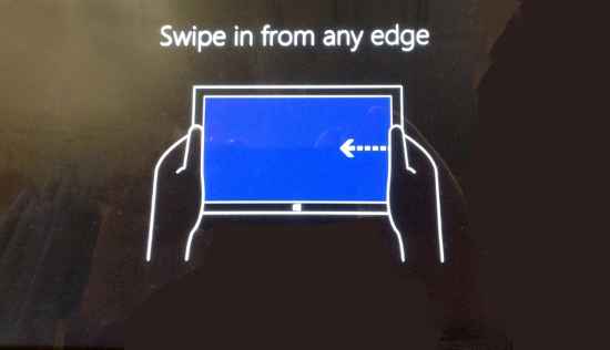
Something I consider extremely important for new Windows 8 users debuts in RTM the first time you log in: You’re now treated to a mini-tutorial on using Windows 8 during initial setup: Simple text and diagrams show you how to swipe in from the sides of the screen (if you’re on a tablet) or to move the mouse pointer to the corners of the screen if you’re using mouse and keyboard. Once users digest these two simple gesture types, they’ve got a lot of what’s needed to operate Windows 8 under their belts.
In another instance of new eye candy, 14 new personalization “tattoos” have been added for the Start screen. To choose one of these, head to PC Settings > Personalize > Start screen. These tattoos are variants on the background swirls behind the tiles of the Windows 8 Start screen. The new ones range from discreet brush strokes to some that are more colorful and elaborate than any we’ve seen up to now. Each tattoo is customized to match the basic color scheme you chose from the 25 options.
A new app-switching option has also been introduced in Windows 8 RTM: Instead of always having your last app pop in to take over the screen when you swipe in from the left, you can now set this action to just bring up the list of recently used apps in a left panel. These tiles formerly only appeared when you swiped in and out—a gesture that took me some time to discover. Changing the setting makes the full app list display whenever you swipe in from the left.
Visit page two to read about the Windows Store, and more…
Copyright © 2010 Ziff Davis Publishing Holdings Inc
The Store Is Open
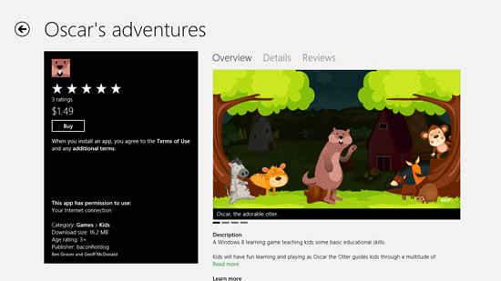
With RTM, you start seeing apps that actually have prices, and in another new tiny visual touch, the Store tile now includes the new Windows logo. Also new is the ability to start typing to search when in the store, just as you can when you’re at the Start screen. I only found a few apps with prices, including a $2.99 Feed Reader, a $1.99 Growth Tracker, and the $4.99 Surly Sudoku. The cheapest app I found was a game called Oscar’s Adventures. The most expensive was the $4.99 game mentioned, but Microsoft has confirmed that the highest price will be $999. The developers get a 70 percent share of the profits up to $25,000, after which they get 80 percent—10 percent more than Apple’s stores.
Setup
Aside from the new help at first run, the setup process for Windows 8 RTM is similar to that for Release Preview. When you first run the OS, you need to go through a four-step setup—Personalize, Wireless setup, Settings, and Sign in. Each step is very simple and uncluttered, using the readable Windows 8 sans serif Segoe font.
The choice of colors is one reason Microsoft decided to go with a new Windows logo that didn’t specify set colors. You just tap one of the 25 choices along a bar, and the background instantly changes to reflect your choice. The only other choice on this Personalize setup page is to enter a name for the device.
The Wireless setup is a matter of tapping your Wi-Fi SSID from the typical list showing signal strength bars, with an optional “Connect automatically” check box that’s checked by default. You can actually skip this step, but that will limit your Windows 8 experience. Hit Connect, and then you’re asked for a password if your router requires one. For a deeper dive into networking in Windows 8 read, Windows 8 Wireless Networking Secrets Revealed.
The Settings page of this initial setup process is more complex and text-heavy—unless you just use Express settings. That choice sets the device to automatically install updates; turns on malware protection; sends Microsoft usage data; lets apps access your location, name, and account picture, enables network sharing; and sets the localization to U.S. English. If you instead choose Customize, you are simply taken through a page for each of these choices. The only option you can’t turn off is to send usage info to Microsoft’s Customer Experience Improvement Program, which only makes sense, given that this is a free test version of the operating system.
Signing In
Next comes signing in. In order to download apps from the Windows Store and take advantage of the SkyDrive cloud service that stores files and photos and syncs your settings with other machines, you need to sign in with a Windows ID. You don’t have to sign in, and can sign in locally instead, but you’ll lose a lot of advantages of Windows 8 and apps designed to use these services. Even after you do log in with a Windows ID, you are asked for a mobile phone number or alternate email address, about which the setup says, “We’ll only use this info to help you recover your password and keep your account more secure.” Nevertheless, it seems similar to the way Facebook tries to verify your identity.
The Windows Start Interface
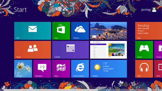
After you’re done setting up and signing it, you finally get your first look at the Windows 8 Start screen. This grid-like display of brightly colored rectangular “live tiles” is where you launch any apps, control settings, and enter the more traditional Windows desktop. The tiles are “live” because they flash information from the apps they represent—Mail shows the latest inbox items, Finance shows stock quotes, and so on. If you find this distracting, luckily you can turn it all off in PC Settings | Notifications.
After a shutdown and restart, you’ll see the lock screen (which will be familiar to any smart phone user). On this you can see battery charge, Wi-Fi signal strength, and notifications for email and any other apps you’ve allowed. A new type of notification for Windows 8 is the “toast” that pops in from the upper right if, for example, you have an incoming instant message. You can also boot from a USB stick or other external device or disc.
Visit page three to read about Windows 8 Gestures, Text, Keyboard, and more…
Copyright © 2010 Ziff Davis Publishing Holdings Inc
Gestures
A key Windows 8 concept for touch input is that the sides of the screen are for Windows, while the top and bottom are for the app you’re running. Swipe in from the right side, and you’ll see the Windows 8 “Charms”—or icons that give access to basic OS functions, including Search, Share, Start, Devices, and Settings. Using the mouse, you get to the charms by moving the pointer to the upper-right corner of your screen.
Swiping from the left edge of a touch screen or touch pad switches you to a previous running app, but also lets you pin a sidebar showing the apps content (formatted just for this space). You can easily swap the large and small views by swiping down from the top and moving the resulting smaller window. Swiping up from the bottom or down from the top opens an app’s own menu.
Windows 8 offers an advantage over both iOS and Lion—the ability to use a swipe gesture to give a peek at another running app. In iOS, you have to completely switch out of one app to take a look at another. Another advantage of Windows 8’s touch implementation for tablets is that you can do nearly everything with your thumbs. This makes sense for the way you hold a tablet. The gesture of swiping to show a sidebar populated with a second app works for full-blown Windows desktop apps, too. Of course, when in the desktop, you can use as many overlapping windows as you like, just as in Windows 7.
Semantic zoom is another helpful innovation. By using a pinch gesture on the Start screen, the app icons shrink, but not in the simple way you zoom out on a photo, the tiles resize to remain readable, and your groups of tiles stay together, all visible on one screen. This lets you do things like moving an app’s tile from the first to the last page without a lot of scrolling. Semantic zoom can also be implemented in apps; for example, when you pinch on the Sports app, the display condenses to a top-level menu.
Entering Text with Touch
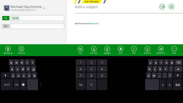
Windows 8’s on-screen keyboard springs up from the bottom of the screen whenever you touch a text entry field. It’s a very versatile tool, more so than other mobile operating systems’ equivalent. You can either use a full keyboard, a split keyboard suited to thumb entry, or stylus handwriting recognition mode. Unlike the iPad’s, Windows 8’s thumbing keyboard is resizable, with a small, medium, and large option. You also get system-wide spell correction.
Another input method supported by Windows 8 is pen input. In my testing, my writing was accurately converted to text. The stylus also makes sense if you want to use the Desktop interface on the road without benefit of keyboard and mouse.
An important note about touch input—the on-screen keyboard didn’t appear for me when I tried entering text in Desktop mode, but, thankfully, a keyboard icon in the system tray pops up the touch-screen keyboard. Now let’s look at what you can do with an actual keyboard and mouse.
Keyboard and Mouse Functions
Microsoft’s philosophy for mouse interaction with the OS is that the corners are key—previous versions of Windows’ Start button were in the lower-left corner, every app’s X to close its window was in the top right corner, the most important menu item was at the top left, and the Aero Peek button in Windows 7 is in the lower-right corner.
You can scroll the Start screen’s tiles simply by nudging the mouse cursor against the right side of the screen. With the first release, Developer Preview, you had to move the cursor down to the bottom edge of the screen and grab the scroll bar, or hit Ctrl-Right Arrow. You can still scroll the Start tiles with the mouse wheel, which I find handy.
Fans of keyboard shortcuts won’t be disappointed: Windows 8 includes a ton of very useful shortcuts, many of which take advantage of the Windows key. Hitting this by itself at any time takes you back the Start screen, and hitting it again returns you to your running app. The venerable Alt-F4 now closes any kind of Windows 8 app (as does slowly swiping to the bottom of the screen) Of particular interest to the tech journalist is the new screen capture feature, Windows Key PrtScn. A final very useful option is Ctrl-Shift-Esc, which opens the task manager. For more depth on what you can do with keyboard shortcuts in Windows 8, read my Windows 8 Keyboard and Mouse Tips.
Visit page four to read about the New Apps, IE10, and more…
Copyright © 2010 Ziff Davis Publishing Holdings Inc
Default Apps
With each preview release of Windows 8, we’ve gotten a new set of default new-style apps. They’re still subject to changes in the final release. RTM includes the same choice of default apps as the Release Preview had, with a few minor user interface tweaks—some of the tile images have changed, and the startup splashes no longer say “App Preview.”
RTM apps include Mail, Calendar, Internet Explorer 10, People, Photos, Maps, Messaging, Video, Music, and Camera. A few apps get their info from Bing—the slickly designed Bing app itself, News, Travel, Sports, and Finance. For windows services, there are the Windows Store, Xbox Live games, and SkyDrive cloud storage apps. The last in particular shows off a couple neat Windows 8 interface tricks. A right-click (or two-finger tap on a touchpad, or swipe down on a tablet) opens the app’s menu, which now shows large, touchable buttons for each sport—NFL, NBA, MLB, and so on. It offers a simple, clear way to get to the content that interests you.
The Music app adds support for Zune Pass, which lets you stream a huge selection of popular music for a monthly fee. Music can keep playing in the background while you’re doing other things on the tablet or PC. And if the machine slips into lock screen mode, the volume buttons bring up the music controls—pause play, next song, and so on. Similarly, you can buy or rent movies in the Video app via Zune Video. As in Windows Phone, you use Microsoft Points for these purchases.
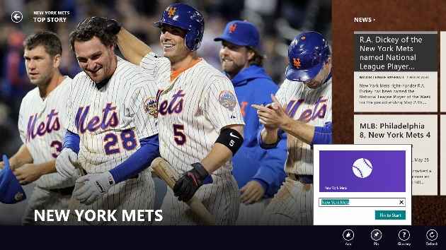
Another nifty thing you can do with apps is to pin subsections to the Start screen, rather than just pinning the whole app. So, for example, I could pin just the Mets team page of the Sports app, or just the MSFT stock symbol page from the Finance app. This lets me see important info like the team’s last game score or the stocks latest price right on its Start screen tile. Mail now lets you pin a particular inbox, and the People app lets you pin a particular person’s updates. Of course, these apps draw heavily from features of Microsoft’s search engine, Bing. The new Travel app lets you see info on destinations, panoramas, and travel articles.
Internet Explorer 10: Yes, It Has Flash!—Sort Of
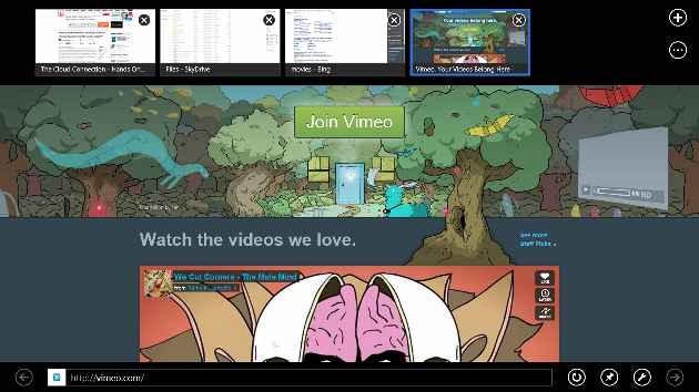
So the rumors that the new-style Windows 8 browser will support Adobe Flash turned out to be true. Well, partly true. Yes, you can go to the very popular sites that make use of Flash, but don’t expect that little hotel in Eleuthera’s Flash-heavy site to work. The Flash support in new-style IE will only display sites that are vetted and approved for a compatibility list. So Vimeo, yes, but Sunshade Resort, probably not. New-style IE10 uses a subset of Flash 11.3 optimized for touch, power, and security. This means you don’t get rollover, but this limited Flash support will work on both Intel and ARM-based devices.
Of course, IE is a tale of two browsers, the new-style Windows 8 and the desktop version. So, even though Flash is limited on the new-style IE, it is fully functioning on the desktop version. There’s also a new navigation option called Flip Ahead. This lets you swipe or the next most likely page on a Web site you’re browsing, without actually requiring you to click on the Next button or link. This feature, which echoes one available in the Opera browser, is off by default, so you’ll have to enable it in IE’s settings. Oh, and it’s new-style IE only, not desktop.
IE10 also improves vastly on IE9’s HTML5 support. On the HTML5Test.com site’s measure out of a maximum score of 500 based on the number of HTML5 features supported, IE10 gets 319 points, compared with 138 for IE9 and 437 for Chrome 21. The increase puts IE10 well within the realm of “modern” browsers.
Finally, IE10 will have Do Not Track turned on by default. The feature, designed to protect consumers from being profiled by prying ad networks, is available in Firefox and Safari, but not Google’s rising Chrome browser.
Visit page five to read about the Picture Passwords, Multi-Monitor, and more…
Copyright © 2010 Ziff Davis Publishing Holdings Inc
Picture Password
Picture password is a tablet-only option, a clever feature that saves you from having to type on your touch screen. To create a picture password, Tap Settings, then More PC Setting, and choose Users. From here, you can not only create the picture password, but also switch to a local account (without SkyDrive benefits), change your regular password, or create a 4-digit PIN that lets you quickly start, much as you can with iOS devices.
The first step is to actually choose your picture. Something with several objects and shapes is best. You then simply draw any combination of three circles, taps, or lines. You then repeat the pattern to confirm it, and, voilà. The first time I tried to sign in, my “password” wasn’t accepted, but it soon became second nature. The feature shows how deeply Microsoft has been thinking about touch interfaces, letting you log in with gestures rather than character entry. And for those worried about security, Microsoft has done the analysis that shows there are over a billion possible gesture combinations for this type of password.
Multi-Monitor Support
Microsoft has done some work on the multi-monitor support in Windows 8, and, indeed, using a two-screen setup seems ideal for one typical Windows 8 scenario: A tablet running the OS that docks into a workstation with keyboard and a larger monitor. With multi-monitor, the user could keep the Metro start screen on the smaller tablet screen, while the tradition desktop and all its business apps are displayed on the larger monitor.
Windows 8’s multi-monitor support even improves on what you get in Windows 7. You can use different background images on each monitor, stretch a wide image across them, and even play a slideshow using multiple monitors—for example one showing landscape-oriented photos, the other portrait. Windows 7 and earlier only allow the taskbar to live on one display (unless you were simply mirroring displays), but Windows 8 will let each screen get its own taskbar, either including all apps or just apps running on that display. An interesting point is that all these options are available only from the Desktop Control Panel; the new Windows 8 Controls still offer a less tunable “Project to a second screen” choice.
All of the monitors can display the Start, the Charms, or switch to other running apps by moving the cursor to the appropriate corners of the screen. You can even drag and drop new-style apps between monitors. The new Windows version also extends the sensitive area of screen corners, making it much easier to invoke the Charms or other screen-corner actions.
I tried all this multi-monitor goodness using a Samsung Series 9 ultrabook attached to a gorgeous 46-inch Samsung UN46ES8000F TV. The extended desktop image would have looked better with two similar-size monitors, and I could mix and match new-style and desktop apps on either screen. The ability to invoke the charms from either monitor was welcome, but sometimes slower than I’d like.
A little practice made this easier, but invoking the Charms or running app list does involve two separate motions. And my cursor did spill over to the left-hand monitor sometimes when I was trying to bring up the running app list. Swapping apps on the monitors was a snap with the Windows key-PgUp shortcut, but I couldn’t drag and drop new-style apps to the other monitor. I also wish you could launch apps from one screen’s Start page to another monitor, thus using one as a dashboard and the other as the work display.
Visit page five to read about the The Cloud Connection, Devices, Release, and more…
Copyright © 2010 Ziff Davis Publishing Holdings Inc
The Cloud Connection
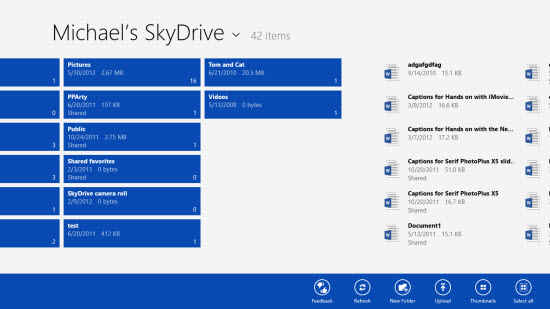
SkyDrive is Microsoft’s online storage service that offers anyone a free 7GB (25GB for longtime users). The new OS makes SkyDrive cloud storage and syncing service available to any Windows 8 app that wants to use it and that you allow to use it. The SkyDrive app itself gets a small start screen tile, and the app’s own interface used pages of tiles. This makes sense for touch interface, but I’d like to be able to switch to a more concise list view—there wasn’t even a semantic zoom view.
But Windows 8’s cloud capabilities go way beyond this simple SkyDrive app, and, indeed, you can always hop onto the more powerful Web interface of SkyDrive. The system integrates messaging and sharing throughout, using whatever communication services you’ve enabled. As with Chrome OS, when you sign into any Windows 8 PC, you’ll see all your same personalization, settings, and even apps.
SkyDrive now offers a synced folder, too, thanks to a desktop utility you can install in Windows 7. So any new or changed files in the synced folder or any of its subfolders will be accessible from any other device logged into the SkyDrive account.
Devices
The Devices charm is accessible by swiping in from the right on a touch screen or moving the mouse cursor to the upper right corner. From here I only saw the multi-monitor setup choice, but heading to the Devices section of PC Settings let me check for new hardware and connect Bluetooth mice, speakers, keyboards, and the like. It also lets you prevent device software from being downloaded when you’re using a metered mobile connection.
When I plugged a USB memory stick into the Windows 8 PC, a notification asked me whether I wanted to use it for backup, view its files or take no action. And when I plugged in an SD card loaded with photos, the OS knew enough to ask if I wanted to import the photos, and even created a new Album in the the Photos app for the newly imported images.
Waiting for General Availability
With each updated release of Windows 8, I feel more comfortable about its potential for acceptance among the general populace—despite the protestations of some tech pundits. True, hardcore power users lament the new OS’s inability to boot directly to the desktop, bypassing those “toy-like,” newfangled Windows 8 “apps” and Start screen. But there are plenty of benefits for those veteran PC users, too—a much faster boot, better security, and new file management tools.
Windows 8 is about the future, not the past. It introduces innovative touch input that even exceeds the iPad in some functions, such as the ability to view a second app in a sidebar and an easier way to see all running apps. The future is pointing strongly towards tablets, while desktops will remain essential tools. Microsoft is betting on its colossal base of Windows PC users to bolster its chances in this tablet-dominated future, while hoping that the drastic changes don’t alienate them. After the next holiday season passes, we’ll have an idea of whether this gamble has paid off.
Copyright © 2010 Ziff Davis Publishing Holdings Inc


