Hands on with the iPad mini
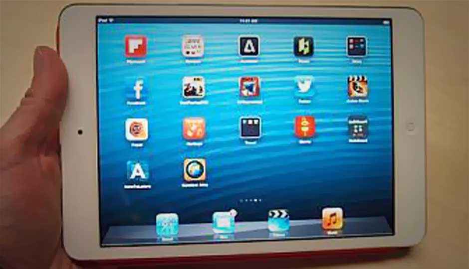
Apple's trying to create a new market with the iPad mini: premium small tablets. Its chief tools are the mini's spectacular, nearly surreal build quality and its amazing array of apps. But unlike other Apple products, the mini isn't necessarily a slam-dunk because of its high price and odd ergonomics. I spent a little while with it at the launch event; here's what I think.
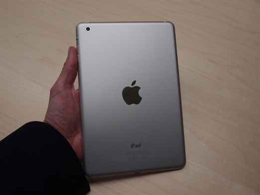
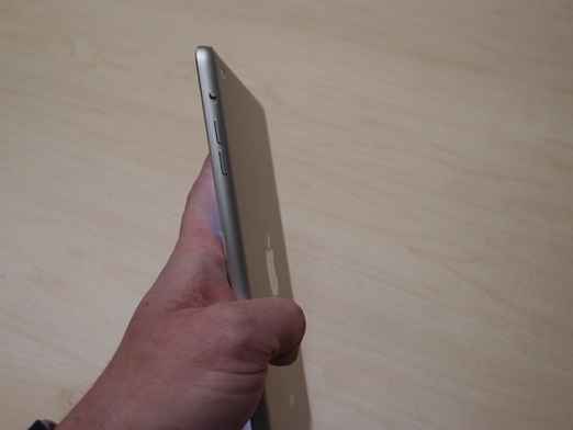
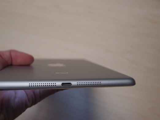
The Apple iPad mini may be the most beautifully built device I've ever seen. It's amazingly thin at 0.28 inches and whisper-light at 10.9 ounces; where the bright LCD screen joins the aluminum body there's a simple beveled metal edge, like on the edge of the iPhone 5. I kept thinking of the iPhone 5 when I was holding it, but also of the HTC One S, another example of sublime material design. It feels years ahead of the current iPad, and even of other high-quality metal tablets like the Asus Transformer series. It's amazing what an invisible seam can do. Every other tablet feels cheap now.
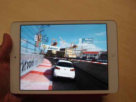
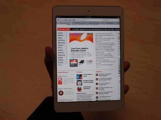
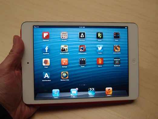
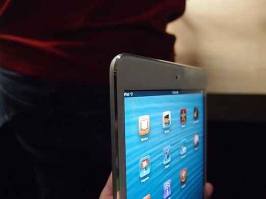
The device works almost exactly like a shrunken-down iPad 2. Same apps, same screen resolution, same performance. Everything's a little smaller and a little sharper than on the iPad 2 because the pixels are smaller, but it's not a Retina Display. It's not even as tight as the screen on the Kindle Fire HD.
Apple's making a big bet that the 275,000 iPad apps will make a difference here, and I think that's a good bet to make. As Apple showed on stage and as I've recounted several times, the 275,000 apps designed for Apple's iPad generally beat Android tablet apps, brutally. Seven-inch Android tablets have been able to coast along because blown-up phone apps don't look outright bad on their screens, the way they do on 10-inch tablets. But tablet apps look even better, and Apple's got more of 'em.
A Mini Tablet For a Maxi Hand
The mini makes two ergonomic missteps, though, which is surprising for Apple.
The first one is subtle, and worthy of further study. When developers write iPad apps, they assume a certain number of pixels per inch. Remember how Steve Jobs went on and on about iPad virtual buttons being just the right size for fingers? Fingers don't change, but the buttons just did, because the same number of pixels now covers less ground.
I found this to be a noticeable, but not overwhelming difference in apps like Kayak, Facebook, and CNN. The touch buttons are a little smaller. With the regular iPad, you don't have to move all that precisely; this little iPad demands a little more exactitude. It'll take some more time to find out whether this makes a noticeable difference in usability.
The iPad mini is also not a one-handed tablet. At 5.3 inches wide (to the Nexus 7's 4.7 inches), it's just too wide. The reality distortion field around this fact was unusually strong, but let's remember that Apple is selling the iPhone 5 as better than the competition at one-handed use specifically because of how narrow it is. Now here comes the iPad mini, which is a better one-handed tablet because … it's wider than the competition.
I know there are all different sizes of hands, and mine are pretty small. But there's no denying that the additional width makes a significant ergonomic difference, and it isn't in the iPad mini's favor. The very narrow bezel makes the problem worse, not better, as there's less of an area to grip the tablet by without activating the touch screen.
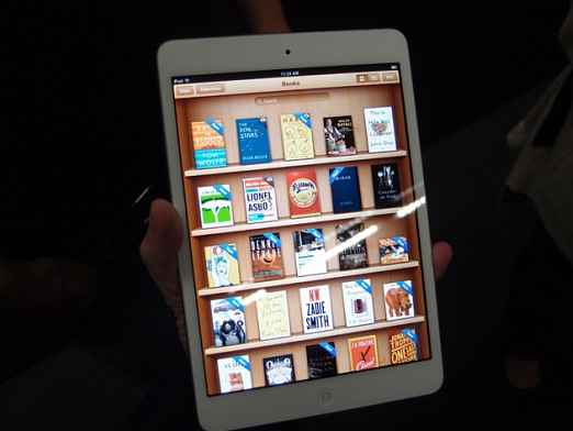
Unfocus yourself from that "one-handed" idea, though, and you see the iPad mini being a top tablet for kids, especially in education. It's a four-fifths-scale iPad; they're four-fifths-scale people. Apple reaches out to schools and helps design curricula, which often involve iPad-only apps. Savings from the lower price add up when you intend to buy in bulk and your choices are iPad or nothing, because only the iPad offers the educational books, apps and resources you want.
It's no concidence that Apple talked extensively about iBooks and schools during this product launch. They're the prime target.
Now, About That Price …
The iPad mini costs $329, which is a lot more than the $199 that Amazon and Google are charging for the Kindle Fire HD and Nexus 7. That's not fatal, though.
Apple is selling this as a premium small tablet, and if anyone can pull that off, Apple can. Apple thinks it can charge the premium for all of the well-known advantages its ecosystem has – not only the 275,000 apps, but the wide variety of accessories and the in-person support and sales experience at Apple Stores.
The stellar build quality is the physical element which should seal the deal on the price. To quote the highest praise from judges on "Project Runway," it feels expensive. This is critical. At $299 it would have been a deal; at $329, it has a chance.
Copyright © 2010 Ziff Davis Publishing Holdings Inc


