Featured RIA: FormCentral

Conducting surveys is yet another activity that stands to be greatly benefited by the internet. One no longer needs to go to people and encourage them to fill the survey, they can now do it at their convenience on their computer, all you need to do is share a link.
With online surveys, we lose out in the our physical presence while gathering responses to surveys, so it becomes important that the form be as rich and dynamic as possible to give the one filling the as much information and context as possible, with a good feedback if they are going wrong.
It is also important to be able to be able to manipulate the responses one gets in order to evaluate the responses better.
We will take a look at FormCental, a recently-released solution by Adobe that allows one to create rich forms that can easily be distributed. Adobe FormCentral aims to provides the tools necessary to create forms, distribute them, and analyze the resulting responses.
In its free tier, it allows one to evaluate the offering by letting them create one form that can be used to collect as many as 50 responses. Other paid tiers allow for the creation of more forms, and collection of more than 50 results, however the functionality remains the same.
Home Page
Adobe FormCentral is an Flash-based RIA that runs entirely in the browser. It has a rich clean interface that ties in well with their other acrobat.com services. For someone who has used other Adobe acrobat.com services such as Buzzword (online document editor), the way the FormCentral UI works will become readily apparent. Even for new users, the UI is responsive and reactive enough that it is not difficult to find your way around.
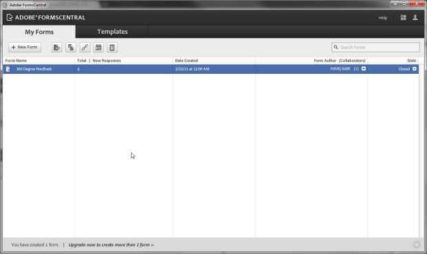
Logging into FormCental will directly take you to your Form list titles “My Forms”. This is where your form will appear, in a detailed list view. Above the list of forms is a toolbar for creating and working with forms. The toolbar allows you to create a new form, open an existing form, duplicate a form, copy the link to a form, open a form for viewing, and delete a form. These options are also available as context-menu actions for a form in the list. Opening a form is as simple as double-clicking it.
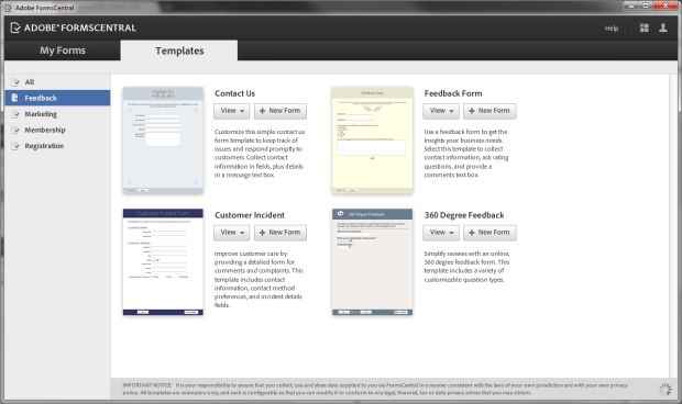
FormCentral also has a tab on the top of the interface for switching to the Template browsing mode. In this mode you can view a number of forms arranged in a grid, with options to test the template form, view it in the form editor (read-only), or create a new form based on the template.
Creating a new form for a template is made simple by having a button labelled “New Form” next to each template. Clicking on this button will immediately take you to the form editing interface, with the the template loaded for editing. One would expect that double-clicking a template preview would open it for editing, however this is not a supported interaction.
Creating Forms
The form designing / editing interface, provides rather clean interface. At the top of the interface are tabs for “Design”, “Test”, “Distribute”, and “View responses”. Editing forms is done in the design view.
In the design view the, below the tabs lie formatting tools that can change the appearance of text on the page. Here you can pick a form layout, and page background color as well. You can choose to have your on top of the form items, or left / right aligned to the left of the form items.
Following the footsteps of the other acrobat.com applications, Adobe FormCentral has a menu in the top-right corner of its interface, instead of the top-left. The top-left area instead displays the applications name, and the name of the open file / form. Also similar to other acrobat.com applications, the status bar is rich and dynamic. The status bar will display the authors currently viewing the document, and includes a button to share the document with others.
The interface for constructing forms is quite intuitive, even someone using the interface for the first time shouldn’t have a problem finding their way. Since the interface is WYSIWYG ‒ or at least WYSIWYM, since what you see is not exactly what you get ‒ there is nothing much to explain about how to go about editing the form. For the most part clicking, and double-clicking do what you’d expect, and right-clicking reveals the context menu for detailed actions.
You start off with a blank white page for creating your form (unless you used a template), and can insert new form elements by clicking on their icons in a panel, or by using the “Insert” menu.
A floating panel containing icons of the different form elements appears wherever you wish to insert a new form item ‒ by default at the bottom of the page. Most icons on the panel make it clear which kind of element it is and in case there is any ambiguity, hovering over the icon will show the name of element in the panel’s title area. Clicking a form item instantly inserts it into the layout, allowing you to edit the label for the form item.
Each form entry when selected shows a dotted border around it, to clearly highlight it as the selected entry. In this state, the app pops up a small floating box on the right of the form item that allows one to modify some of the parameters of the form items, such as whether the item is a required entry. The floating box also asks for additional attributes such as the kind of data the form item accepts (text, number, date), help-text related to the entry etc.
A selected form entry also displays a bin icon at the rightmost, to delete the item, and an area at the left-most end of the entry that can be dragged to change the order of text entries, and small button in the top-left corner, to add an entry before the field instead of after it.
There is a good visual connection between what you are working on, and the actions available, which makes the application quite easy to use.
Testing and distributing forms
While the interface of the application is entirely Flash-based, the forms generated by the application are standard HTML forms.
When you are done creating you form, you can use the “Test” tab to test out your form before making it live. The “Test” tab simply provides a link to the actual form page that you can click on to open your form in a new tab.
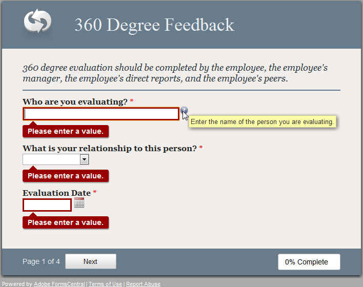
The forms themselves are rich, and provide good visual feedback for the data you enter. The form will validate your data before submitting it, not only on submitting the form but also on changing the page.
While testing, you can actually submit test data to see if everything is working fine, and to test how you can manipulate the data.
In the “Distribution” tab you can see a link to the form that you can post to people who need to participate in your survey. From here you can change the state of the form from Closed (not collecting responses) or Open (collecting responses). Here you can also specify the confirmation message for when the form is submitted, and also a message to display when the form is closed.
Viewing Responses
FormCentral has powerful views to manipulate the responses you collect. The responses you collect are presented to you in the form of a spreadsheet; you can add or remove sheets, and otherwise edit the content of the response table.
In fact, the “View Responses” page is the full-featured Tables editor that spreadsheet editing component of acrobat.com document editing suite, and includes all its powerful data manipulation tools.
Just like the spreadsheet app “Tables”, you can format the table of responses to your liking for printing or exporting.
The table editor includes a detail view, that opens a sidebar that displays details from the currently selected row ‒ this bit of UI can make it quite easy to see all the data of a form entry in one place.
The most interesting and powerful aspect of the application is its filters. FormCentral’s table editor has a powerful filter dialog that allows you to construct powerful filter operations for viewing only part of your data. Using the filter dialog is quite easy and intuitive, as it automatically uses table headings / form item labels instead of column numbers / letters.
Additionally, you can right-click on a column heading and click on “Filter…” to filter your data based on that parameter / field, or right click on any cell to filter based on that value.
For example, in a form with a large number of fields, you could right click on a row with gender as male, and choose to filter by that value, which will filter all male participants. After this you could do the same thing for marriage status, and filter in only married participants. The table will now contain only entries from people who are married and male.
Another great UI feature is that one can add summary rows that sum-up / average or otherwise provide overall data at the end of a table these rows will be exempt from filtering.
Conclusion
Adobe FormCentral is an easy-to use, intuitive RIA for designing forms. It works across technologies, as the application is in Flash, while the forms are in HTML, but it manages to retain the same appearance.
The use of animations and other visual cues in the interface make working with the application feel quite smooth, as there is immediate feedback for each action.
FormCentral includes a number of web-centric features such as sharing forms with others for collaborative editing, while still maintaining a desktop-like interface that anyone adept with computers will be able to explore with ease.
While the number of form entry options are limited, and branching is not possible, the filtering and visual layout features are indeed quite good. For a newcomer to FormCentral, or even one creating a web form for the first time, the interface is quite inviting. It manages to be clear and neat while still presenting the data and tools to manipulate your form data.


_2011-02-22_00-33-13-small.jpg)
_2011-02-22_00-34-21-small.jpg)

_2011-02-22_00-37-54-small.jpg)
_2011-02-22_00-40-31-small.jpg)
_2011-02-22_00-40-42-smalll.jpg)
_2011-02-22_00-59-48.png)
_2011-02-22_00-41-07-small.jpg)