In-car technology comparison: Ford v. Hyundai v. Honda v. Maruti v. Skoda v. Tata v. Toyota v. Volkswagen
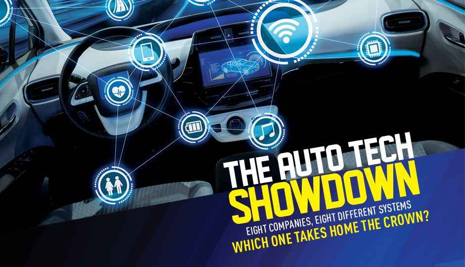
Eight different cars from eight of India's most popular car companies show the best in-car technology that each of these companies have on offer. Find out who takes home the crown.
The Indian auto industry has evolved manifold over the last few years. Gone are the days when the average car buyer in India would only focus on mileage and after-sales service. With a growing range of lifestyle choices, buyers in India are looking closer at what more can a car offer.
As a result, what we decided to do as an end-of-year adventure of sorts is to compare eight different infotainment systems from eight of the most popular car makers in India. Each of these systems happen to be the latest generation infotainment firmware available for the respective companies, and each present a different take on an in-car infotainment system. While some focus on simply delivering the core essentials, some of the others provide extra features that may make a difference once the novelty of buying a new car wears off.
It is also this factor that made testing the in-car technology packages very relevant. Once you have picked your car and shelled out the hard earned money, the experience and thrill of owning a new car tends to wear off in the congestion-ridden city rides. It is then that finer elements such as a superior audio system, electronically operated paraphernalia and other such features come into defining how happy you would be, with your car.
Our tests hence involved testing the infotainment systems in terms of the essential features on offer, refinement, ergonomics, distraction levels and additional elements in it. This gave us a good idea of how each stood in terms of providing all essentials, and some more to make them stand out among the rest.
With that, let the auto tech showdown begin!
Ford
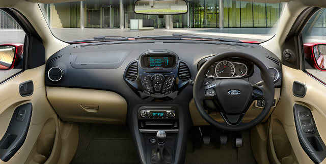
The Ford SYNC 2 infotainment firmware setup in the Aspire is utterly dated, and it is actually a bit of a surprise that Ford didn’t replace it with the SYNC 3 touchscreen system sooner. The existing setup gets a tiny duochrome display (blue on black), and is operated via plastic buttons on the central console. You get USB, Bluetooth and aux audio playback, along with handsfree telephony. There is an option to get app data by pairing your phone via the Ford SYNC app, but the setup itself is not intuitive.
Pros
Extremely easy to setup
Covers basic audio and telephony requirements
Cons
Too dated for the present day
Operating via the hard plastic buttons is tedious
No navigation or graphic data
No parking sensor
Bonus
None, really.
Score
Features: 4/10
Distraction: 9/10
Ergonomics: 4/10
Overall: 5.7/10
Honda
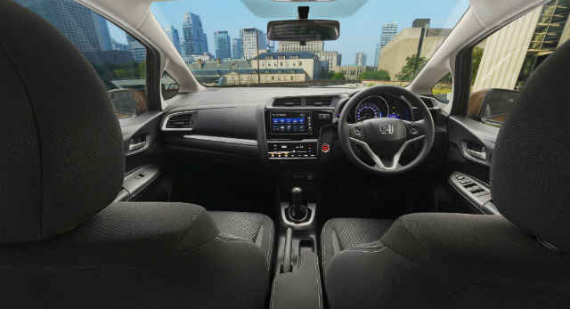
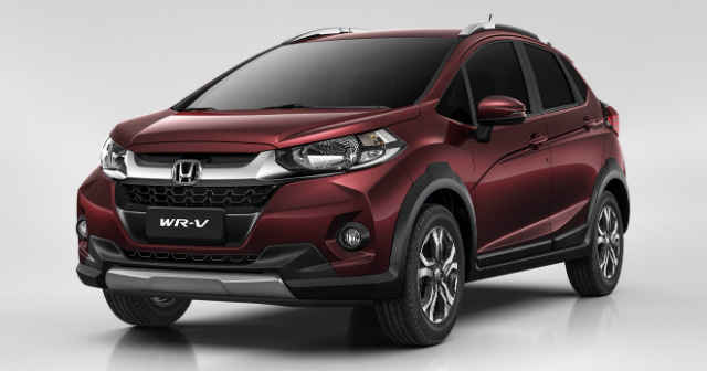
The new Honda DigiPad infotainment system, tested on the Honda WR-V crossover, is almost an Android smartphone in motion. However, it is laid out like an old Android smartphone, and as a result, there are errors that crop up in the system. For instance, our unit failed to connect to the Wi-Fi hotspot, and even when we did connect, the Internet browser failed to load webpages. However, we loved the familiarity and ease of the system’s interface, and how it covers almost every feature that you can think of in a car today. The nav setup is surprisingly accurate, and the overall system will give you more smiles than frowns.
Pros
Familiar, easy to use interface
Good combination of touchscreen and buttons
One of the most feature-loaded systems around
Highly ergonomic
Cons
Overall display quality looks slightly dull
Internet connectivity falters too often
Bonus
The HDMI port!
Score
Features: 8/10
Distraction: 6.5/10
Ergonomics: 7.5/10
Overall: 7.3/10
Hyundai
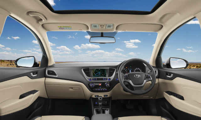
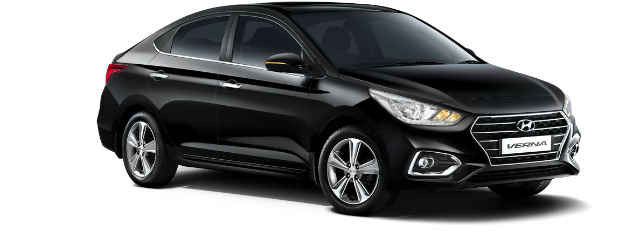
The Hyundai Verna stands for the best of what Hyundai has on offer, in a wonderfully balanced format. You get Bluetooth connectivity, along with USB and aux. The default interface itself is excellent, and that is coupled with Android Auto and Apple CarPlay to make the system complete. Alongside, you get integrated sat-nav that is highly accurate, all of which is further supplemented with voice commands and a high resolution display with fluid touch response. Furthermore, you get Arkamys audio enhancement, all of which makes the Hyundai Verna’s infotainment system the best equipped in its segment. The MID on the instrument cluster complements the main system very well.
Pros
Easy, ergonomic interface
The most complete suite of features
Well-integrated and user friendly
Excellent MID
Cons
Nothing, really!
Bonus
Cooled seats
Score
Features: 9/10
Distraction: 6.5/10
Ergonomics: 8/10
Overall: 8/10
Maruti Suzuki
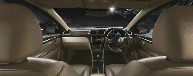
Maruti Suzuki went for a revamp to appeal more to lifestyle-centric buyers in the country, and the biggest flagbearer of its new generation of cars is the new Dzire. Inside, Maruti has equipped the Dzire with its new SmartPlay infotainment system, which goes for substance over style. While the design may not be the most appealing, Maruti has ensured that you get every feature that you may need while driving – handsfree calling, audio playback, navigation, easy access shortcuts, and even Android Auto and Apple CarPlay. The touch-based volume controls are not very intuitive, but the rest of the system just works, hence scoring high on practicality. In fact, the infotainment system itself makes the Dzire feel way more upmarket than before.
Pros
Simple tiled interface
Has everything you need on the go
Display is well placed for enhanced ergonomics
Cons
Interface looks a bit too basic
Noticeable lag in certain operations
Bonus
Only one of the two cars in its segment with Apple CarPlay
Score
Features: 7/10
Distraction: 7/10
Ergonomics: 7/10
Overall: 7/10
Skoda
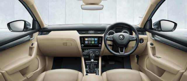
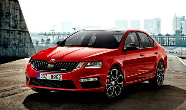
The Skoda Octavia has always been one of the most well-revered cars in its category, and the 2017 edition is no different. The new Skoda Octavia comes with a bigger, better touchscreen that also happens to be the smoothest to use. Add that to Apple CarPlay, Android Auto and MirrorLink, and you have one of the best designed and easiest infotainment systems in the market today. However, the India edition strangely misses out on navigation, even though you can get it via Android Auto. The Skoda Octavia’s infotainment system is also very well integrated with its MID, which actually removes any need to access the touchscreen system while driving.
Pros
One of the best designed systems around
Touch buttons are super responsive
Versatile MID removes distractions
Proximity sensor makes usage on the go easier
Cons
Surprisingly misses out on navigation
Bonus
Handsfree parking!
Score
Features: 8/10
Distraction: 7/10
Ergonomics: 6.5/10
Overall: 7.2/10
Tata Motors
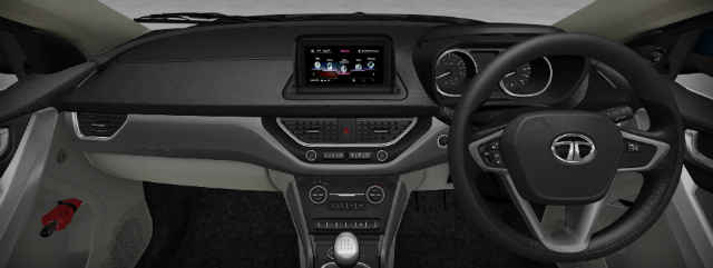
Tata’s new ConnectNext infotainment system is not just the best that it has made so far, it is one of the most improved infotainment systems from any company. The new setup is presented in a floating display format, which looks quite upmarket. Tata has presented finer features like matching the infotainment background with the driving mode, although they still haven’t managed to introduce their ConnectNext app suite to iOS. However, it now gets Android Auto, and Apple CarPlay should be introduced soon. As a result, the overall package feels a bit like work in progress, particularly seeing that a lot of its features are still being worked on.
Pros
Good UI design
Much more useable than before
Neatly arranged shortcuts
Cons
Apple CarPlay, iOS app suite still in works
No integrated navigation
Bonus
The Audi-like design
Score
Features: 6.5/10
Distraction: 6.5/10
Ergonomics: 7/10
Overall: 6.7/10
Toyota
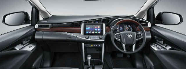
The Toyota Innova’s infotainment system includes one of the brightest infotainment displays that we have ever tested. However, we actually expected more out of it in terms of versatility and features. You do not get Android Auto or Apple CarPlay, and navigation is optional via SD card-mounted data. The audio setup is well adjustable, and handsfree telephony is fairly easy. However, the touch buttons did not really suit us well, and even after one full week of constant usage, we could not make it into a seamless habit and hence relied on the steering-mounted buttons. However, the MID includes most of the infotainment features and even a direction-guiding compass, which makes the overall level of distraction quite less.
Pros
Very bright display good for direct sunlight visibility
Excellent MID
Soothing ambient LEDs
Cons
No Android Auto, Apple CarPlay
Touch buttons are not entirely seamless
Only one USB port in a 7-seater car
Bonus
The infotainment system does not have a single physical button!
Score
Features: 7/10
Distraction: 6.5/10
Ergonomics: 6.5/10
Overall: 6.7/10
Volkswagen
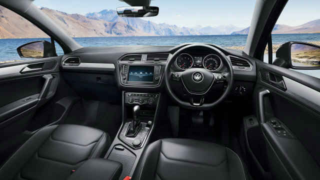
Our final entrant brings the best of what Volkswagen has on offer. While it does make for a reasonably well equipped infotainment setup, there is unfortunately nothing truly special about it. The overall interface feels austere, which means that you would end up taking more time to get used to the system, or just stick to using the basics. That said, there is an impeccable sense of finesse about the Volkswagen SmartLink+ firmware that many would love. This too performs similarly to the Skoda setup, although is a tad less refined in terms of the fonts and other peripherals.
Pros
Very well designed
Has all necessities
Does not distract
Cons
Fails to feel premium
Bonus
Suave German designing all the way
Score
Features: 7/10
Distraction: 7.5/10
Ergonomics: 7/10
Overall: 7.2/10
Winners
Winner: Hyundai (Verna)
With every factor taken into account, it is Hyundai’s infotainment setup which comes out at the top. The smooth blue background is fused with a high resolution display and a very friendly interface design. Furthermore, you get integrated satellite-based navigation, wireless connectivity, physical interfaces (USB, aux, SD card), and all of these combine to make this infotainment setup good enough to be used, without even needing Android Auto and Apple CarPlay.
You also get very well laid-out icons, and enhancements such as multiple languages, audio mood settings (along with equaliser), and a high definition rear view camera with dynamic guide rails. If the in-car infotainment setup is one of the biggest priorities for you when choosing a car, the Hyundai Verna (or Elantra) is about the best equipped car that you can get in India in its price segment.
Runner Up: Honda (WR-V)
While the best systems of Skoda and Volkswagen ran the competition close, it is Honda’s DigiPad — presently powering the WR-V and the 2017 City which comes second just after Hyundai. The Honda DigiPad system uses the Android interface really well, adding familiarity and ease of usage with every essential feature that you can think of, and even a little more.
These ‘little more’ elements include support for apps, Internet connectivity, an HDMI port, a photo viewer, and even a sunroof. It comes second only because of the few erratic flaws and a rather dated interface, but that still does not stop it from being one of the very best.
Special Mention: Skoda (Octavia)
The Skoda Octavia missed out primarily owing to the absence of integrated navigation services. The SmartLink+ infotainment system is the best in terms of display quality and usability, but there are way too many omissions made from the European feature list. It still works like a charm if you do not rely much on the onboard navigation services anyway, but we deem it to be a necessity, particularly from a system which happens to be the best that a company has on offer at the moment.

