Discovering the tech inside the Tata Safari Storme

Without doubt, the Tata Safari was an excellent off-roader, in the rough sort of way that got you closer to the driving experience. The SUV has been given a makeover. We check out the Tata Safari Storme, in the new Explorer trim.
Contrary to general perception, the Tata Safari Storme is not a minor facelift or a “refresh”. The Storme is pretty much a new car, with a new platform, new power plant, fresh design philosophy and very different driving characteristics. This is almost nothing like the Tata Safari you have been used to seeing, and driving.
In simple terms, the Safari has always been an unpretentious thoroughbred SUV. Just for the perspective of numbers, the Safari Storme is double the kerb weight of the Renault Duster, and has more ground clearance than the Mahindra Scorpio and the XUV 500.
I had a chance to drive this proper, affordable SUV for a few days. Here’s what I thought.
Tech upgrades: Tata Motors seems to be understanding the need for geeky stuff!
It’s good to see Tata Motors working on bringing the Safari closer to its rivals in terms of the tech bits inside the car. For a while, the Safari did feel like the unloved beast, with a very basic feature set. It had essentially, a bunch of knobs that did the basic tasks, and that was that. However, things have changed now.
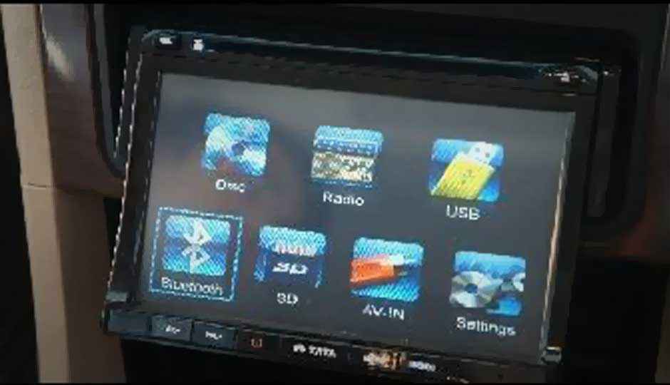
There is a now a 2-din touchscreen unit, with a phone pairing feature via Bluetooth. When you pair a phone to it for the first time, the phonebook gets synced to the on-board memory. Happily enough, this contacts list can only be accessed if that particular phone is connected to the system – which is a good privacy and security aspect. We connected an HTC One to the system, and the hook-up was smooth. The first time it did that, there was a prompt on the phone to allow the system to access the phonebook. After giving it the permission, the system showed that the contacts were syncing. For around 700 contacts on the device, the process took just a bit more than a minute.
There are two ways through which you can make a call – use the phone itself to make the call, or the number-pad on the touchscreen. This is also the case when receiving a call. However, we couldn’t find a way to see the contacts list on the system, like on Ford’s Sync (EcoSport) and Fiat’s Blue & Me (Punto and Linea). The addition of that feature would have definitely made this a more sophisticated setup to use. At the moment, what this just helps is in identifying the incoming call party, or if you want to see the last dialed numbers. Unlike Sync and Blue & Me, Tata’s system at the moment has no voice command control, but considering the accent and pronunciation issues most similar systems face, we aren’t really missing that.
For music playback, we connected an iPod Touch, and again, the setup was quick and smooth. The playback – pause/play, next/previous track and volume can be controlled via the touchscreen or the steering column’s right hand side lever, which also doubles up as the headlight control! The system offers good sound quality, but most purists would prefer an amplifier and sub-woofer after-market installation.
All in all, while we appreciate that Tata Motors did understand the need to add some geeky stuff to their high-end vehicles, it is still very much the very first step in that refresh cycle. If at all the company is willing to go through with this, then something like the Ford Sync would be the ideal benchmark to try and achieve. The current 2-din system feels like an afterthought and an after-market addition, and the future implementations need to integrate the setup better into the dash.
.jpg) |
Media & Phone |
.jpg) |
Not the traditional steering controls Not the typical deployment of the media playback (volume etc.) controls for the driver, on the steering, but on the right hand side stalk, which also doubles up as the headlight control. Leaves the steering looking clean, and is usable as well – neat concept. |
Back to the basics: A new platform
This is possibly the biggest transformation that Tata Motors could have given to the Safari. Between the Dicor version and this one, there really isn’t much that’s similar, apart from the heritage. The Storme starts off from the new hydroformed body-on-frame X2 platform that Tata has been working on. For the uninitiated, ‘hydroforming’ is a specialized die-forming process which involves the use of high-pressure hydraulic fluid that lends shape to the chassis components. The first car to get this was the Aria MPV, and the improvements over the platform that the Safari Dicor uses are immense.
.jpg)
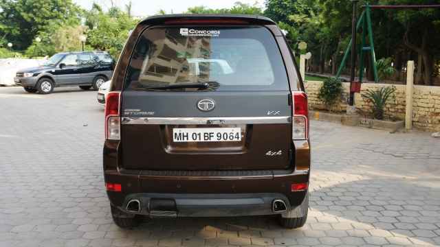
The tall stance of the Safari Storme gives it an imposing look. The benefit of that is the unbelievable amount of headroom inside.
Driving experience: The proper SUV, it remains
The advantage is a stiffer setup resulting in less body roll and more consistent driving characteristics. True to the promise, the Storme feels a lot less wallowy than the Dicor under braking and when going around a bend. This makes it a lot more assured to drive, unlike the Dicor version. The Power delivery is a lot smoother, and most of the grunt is at the lower end, making this quite responsive in start-stop traffic. The high seating position, and the low rise glass line gives you an extremely good view of the world around you, particularly the road.
.jpg)
The Varicor engine is much better than the Dicor in terms of lower end grunt, and the better acceleration in heavy traffic. The ground clearance levels is among the highest across all SUVs, irrespective of the price.
The Storme is undoubtedly a massive improvement over the Dicor version in terms of drivability, but there are a couple of issues. The steering response is rather inconsistent. There are times when you get the exact response you need while turning the car into a corner, and at other times, there is a slight hesitation – a muscle car personality, if I may. Admittedly, you get used to it as you drive more and more, but it is enough to put off those who pray to the Gods of Precision. Secondly, while the engine growls beautifully till around 60kmph / 2800rpm, it just sounds coarse after that. Maybe that can be tweaked in the next update to sound better.
.jpg) |
Projector Headlamps Not many cars offer projector headlamps as a factory fitted accessory. The sharp design is a massive shift from the curvy design on the Safari Dicor. Good throw, and cuts through the dust that is usually thrown up by the car ahead, on bad roads. Incidentally, a key on the remote lets you switch on the car’s headlights, if you happen to get lost in the parking. |
.jpg) |
The Explorer! The special edition Safari Storme easily stands out, with this decal on the hood and the C-pillar on one side. Surely, this is the best way to advertise the fact that you love an adventure! |
Room for improvement
We appreciate Tata Motors’ idea behind the upgrades, but there is room for improvement. First, the touchscreen system at the moment looks like an afterthought. A better integration is needed, to make it blend in better. Second, the aim should be to achieve something closer to the Sync setup that Ford has. It is good that Tata is not neglecting the geek aspect while upgrading the Safari, but there is still a long way to go.


