A look at the Windows 8 Developer Preview

Microsoft seems to have taken a page from the Linux book by releasing such an early version of Windows publically. We take a look at what the Developer preview offers.
As good as Windows 7 is, it mostly just tried to repair some of the damage done by Windows Vista, Windows 8 by comparison is very ambitious. Nearly every corner of the OS has been touched, and it shows from the boot.
Windows 8 is highly inspired by its cousin running on phones, Windows Phone 7, and uses the same UI style called Metro. Metro is a big and central part of Windows 8, it’s hard to escape and likely it won’t be something you can turn off even in the final release. It’s not just about the UI but also the work that has gone into creating a new way for developers to create Windows applications using even web technologies such as HTML5, CSS3 and JavaScript.
We immediately downloaded and tested Windows 8 on a desktop computer so our experience is mostly based on the how it works on a non-touch environment. However some of the major new additions to Windows 8 actually have to do with Tablets. Windows 8 is essentially meant to be an OS that can run on tablets, netbooks and desktops, with Windows Phone catering to smartphones.
Let us first dispense with the rumours that Windows 8 will only have the toned down Metro UI, and the familiar Windows desktop is gone. This is not true, the familiar old Windows 7 UI and desktop is still there (mostly). So the question is not of what is lost by in Windows 8, but whether what is added (Metro) is worthwhile, or just gets in the way, that question however will be for you to answer once you have used it a bit. For that purpose we will divide our attentions between the new Windows Metro UI and the “classic” UI.
Metro
Metro is a complete departure from the classic Windows UI, and is optimized heavily for touch screens. Touch screens need big targets, and that isn’t just true of the OS, but of each application as well. Windows 7 came with support for multitouch screens, but no one made much of it because neither the Windows UI, nor the UI of most Windows apps was very conducive to a good multitouch experience. Windows 8 rectifies this is with a fresh new tile-based Metro UI.
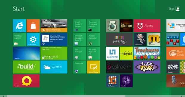
When you first boot Windows 8 you are greeted with this UI which shows your installed applications as a collection of tiles. What’s great about these tiles is that they are not only a way to launch applications, but also small windows into the application. A tile for your email app could show you your unread email count, your social networking app could show the latest posts, and your image management app could show a slideshow of images etc.
We say “could” because right now apps don’t support this functionality – remember this is the preview that is supposed to get developers started developing apps for Windows 8 – but the sample apps included showcase it quite well; the news app shows news from configured feeds, the Twitter apps shows tweets and the stocks app shows stocks. Apps launch in full screen but can be made to share space as well. Applications whether they are Metro apps or traditional apps or web apps can be pinned into the Metro start screen.
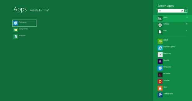
In this Metro start screen, if you start typing, you will immediately see a filtered list of installed applications, but you can search in settings and files as well. And here comes the awesome part, you can search from here within applications as well! Applications expose their data to Windows which can then search within that data as well. A hypothetical example would be, if Amazon’s Kindle eBook reading app supported this feature you’d be able to search for eBooks directly from Windows.
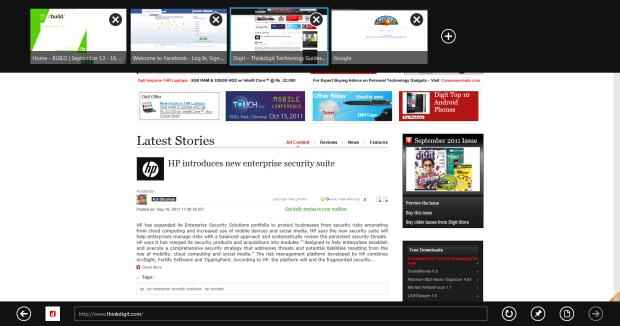
Windows 8 comes with a version of Internet Explorer 10 with a Metro interface that doesn’t allow plugins such as Flash and Silverlight. This UI is highly optimized for tablet devices, but is functional on desktops / laptops as well.
The login / lock screen has received some Metro love and now finally displays the current time and can even be extended to show data from some applications – another useful feature for Tablets.
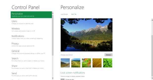
A completely new Metro-styled control panel is also available that offers a simpler way to configure most common settings.
Even the boot process has finally been revamped to use a Metro-style UI. You can select which OS to boot using your mouse / touchscreen. This makes sense for tablets where there would be no keyboard to make an OS selection.
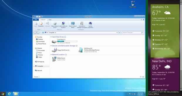
All of this is available in addition to the more traditional Windows UI, which we talk about next. However you needn’t use the traditional UI if Metro is all you want. What is great is that these two can coexist and even cooperate by sharing screen space between metro and traditional apps.
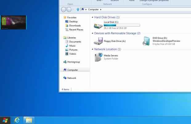
Hovering near the edge of the screen shows a preview of other running applications; this preview can be dragged onto the screen to make it share space with the current app, or take over the screen.
Read more about Windows 8 Developer Preview, on Page 2…
Windows 8 “classic” UI
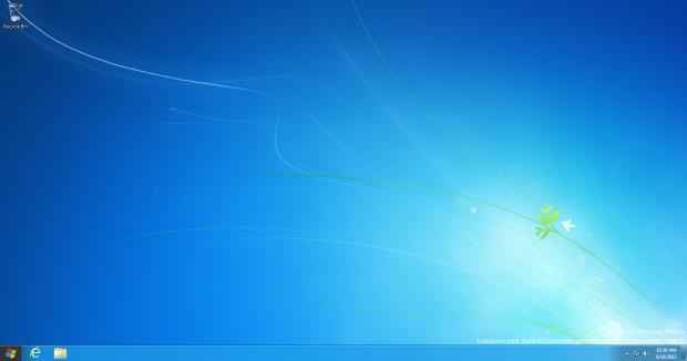
One of the biggest losses in this whole Metro thing is the Start Menu. RIP (1995 – 2012). The Windows 8 Developer Preview does not feature the traditional start menu; instead it launches the Metro start screen described above. We emphasize “Developer Preview” because this could very well change by the time it releases.
There is just so much new here that we feel we have to list it in points:
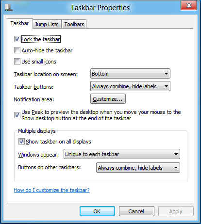
- Proper multi-monitor support! Each screen can now have its own taskbar that can show all apps, or only the apps running on that screen. In fact Windows even comes with a theme with a dual-screen wallpaper just for multi-monitor users. The Metro UI can only work on one screen at a time, you can switch between screens at any time.
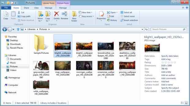
- Explorer has a new ribbon based UI. Love it or hate it, it is there; in our opinion it is quite functional. With the loss of menus in Windows Vista, this UI brings back many useful operations. It can always be collapsed and ignored.
- The ribbon UI can show context and content sensitive tools such as pinning apps and running as administrator for exes, extraction options for zip files, mounting and burning options for ISOs etc.
- Common operations can be pinned to the Windows Explorer toolbar
- An up button next to the back and forward button to move to a folders parent.
- Yes, Windows 8 can now mount ISO and VHD files without any 3rd party software!
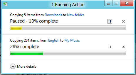
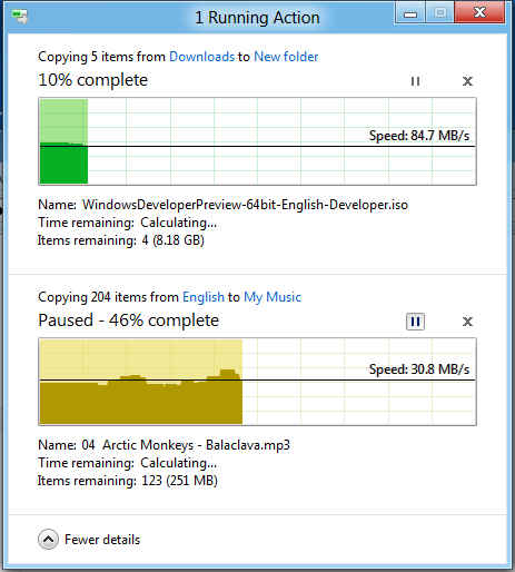
- The copy and move interface is revamped such that:
- All file transfer operations will appear in the same window
- These operations can be paused
- A detailed view will show a graph of changes in speed over time
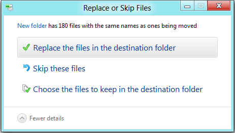
- The UI for resolving conflicts is much improved
- There is a new “Automatic” option for Aero window colour which automatically selects the colour of the window borders based on the wallpaper colour. If your wallpaper is set to a slideshow, your window Aero colours will change with each change of the wallpaper.
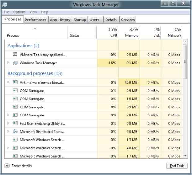
- There is a new task manager that in its detailed view is very powerful. You can see not only how much CPU and memory each application is consuming, but also its network utilization.
Windows 8 core features
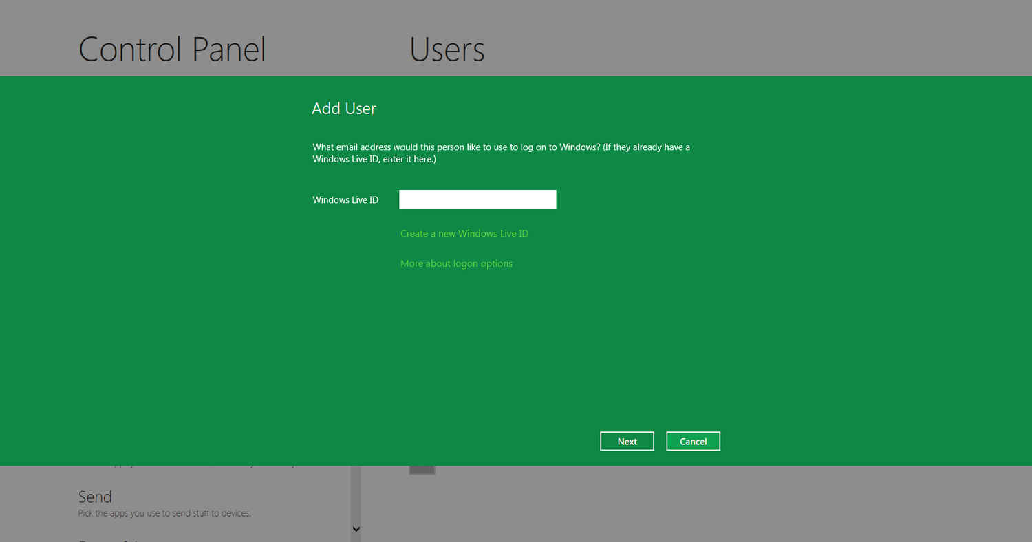
A number of features in Windows 8 change the core of the Windows experience. One major addition is that of cloud syncing inbuilt into Windows. You can notice it the first time you set up your user account, when Windows asks you to enter your Windows Live credentials. You can use your Windows live account instead of a local account (which too is an option), and in that case, some of your settings etc. will automatically be synched to the web and to other computers associated with the same login. This is quite similar to Chrome OS, which does the same with Google accounts.
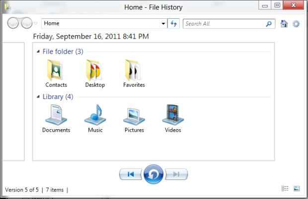
Another great example is the new File history feature. Volume shadow copy / system restore from Windows XP was improved in Windows Vista with a “Previous Version” option to get back old version of files. Windows 8 takes it further by building a proper UI around it, allowing you to browse the history of your data folders and restore previous versions of your library folders at any time. All your libraries are automatically backed up. You can now even select where to store these previous versions of files; even network locations can be selected, and you can offer your computer’s storage as to others in your HomeGroup.
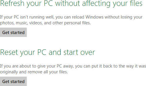
Windows 8 now also offers an option to “Refresh” the Windows install, which will reload all Windows files without touching your personal data. In this case the some setting will be reverted and your applications will need to be reinstalled (not the ones installed from the Windows Store though). Another option is to “Reset” your install, which instead removed all personal data from the computer so you can resell it.
Antivirus technology is also inbuilt in Windows 8, including the new SmartScreen filter that was introduced in IE 9. Now files downloaded using any browser will be checked by Windows against an online malware database.
Another core improvement in Windows 8 is in how it shuts down and boots up. Now even on shutting down Windows hibernates its core processes so they can launch that much faster next time. This can lead to some serious improvements in boot speed.
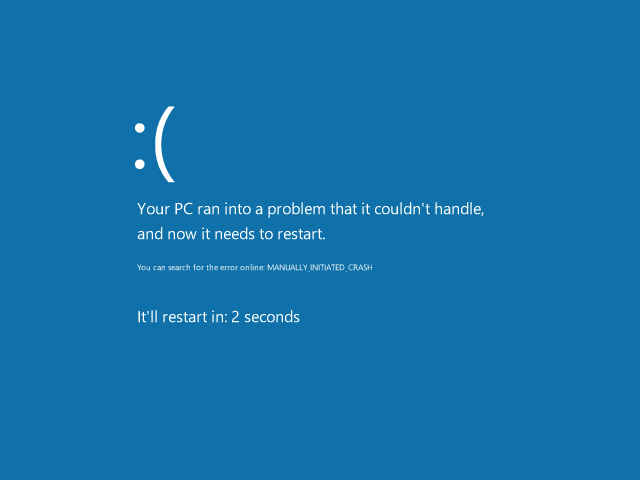
There are numerous improvements in Windows 8; even the Blue Screen of Death has been changed to a less threatening emoticon-laced design. There are many things to hate and many to love. But this is just a hint of Windows 8, released mostly for developers.
Yes, the Windows 8 Developer is not complete; it is not even a beta, but a pre-beta. While all of what we have mentioned here is available in the Developer Preview build – and you can check it for yourself, it’s on the DVD – take it all with a grain of salt. The final version of Windows 8 will most likely improve many things and possibly even remove some features.

