A look at Gnome 3

Gnome 3 is a major new update to the Gnome desktop environment that redefines the desktop interface entirely. The Gnome developers have left no stone unturned, and have come up with new paradigms for the way you interact with windows and workspaces.
In the process of evaluating every aspect of the desktop environment, many of the the things that you may have taken for granted have been removed or changed significantly.
Are all these changes for the better? That answer will depend greatly on how you use your computer. First things first, Gnome 3 still comes with the a fallback Gnome 2-like UI. However, this is just a temporary measure while there is still hardware that is incompatible with Gnome 3. The old UI will probably be going away, so we will not consider that option, and will instead talk only of the new Gnome Shell, and here-on all our references to Gnome 3 mean Gnome 3 with the new shell. Gnome is more than just the shell though, it also includes a number of great applications such a Nautilus for browsing files and folders, and Empathy for instant messaging. These applications have also been updated, and some have better integration with the shell now.
There is one thing for certain, Gnome 3 is a lot less flexible than Gnome 2 was, and Gnome 2 wasn't very flexible ‒ at least not compared to KDE. If you have become used to moving panels around and arranging widgets to your linking, we're sorry to say you're out of luck with Gnome 3, better luck with KDE or stick to Gnome 2!
Despite that, Gnome 3 is beautiful! A clean interface, and smooth animations ‒ as long as you have a supported graphics card ‒ make this a significant step up from Gnome 2, which while being a brilliant desktop environment, was somewhat dated. If you've never used a computer before, Gnome 3 is brilliant way to get introduced, and will instill an aversion to what we might call traditional interfaces.
Let us begin with some of the immediately-visible changes, and then go deeper down the rabbit hole.
Gnome 3 desktop UI
The first thing you are likely to notice is that the two-panel layout has been done away with, and now Gnome sports only one panel at the top. There is no menu to speak of, but we'll come to that later.
The second thing you will notice is that there are no icons on the desktop. This is because Gnome 3 does not have the concept of desktop icons! Your desktop is just an empty back-drop that does not accept files or show them.
At the left-most edge of the panel is the Activities button. This button is to switch to your activities overview. The activities view is where you can see the running applications and launch new ones. You do not even need to click the button, as the top-left area of the screen is a hot-spot and will trigger the activities view if you move the mouse to that corner. We will cover this in more detail later.
Just adjacent to the Activities button is the active application. It shows the name of the running application, and a zoomed-in icon of the same. This is not like a task bar, since it will only list the application that is currently active, even if there are other applications running. Additionally, clicking on it will reveal a menu of actions that apply to the entire application. Unlike a taskbar, the actions listed here will apply to the entire application, not the current window. So if you Quit Firefox from here it will close the entire app, not just the active window. Currently the applications we used merely showed a menu item for quitting, but perhaps more will come in the future.
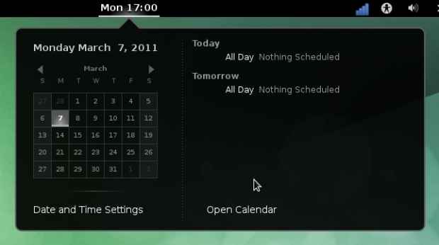
At the center of the top panel, is the date / time display; clicking on this will drop down a calendar that is integrated with Evolution — an open-source alternative to Microsoft Outlook — such that your calender entries will display here.
On the right-most area are your system tray icons. Now, Gnome distinguishes between core system icons, and those created by other applications. This area will just display system icons, such as bluetooth, WiFi / network connectivity, battery indicator, volume etc. All your other icons, such as those for applications you install will show up at the bottom-right corner in the message tray. More about that in a bit.
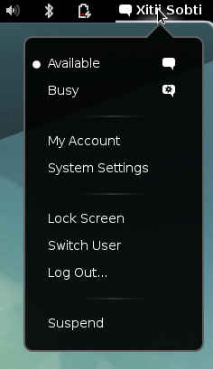
Right next to the system icons is the current user's name, clicking on which will reveal activities related to the current user account, such as setting preferences, social networking options, logging off / shutting down etc.
Since this panel shows a fixed, limited amount of information and controls, there is little chance of it getting overloaded even if it is being used on a small screen device such as a netbook or tablet. By keeping only Gnome-related components on this bar, the developers have ensured that it will have a consistent look and functionality, and wont easily be overloaded as the users installs more applications, or makes changes to the system.
The message tray
Here you will find all the system tray icons for applications you have installed. The message tray usually stays out of the way, bu slickly slides into view when the mouse reaches the bottom-right corner of the screen.
It lists all your system tray icons and also any icons for notifications, which we will elaborate on shortly. As you slide your mouse across the icons in the bar, the icon you hover on expands and shows its title on the (right) side. This looks better than it works, since you are presented with a moving target of icons that, made worse by the fact that any right-click / left-click action related to the applications in the tray only work on the icon, and not on the title label. It is difficult to imagine why such a mechanism would be needed, and what benefit it serves over a simple tooltop.
Now for the notifications. Notifications on Gnome are incredibly sexy. They slide out at the bottom of the screen, without imposing on you, and slink away from whence they came. Gnome distinguishes between important notifications that you need to take action on, and merely informative or suggestive messages that do not serve a purpose by persisting. For example, a message telling you that you have new email / IM messages is likely to be something you will interact with, and expect it to open the corresponding application. However a message telling you that your battery is full, is something that is just informative at the moment, and does not need to pile up in the notification tray.
Gnome makes it even simpler to interact with notifications, and makes sure that they don't interrupt the work you are doing. To that end, if your mouse is already near the area where the notifications appear, the system is smart enough not to accidentally trigger a notification's action. Additionally the notification system behaves differently when you mark yourself as busy using the personal menu.
Speaking of great interactions with notifications, IM message notifications have a powerful feature, wherein you can actually reply to a chat message from the notification popup! This ties in with Empathy, the default IM client in Gnome 3. You do not need to launch the chat window, you can have short (or even long) conversations using the notification itself.
Activities view
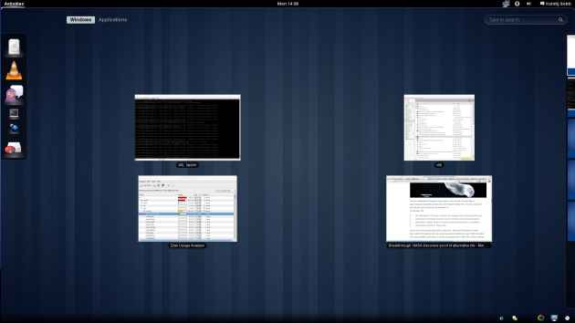
The activities view is where you can get a visual overview of your running applications, and workspaces.
A dock on the left side of the screen displays icons of applications that are either running, or marked as favourite — this is comparable to the Windows 7 taskbar that displays running or pinned applications. Clicking on an application in this list will allow you to switch to its window, or launch it if it isn't already launched. Right-clicking will show a list of actions such as launching a new window of the application, switching to one of its opened windows, or marking it as a favourite application.
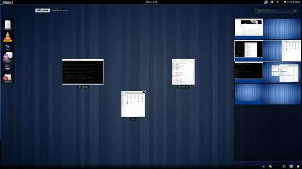
In the center area of the screen you will find the windows of running application presented in front of you. You can click on a window to switch to it, or drag it to the list of workspaces on the right. Additionally, you can drag a window from any other workspace and drop it in this area to bring it to the current workspace. Clicking on a workspace on the right will take you to that workspace.
Gnome 3 has a great feature called automatic workspaces. Unlike Gnome 2, where the number of workspaces was fixed, usually at 2 or 4, Gnome 3 starts with only one workspace, and adds new workspaces as necessary. Gnome 3 will keep one free workspace that you can move windows to; as soon as you use up all workspaces with windows, Gnome 3 will add another one. On the other hand, if you move windows from one workspace to another, such that there is more than one empty workspace, Gnome 3 will eliminate the freed up workspace. In a way it wil insure that there is only one free workspace in your list of workspaces, and that workspace is always the last one.
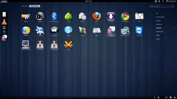
The activities view is also the place to launch applications. Clicking on the "Applications" toggle button will switch to a grid of all applications installed on your system. Applications that are running will be subtly highlighted here. On the right side, you can see a list of categories to which these applications belong. The categories of applications are quite broad, with no sub-categorization, so you will find your IM apps, browsers, and download managers all together.
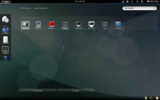
It is likely that you will find it cumbersome to navigate this list alone, but the good news is, you don't need to! Just start typing the name of the application after switching to the activity view (even if it is in window mode) and the list of applications will be filtered out.
The search mechanism leaves a lot to be desired. It is utterly unintelligent! For example, I searched for "terminal" in order to launch the Gnome Terminal, however the first entry I got was for a remote terminal app. Despite typing "terminal" and starting the Gnome Terminal a number of times, Gnome still lists the remote terminal application first. Eventually I just uninstalled the application as I didn't use it anyway.
Window management
Gnome 3 features some radical changes when it comes to window management. First of all, there is the concept of automatic workspaces. In the future, Gnome developers plan to make this smarter, such that it will automatically perform basic workspace management for you. For example, GIMP with its multiple windows and panels will automatically open in a new workspace.
Switching between windows using the activities view can be quite cumbersome as you may well imagine. First you press a key or move the mouse to launch the activities view, then you select the workspace the window is in, then you click on the window to activate it! There is no proper taskbar, which makes things even more difficult. Fortunately there is always Alt-tab.
The task switching (alt-tab) feature in Gnome 3 has also been through a major revamp. While the current trend is to display live previews of windows while switching tasks, Gnome 3 instead relies simply on large application icons.
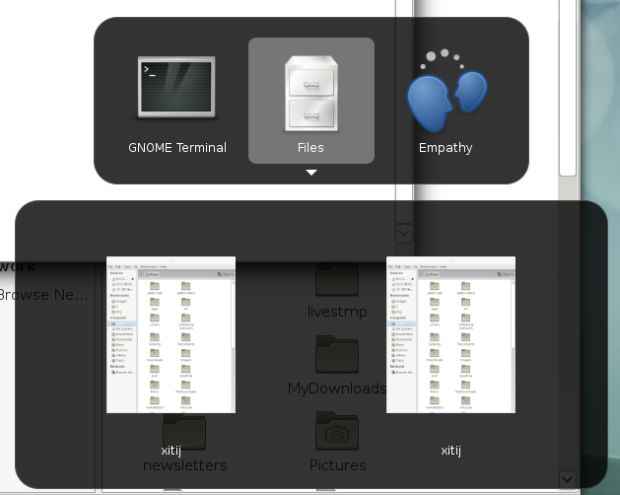
The alt-tab mechanism now serves as an application switcher rather than a window switcher. You will find a row of application icon and application names while switching, instead of the title of the windows you have open. However, Gnome 3 goes a little further, and offers and additional interface to switch to particular windows of particular applications. This is exemplified by the following image:
Window thumbnails pop up below the application icon for those applications that have multiple windows. Navigating here is a concern, since you need to use either the mouse, or the arrow keys in addition to alt-tab.
These are not the extent of the changes, Gnome goes further and deeper.
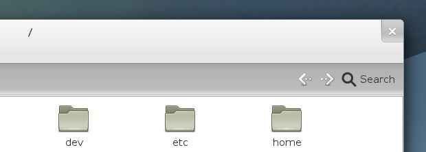
Have you ever maximized or minimized a window? Please tell the Gnome devs because apparently they've forgotten to consider people like you. Yes, the maximize and minimize window buttons are gone! If you were one of the people pissed about Ubuntu's shifting the title-bar buttons to the left, know that at least there was a hack to undo that, for Gnome 3 there is nothing.
Another issue with Gnome 3's window manager is that even the close button is absent on some windows! If the window already includes a button labeled "Close" ‒ such as a dialog ‒ Gnome will forgo showing even a close button on the window.
In a way it makes sense, maximizing a window is an action that already has a popular interaction associated with it ‒ double-clicking a window's titlebar ‒ the button is just redundant. In addition, Windows 7-like interactions for maximizing windows by dragging them to the top of the screen, and expanding them to half the monitor by dragging to the sides.
Additionally, why does one need a minimize button? When an application you are using is not important / required or distracting in the current context of you work. Say a media player along with your documents is a candidate for being minimized. Gnome already has (and has had for a while) a better solution for organizing different applications based on context: Virtual Desktops / Workspaces. After all why would you want to minimize a window and get it out of the way, didn't you launch it in the first place? With your windows arranged according to the different tasks they perform, there is little need to minimize your windows, just move it to a different workspace. Minimizing windows is such a Windows thing to do!
While one acclimated to using computers a certain way might find the these missing buttons a travesty, a Gnome 3 user will probably never need them.
Unfortunately, while people already familiar with the Windows 7 gestures, or double-clicking titlebars will be able to get to work immediately, new users will need to discover these gestures, which is always a barrier. Buttons are more tangable than abstract gestures and even the earliest GUIs gave some indication of what is happening when you clicked these buttons. There is no way to supply a tooltip for maximizing a window by dragging — although Gnome devs could go along the path the Opera did by making gestures easy to discover.
Conclusion
I used Gnome 3 beta builds (near-final ones) for over a week while working, and found it quite a productive desktop environment. One does need to embrace it entirely and use it as it is though.
In my case, I used different automatic virtual workspaces for different related activities, and used the keyboard to switch between my active window and workspace mode. I also launched application primary using the keyboard, by switching to activity mode and typing the name of the application.
What I realized over time, is the neither the mouse not the keyboard alone enough to use Gnome 3, and you need a combination of both for best efficiency. This annoyed me a bit, since I could usually get around fine with just the keyboard even on Windows! Gnome 3 is optimized for a Keyboard Mouse experience which is possibly how most people interact with their computers anyway, but there are still some blockers for getting some tasks done fast using only one input device.
Despite its flaws, which are to be expected in an initial release, Gnome 3 is a solid desktop environment. It has stopped trying to be everything for everyone, and is now focusing on bringing its own new experience, such like Apple does with Mac OSX.
What hurts here is not that the design and the decisions made to create Gnome 3. Linux and open source are all about choice, but sadly this is not reflected by Gnome 3. It is a great desktop environment, but we cant help but feel that it now meets the needs of a narrower group of people than Gnome 2 did. Or at the very least it meets the needs of fewer Gnome 2 users than Gnome 2 did. Will its definition of a desktop environment meet the needs of more people, only time will tell.
Contrast this with KDE, that allows you to configure nearly every part of the experience. You can remove the maximise and minimize buttons, or alternatively, you can add even more buttons for actions such as keep-on-top, shade etc. With KDE, you can configure each and every shortcut, mouse gesture, effect etc. It's hard to find an aspect of KDE you can't configure!
Nearly all great visions are disruptive, and ‒ all chiding apart ‒ Gnome 3 deserves a fair trial. After all, it is designed and developed with love and care by talented people dedicated to the vision. Change for change sake might be bad, but refusing to even give something a chance just because it has changed is simply dogmatic. If Gnome 3 has indeed come up with the perfect formula for a desktop, then


