A closer look at Windows 8’s browser: Internet Explorer 10
Internet Explorer 10 serves dual roles as the default Metro and desktop browser, and its HTML5 support breaks new ground for a Microsoft browser.
 Survey
Windows 8’s browser, Internet Explorer 10, leads a double life. You can run it in Metro, you can run it in the traditional Windows desktop view. Underneath, however, both use the same rendering engine. This engine has been considerably improved, in both speed and support for new Web technologies such as HTML5 and CSS3. Maybe even more significantly, IE10 isn’t just the browser for Windows 8, it actually becomes the underlying engine that powers Metro style applications that use HTML5 and JavaScript. When you realize that, it becomes clear that Internet Explorer 10 is a crucial piece of the Windows 8 puzzle.
At the moment, Microsoft is only making the preview version of IE10 available for Windows 8 Release Preview, but, at release, it will be available for Windows 7, Windows 8, Windows Server 2008 R2, and Windows Server 2012. To try out Windows 8 and IE10, head to the Windows 8 Release Preview download page.
Microsoft made a big push with IE9 for more standards support, and, indeed, that browser version far outstrips what IE8 offered. This is of particular importance for Windows 8’s role as a tablet operating system, even though the Metro (the touch-tablet-centric part of Windows 8) guise of IE10 will include the Adobe Flash plugin built-in, as Google Chrome does. But more and more sites are relying on HTML5 to take over that plugin’s functions.
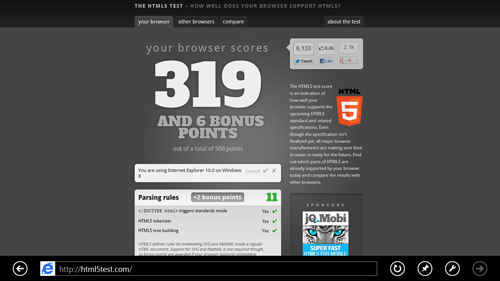
Windows 8One gauge of HTML5 readiness is the HTML5Test.com site, which reports a score based on how many HTML5 features it supports, along with bonus points for non-standard-specific extras like video codecs. Out of a possible 500, IE9 earns a score of 138, compared with 414 for Google Chrome. IE10 changes this picture considerably, with a score of 319 and 6 bonus points.
But that score isn’t the whole story. Far from it. HTML5Test.com merely checks for that the feature is recognized, not whether it’s correctly implemented. On the IETestdrive site, Microsoft has published dozens of proof-of-concept demos showing exactly what a lot of these HTML5 features can do. You can peruse the IEBlog to read about the tons of work the IE team has done to add bleeding-edge support to the browser. Though it’s often stated that Chrome and Firefox are ahead of IE in HTML5 support, some of the test drive demos show that those browsers haven’t yet implemented every capability. One example is Touch Events, which lets a webpage respond to gestures.
Atop all those underlying Web technology updates, however, there’s an app interface you use to browse the Web, and the main changes here are in the Metro version of IE10. Let’s look at how this clean, minimalist design, full-screen, touch-friendly new interface handles your daily browsing needs. After that, I’ll look at some comparative benchmark numbers.
Continued—Metro Internet Explorer 10’s User Interface>
Copyright © 2010 Ziff Davis Publishing Holdings Inc
Metro Internet Explorer 10’s User Interface
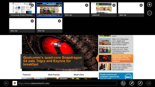
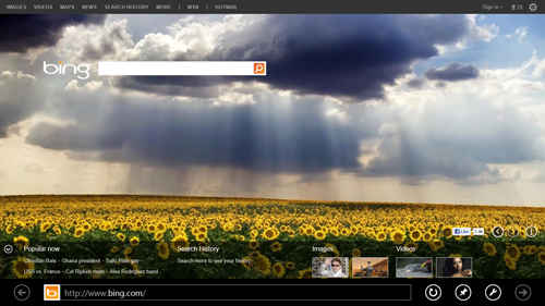
Like other Metro applications, this flavor of IE10 runs in full screen view, letting your Web pages completely take over. To access any browser controls, you do what you’d do with any other Metro app: Right-click, or on a tablet, swipe in from the bottom or top of the screen. This drops down large thumbnails of all your open webpage tabs, along with a Plus sign button to open a new tab, and a “…” button that offers InPrivate browsing or lets you close all tabs except the selected one.
After a right-click or swipe in from bottom or top on a tablet, in addition to the tab thumbnails along the top, along the bottom of the screen will also pop up your address bar, along with a back arrow and buttons for refreshing, pinning sites, settings, and forward. The placement of the back arrow a the leftmost point and forward as the last button on the right is well-suited to tablet browsing, but on a laptop or desktop, having them next to each other would be better.
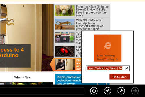
The Pin button, looking like a pushpin, works quite differently than it does in IE9 under Windows 7. It creates a tile on the Metro start screen that opens the browser to the pinned page. This seems to detract from IE9’s emphasis on pinning sites to the taskbar. The created metro tiles I created by pinning only showed the standard IE tile; it would be preferable for sites to be able to customize this. One way around this for sites is to build an app.
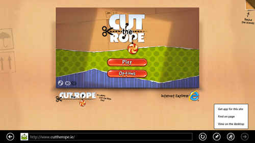
For certain sites the settings wrench button is already graced with a Plus sign, meaning a “Get App for this Site” choice is added to its context menu. When I went to Cut the Rope’s Web version, this option took me to the Windows Store to install the app. But I still came upon several sites that do have apps (like USAToday) yet don’t have this option from the wrench icon.
The setting wrench button offers two more important actions: Find on page, and View on the desktop. The first is thankfully still also available with a hit of the Ctrl-F key combo—a shortcut I use incessantly. The infobar along the bottom shows how many find hits there are, and those are all highlighted on the page itself. The View on desktop choice will be indispensable for those who need traditional windows features like overlapping windows and toolbars.
The right-click presents a problem for sophisticated Web users, however. In all other browsers, including IE9 and IE10 on the desktop, right-clicking opens a menu offering information and actions. In fact, one of IE’s hallmark features has been Accelerators, which you get to with a right click. For Metro IE10, those are all gone. I often right-click on an image to see its pixel size or source url, no more. Doing so (or holding your finger down on a tablet) does open a simple context menu offering Copy, Copy link, Open link in new tab, and Save to picture library.
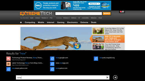
When you click into Metro IE10’s address bar to start entering a URL, colored tiles showing your frequently visited and pinned sites pop up above it. Once you start entering characters, popular site suggestions pop up in smaller blue tiles. Once convenience that warms the cockles of my heart, that Microsoft finally has included in a browser—Paste and Go. This saves you a click every time you enter a URL from the clipboard, but unfortunately, it’s only in the Metro version, not the desktop one.
Page zooming works well in both touch tablets, with an “unpinch” gesture, and on the desktop, using Ctrl-mouse wheel. Firefox, too, supports pinch zoom, but the response was smoother in IE10. The Ctrl- and Ctrl- keyboard shortcuts still zoom and unzoom, too. And another welcome touch is pop-up blocking—it worked well for blocking automatic advertising popups, but if I specifically clicked on a link that opened a window, I was taken to a new tab. Since it’s full-screen, there are no overlapping windows; for that you need to go to desktop IE10.
Another expected browser convenience included in Metro IE10 is password saving, which is clearly handled. But say goodbye to history and favorites managers (or go to the desktop for them). Hitting Ctrl-H or Ctrl-B does nothing. The new browser does, however, handle downloads with the same security and options to run or save as IE9. But again, Ctrl-D doesn’t open the nonexistent download manager, and I wish that in addition to Run and Close you got a Show in Explorer choice after a download; you’ll have to simply open your Downloads folder.
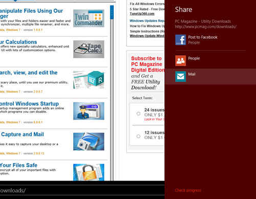
As does any well-behaved Metro app, IE10 takes good advantage of the Share charm. I could send any webpage link—along with a thumbnail preview—via email, or, using the People app, I could share it as a Facebook post or Twitter tweet. This integration does indeed help with easy sharing of pages that strike your fancy.
One thing missing here is any help on the new tab page—I mean any. When I opened a new tab without entering a url and tapped on the screen, I got a completely blank white page with a cursor, and on a touch tablet you don’t even get the cursor. Sure, I could right click on the laptop or swipe in from the edges on the tablet, but no interface should ever display nothing but white. Hopefully at release Microsoft will add pointers helping users get back to something useful.
The tab system works adequately, and makes sense for touch input, where it’s probably better than standard browser tabs across the top. But on a desktop, this tab system is less immediate than the typical browser tabs. Another choice I’d like to see from the … menu is to reopen closed tabs, since you don’t get this on the new tab page.
Desktop IE10
Heading over to the desktop version of IE10, you’d be hard pressed to detect any difference from IE9. Of course, the underlying page-rendering engines are same the new, faster, more standards-supporting ones used by the Metro form of Internet Explorer 10. As we’ll see in the next section, there are performance differences, too.
Continued—Performance>
Copyright © 2010 Ziff Davis Publishing Holdings Inc
Performance
To see how IE10 compares with the other two leading browsers, Firefox and Chrome, in terms of performance, I ran a few standard industry JavaScript benchmarks—SunSpider, Google V8, and Mozilla Kraken, along with a couple of tests of hardware acceleration from Microsoft’s IETestdrive site. I used a lovely new Toshiba ultrabook, the Portege R835-P88, with a 2.5GHz Core i5 processor and 6GB of RAM, running 64-bit Windows 8 Release Preview for the first four tests, and a Windows 8 tablet (specs below) for the last. No apps beside the browser were running during testing.
The first test I ran was good old Sunspider; most browsers have optimized up to the hilt for this JavaScript benchmark. Nevertheless, it’s a good opening ante speed test. A striking thing I noticed was that the desktop version of IE10 consistently delivered a score of about 10ms better than the Metro version. Not really a significant difference, but perhaps worth noting. What was significant was how much faster IE10 was than Chrome on this test, by nearly 100ms—a third again faster. Of course, it’s a preview version of new OS, and Microsoft engineers have had more time and access to optimize their browser. Firefox on Windows 8 Release Preview was only marginally better than Chrome on this test.
The next test I ran was Google’s V8 (v.7) JavaScript benchmark. One would certainly expect Google’s own browser, Chrome, to ace this one. And indeed that turns out to be the case: Chrome achieved more than double IE10 Metro’s performance on this test. Again, I saw the disparity between Metro and desktop IE performance, with the benefit going to desktop. Firefox came in second here, making the whole result set in line with what I’ve found in Windows 7 tests for these browsers.
Mozilla’s Kraken benchmark takes longer to run and the organization claims it’s a better representation of actual Web browsing patterns. In this benchmark, we see a similar pattern as for V8, but with an important difference. Chrome again comes in first and Firefox second, but this time Metro IE10 beats out its more traditional alter-ego. Perhaps there’s something to that “real-world” stuff after all.
A final performance test I ran is from the IETestdrive collection, Psychedelic Browsing, a test of a browser’s use of graphics hardware to accelerate Web page rendering. This test spins a color wheel as fast as the browser can handle, and plays a spacy sound effect using HTML5. For this one, both flavors of IE10 got an identical score. The score 1,815 RPM certainly evidences hardware acceleration, since browsers without it normally only muster results in the double digits. It seems that IE10 is limiting the result of this test, since I got an identical result on different systems, however.
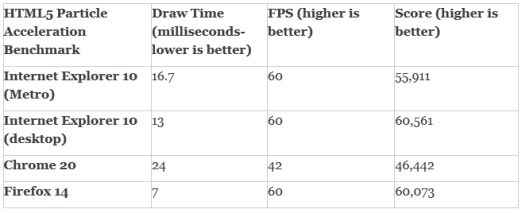
A newer IETestdrive benchmark of hardware acceleration is the Particle acceleration benchmark. I ran this one on an 1.6GHz Intel Core i5 Windows 8 tablet with 4GB memory running 64-bit Windows 8 Release Preview. This displays a rolling sphere of molecule representations, and reports draw time, frames per second, and a score. I recorded the highest score observed, since the benchmark runs continuously.
Achieving 60 frames per second is a pass for this test, since that’s the screen refresh rate of the LCD. Firefox was surprisingly good at this test, beating out Chrome and achieving the fastest draw time, but IE10 on the desktop attained the highest observed score.
A Brave New Way to Browse
When you’re browsing the Web, you don’t really want to think about or see the browser’s interface: You want to see the webpage you’re visiting. The Metro version of Internet Explorer 10 takes this view to the extreme, when you’re on a page, you only see the page—there’s zero browser interface. And with Web sites becoming more like applications all the time, this immersive view is more important than ever.
Web apps, too, need more than simple Web page display in order to be fully functional, and IE10’s much-improved HTML5 support allows them to do nearly anything an installed application can. Finally, for all this to happen in a way that will please users, it’s got to be fast. IE10 is fast, but it’s not the leader on most of my tests. And I was surprised that the desktop version made a better showing than the new Metro version. Perhaps this is because Microsoft has had longer to optimize the desktop version, or the Metro version introduces another layer on top of the OS kernel. In any case, this is not the last word, and optimizations often come along late in the development cycle.
There’s no doubt that IE10 is the fastest, most Web-standard compliant, and leanly interfaced version of Internet Explorer we’ve ever seen. And while it doesn’t lead competitors like Chrome and Firefox on some of these measures yet, it’s still pre-release software. I like the directions this browser is moving in, and, when the final version of Windows 8 arrives, Internet Explorer 10 may well top the leader board.
Copyright © 2010 Ziff Davis Publishing Holdings Inc
.jpg)

