Virtual Reality User Experience Tips from VRMonkey

Abstract
Virtual reality has been hyped for years, so people understand that it is really happening. Now is your chance to enter a new development platform, but are you ready for it?
The following guidelines show you how to avoid creating unpleasant feelings when developing for virtual reality. We also provide tested solutions from the people on the frontier of this new media.
Ready for a New Adventure?
This article aims to cover the best practices of virtual reality. It covers some of the major issues that people have been experiencing and how to solve them.
Our approach consists of rules, so let’s start with rule number 1, one of the more important rules of virtual reality (VR): Every rule has exceptions. With the advent of so many new VR devices, it is practically impossible to find someone who really knows what works and what doesn’t. With that in mind, always try something different.
In other words, there are no real experts in this area, only scientists. So try to be a scientist—apply a very defined methodology and try. It is important to try everything over and over again, and with the largest number of people that you can find.
Remember, everyone is different when we are talking about VR. Some people play games running around and making loops and nothing bothers them, other people can feel sick just looking at a scene with the wrong field of view (FOV), and can feel sick for the entire day.
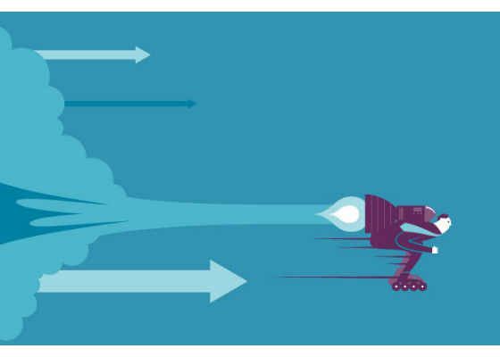
Having said that, let’s go to the second rule: Never accelerate your player abruptly. Most games are not meant to be in VR so they use accelerations in a way that produces this sensation through the monitor. In fact, if you do that in VR, your own body will feel strange from accelerating and a very strong dizziness can overcome you.
Remember that most of the VR experience the camera sees appears to the player through the HMD. If the player is not moving, do not move the camera. This also applies to camera shaking, which is very common in producing a sensation of being hit or that you are in distress, but when you do that to a player it is very unpleasant. It is like shaking your head after few drinks.
Figure 1. Speeding up your player may make him feel really nauseous.
Do not forget that when the player uses a head-mounted display (HMD) he has a better notion of space, so sizes and velocity should follow measures similar to those in real life. For instance, in Half-Life* 2 the normal walking speed is around 17 km/h [1], which greatly differs from a normal walking speed of around 4 to 5 km/h [2]. So, keep that in mind when creating movement inputs for your character.
In fact, all locomotion in VR is very unpleasant. Until now, many mechanics have been proposed such as using a controller as usual, with a gamepad or keyboard, or creating an element of movement (which in fact has generated the bad reception for Resident Evil* 7 demo [3].
Other options, like teleport or dash movement, have been selected as better options.
If the movement takes less than 100 ms, the player will not notice it and will not get motion sickness. This approach is very comfortable, but still can be disorienting, since the player may be jumping from one place to another. Some solutions are to show the player the direction he is going, and keep his orientation fixed.
Another great option for movement is to have movements on rails, like in old arcade games like Virtual Cop* and House of the Dead*.
Having a reference point is very important in avoiding cyber sickness; if you display a helmet or a cockpit interior this helps a lot in preventing nausea.
Believe it or not, some researchers have put a virtual nose to make some VR experiences more comfortable. This is true. Not that all VR games should have a nose, but to have this kind of UI feature makes it easier for the player to focus his attention on something not moving around him all the time.
Another common solution is to apply a continuous movement; for instance, when the player hits the button he begins movement on just one axis, and keeps that movement on only that axis until he moves his head to a boundary angle or hits a button again.
Apart from locomotion, another big problem usually found in many VR applications is the frame rate. This is something that is so easily measured that even VR stores will not publish games that have frame rates that do not maintain a framerate of at least 90 fps.
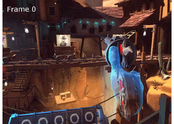
I believe that with some great, low-latency screens and with great technologies like asynchronous timewarp [4] and asynchronous spacewarp [5] we could have great experiences with even 45 fps; and remember that when talking about mobile devices, like GearVR* or Daydream*, the target frame rate is really 60 fps (a hardware limitation for now).
Figure 2. Example of asynchronous spacewarp—creating a new frame from the interpolation of 2.
Nevertheless, the frame rate is a very strong matter. Just because a console game or other games look good enough at 30 fps, this does not mean that it works in the VR experience. When the frame rate is low the interaction between head movement and game response is slow, and you start to get a lot of blurring; believe me, you will become sick after too much time exposed to that experience.
Another great thing that changes with using HMD is how interfaces should be placed. Nowadays we have gaming interfaces with a lot of information all around the screen showing maps, ammo, enemies, tutorials, and everything else. It is great when they are on a 50” TV five feet away, or even on a 21” monitor when playing with mouse or keyboard. But, when you are using a headset, the position of these interface gadgets should be carefully thought out.
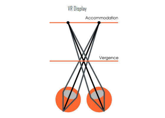
In fact, if anything is too close to your eye it is hard to focus, so if you want to put some 2D sprite as an interface, try to place it at least two meters distant. Or try something more natural; place your interfaces over objects of your virtual world, similar to some amazing games such as Tomb Raider* and The Division. This gives a more natural approach to interacting with the interfaces and the results are pleasant.
Figure 3. Remember to place virtual objects at a comfortable distance from the viewer.
Not only for interfaces, but for all objects in your virtual world, be careful when putting anything too close to the player. It is very nice to give camera closes; as VR experiences have stereoscopic vision, the player usually tries to avoid objects coming toward him. But at the same time, try to make this kind of interaction fast. Having to put focus on something that is very close to you will make you dizzy.
It is important to figure out how the body reacts to different stimulus in real life. For instance, we usually have 250 ms of reaction time for visual input, 170 ms for sound input and 150 ms for touch inputs (like controller rumbles). But, when the environment is dark our reactions are slower, which means that you can use that in VR.
In other words, dark, virtual places are more comfortable than brighter places, since our response time is usually slower in real life. Very fast audio feedback also increases the level of comfort in an experience, and understanding how to use special audio can make all the difference in your VR application.
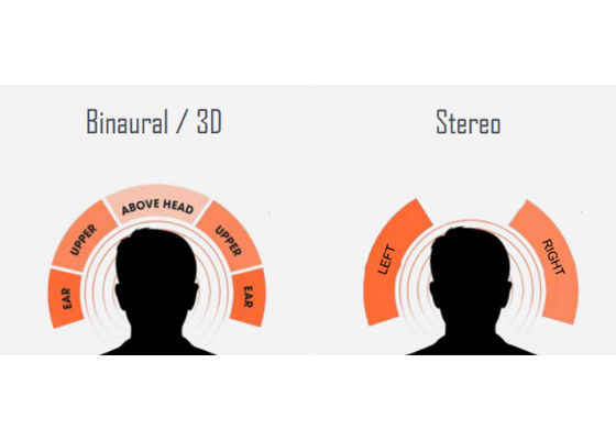
As an example, for the Virtual Barbershop we could say that this is a VR experience, just using audio. Because it is binaural audio, it can express (even through stereo headphones) several positions for the audio source. The immersion you get from having sound like that is much better, and luckily most game engines are ready to create a 3D sound environment.
Figure 4. The difference between binaural audio and stereo audio, which creates a more immersive environment.
Another great hint is to not show the players’ body. You could ask, why? Well, there are several reasons for that. First, your player is no longer a spectator, he is the player! The embodiment that he has is much deeper; for instance, if a girl is playing she will not identify herself with a flat-chested male with strong arms.
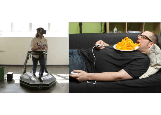
Apart from that, some amazing new tools are allowing us to play the game in many different ways and positions—we can use room-scale VR, hand controls, or simple game pads. Imagine the difference between the players. How can you profile the player if they are in such different positions?
Figure 5. Remember, players do not like to follow rules. They will play your game in the position they prefer.
Since we just talked about controllers, consider using the hands as controllers. There are several technologies aimed to do that; the most popular are the Leap Motion* [6] and the motion controller of each main VR platform (Oculus Touch* and HTC controllers). They have amazing precision and create the perfect way to interact with the environment.
Some common interaction approaches are drastically changed when using these technologies, but almost every VR user, when facing the virtual world for the first time, has an immediate response of trying to reach the object with their hands.
In fact, it is so natural that it is even simpler than teaching touch controls on smart phones. If you look at videos on the Internet you will realize that elderly people (not monkeys) have almost no problems using VR, and they usually try to reach and interact using their hands.
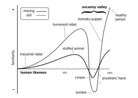
Have you ever got a feeling that the face of some character is strange, almost wrong? That is probably because of the uncanny valley. The uncanny valley is how we perceive a human replica as a robot or a human; our strange revulsion toward things that appear nearly human, but not quite right. [7].
Why is that important for VR? Basically, it is important for every game, but given the problems with performance on VR (need to keep 90 fps at least), several graphical details must be avoided, and usually animations and a number of polygons are cut. Finally, we end up with faces in characters that are not realistic enough to feel like healthy people and we enter into the uncanny valley. Avoid that!
Figure 6. The uncanny valley [8], and how creepy it can be to be similar to humans.
The summary of all these tips is that VR is a science, and as a science a scientific approach must be taken. This means that you must experiment as much as possible; make new assumptions, create new hypotheses, and try them in prototypes. Never forget to take notes of what went well and what went bad, try to adapt, and never get too attached to an experiment; just mark it as failed and go to the next idea.
Conclusion
We are just entering a new world where anything is possible, so do not be closed in with ideas like, “My game must be a first person,” or “I should not move my character with analog sticks.” Try and reach new conclusions. If you want fast results go for the well-known, but if you want to achieve new possibilities, do not be afraid to try. More information can be found in the reference documents [9], [10], [11].
For more such intel resources and tools from Intel on Game, please visit the Intel® Game Developer Zone
Source:https://software.intel.com/en-us/articles/virtual-reality-user-experience-tips-from-vrmonkey

