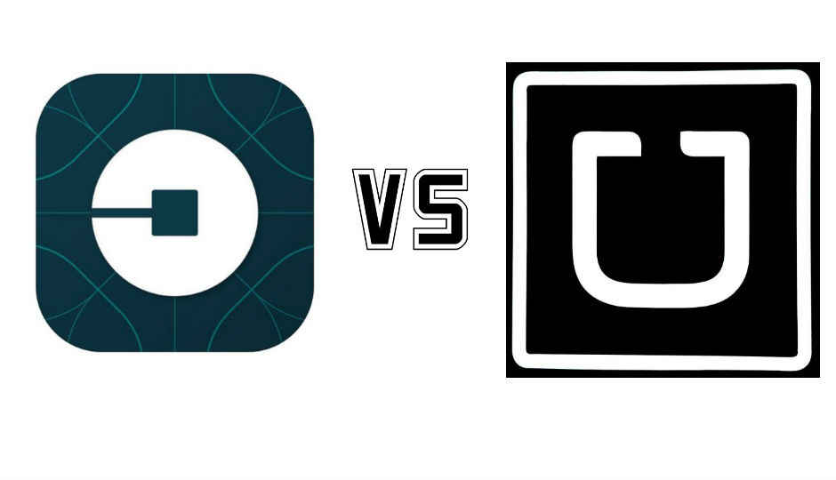
Uber’s logo change: Here’s how the world reacted

Uber's logo change has many befuddled, while others say it's downright bad. Twitter spoke, as usual.
You've probably already heard about Uber's logo change. Travis Kalanick, CEO, Uber, explained the new logo in a blog post, stating, "There are many reasons for the change, but the most important is that Uber is getting ready to go global – I mean an Uber in every major city in the world. We need an identity that the world can understand and one that would get us out of the trademark infringement trouble that our BIG RED U was bound to get us into." If your Uber app has been updated, you may be looking around your phone for that magnet-shaped 'U' logo, but Uber's new logo is the bit and you can read all about it, here in Uber's blog post.
While Uber may have its reasons for changing the logo, it has left many questions in people's minds. For one, what exactly is Uber planning to do in future, that its U logo doesn't work? Well, here are some interesting reactions from Twitter.
Useful to useless
Dear Uber: your old logo was very bad but useful. Your new logo is very bad and useless. Yours truly, Everyone. pic.twitter.com/uWHgJcSbm4
— Joshua Topolsky (@joshuatopolsky) February 3, 2016
They copied SBI!
The new Uber logo looks so typically Indian that it could be a part of the next Coldplay video. pic.twitter.com/ydmsgXqHuW
— Sapan Verma (@sapanv) February 3, 2016
.@TheOfficialSBI won't file a case on @Uber for copying the logo because their lunch time is going on. pic.twitter.com/iqgQeSqVYH
— Godman Chikna (@Madan_Chikna) February 3, 2016
The bit, the spoon or the sperm?
.@Zomato Has a spoon in their logo, this is what @Uber did in their logo. #UberLogo pic.twitter.com/6nyX7recvr
— Peaceful Madness (@AJumpper) February 3, 2016
congrats to uber for shaking its anxiously masculine dudebro image by literally making its new logo a dark sperm https://t.co/CeKLN6eHvT
— Matt Weinberger (@gamoid) February 2, 2016
We don't get it, why the change?
Uber changing its app logo to this. Dropping what must be the most recognisable U on the planet. Madness? pic.twitter.com/rtBcg1UNpz
— Dave Lee (@DaveLeeBBC) February 2, 2016
I extremely do not "get" the new Uber logo. What..is it pic.twitter.com/RVdy7DznSh
— Chuck Anderson (@NoPattern) February 3, 2016
Curioser and curioser
Uber just rolled out their new logo. It's kind of like looking at a Rorschachtest. https://t.co/Y2GVfI3Tgi pic.twitter.com/cTNYrm0eNx
— Andreas Ekegren (@andreasekegren) February 2, 2016
#JustSaying
I’m just going to go ahead and say what everyone else won’t: Uber’s logo is bad.
— Tony M (@tonym) January 25, 2016


