
Lollipop UI walkthrough and how it is different from KitKat.
For this Lollipop vs. KitKat UI walkthrough, we have compared two Nexus devices with one of them running on Android Lollipop and the other on the latest KitKat build. All the UI screenshots to the left are from the Nexus 4 running on KitKat and the right ones are taken from a Nexus 4 running on Android 5.0 (Lollipop).

Home Screen
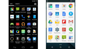
The Home Screen on Lollipop is one of the first things that exhibits the new material design by Google. The App Drawer button has a white background and the on-screen keys are different now.
App Drawer
The App Drawer also has a white background on Lollipop, with the same side scrolling that you had before. Except the background, not much is different here, unless you count the transition animations.
Notifications Dropdown
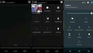
The notifications dropdown has undergone a major UI change. You can now pull down once for notifications and then again for quick settings. You can also pull down with two fingers for quick settings directly. On KitKat you had to pull down for the notifications and then press on the button on the top right or pull down with two fingers to go straight to the notifications.

Keyboard
The new material keyboard sports borderless keys and is still a trace keyboard, which means you can swipe to type as well. The keyboard, as we have told you before, is much easier to type in and better looking as well.
Battery Settings
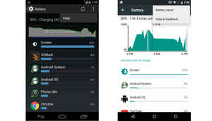
If you go into the Settings Menu -> Battery, you will find the Battery Saver option on the top right. It also shows you how long your phone will take to charge if it is charging. The information is also displayed on your lock screen.

Google Search
The Spotlight search, I mean, Google Search is more omnipresent now. You can use the search not only to get results from the web, but also from your phone and apps. You couldn't do this in KitKat.
Multitasking
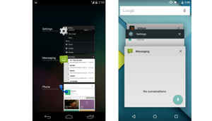
The multitasking screen looks a lot like the Google Chrome tabs that you would perhaps be familiar with. You can swipe across to close apps and the Google Search bar remains on top.

Screen Pinning
Another addition to the multitasking screen is that you can click the 'Pin' icon at the bottom of the app that is on top. This allows you to pin certain screens and allow other users to only browse through that screen.
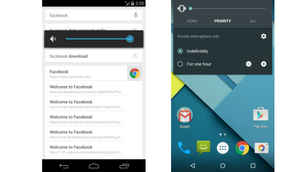
Volume Control
The volume control bar now has the All, Priority and None option. The Priority option takes the phone to the Priority mode, while None makes it silent.
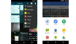
Sharing
The sharing option also has some UI changes. In fact, it looks somewhat like Apple's now, only with more options for sharing.

Security (This is a new feature, introduced with Lollipop)
If you go into the Security menu from Settings, you can access the Smart Lock option, which allows you to unlock the phone whenever certain devices are nearby.

Multi-User Support (This is a new feature, introduced with Lollipop)
See that small User logo on the top right of the notifications screen. You can access the user control from here.
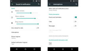
Interruptions
The sound and notifications menu also has some changes. The Interruptions option is where you control the Priority Mode from and there are also toggles for the Media Volume, Alarm Volume and Ring Volume.